ROOT CAUSE HERBALS
CLINICAL HERBALIST
ŠUMPERK, CZECH REPUBLIC
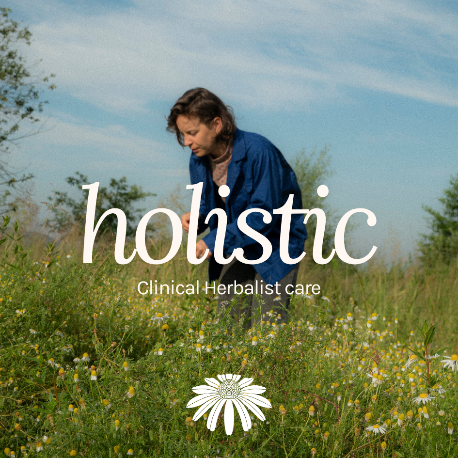
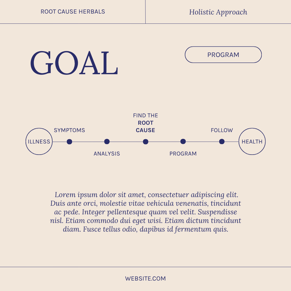
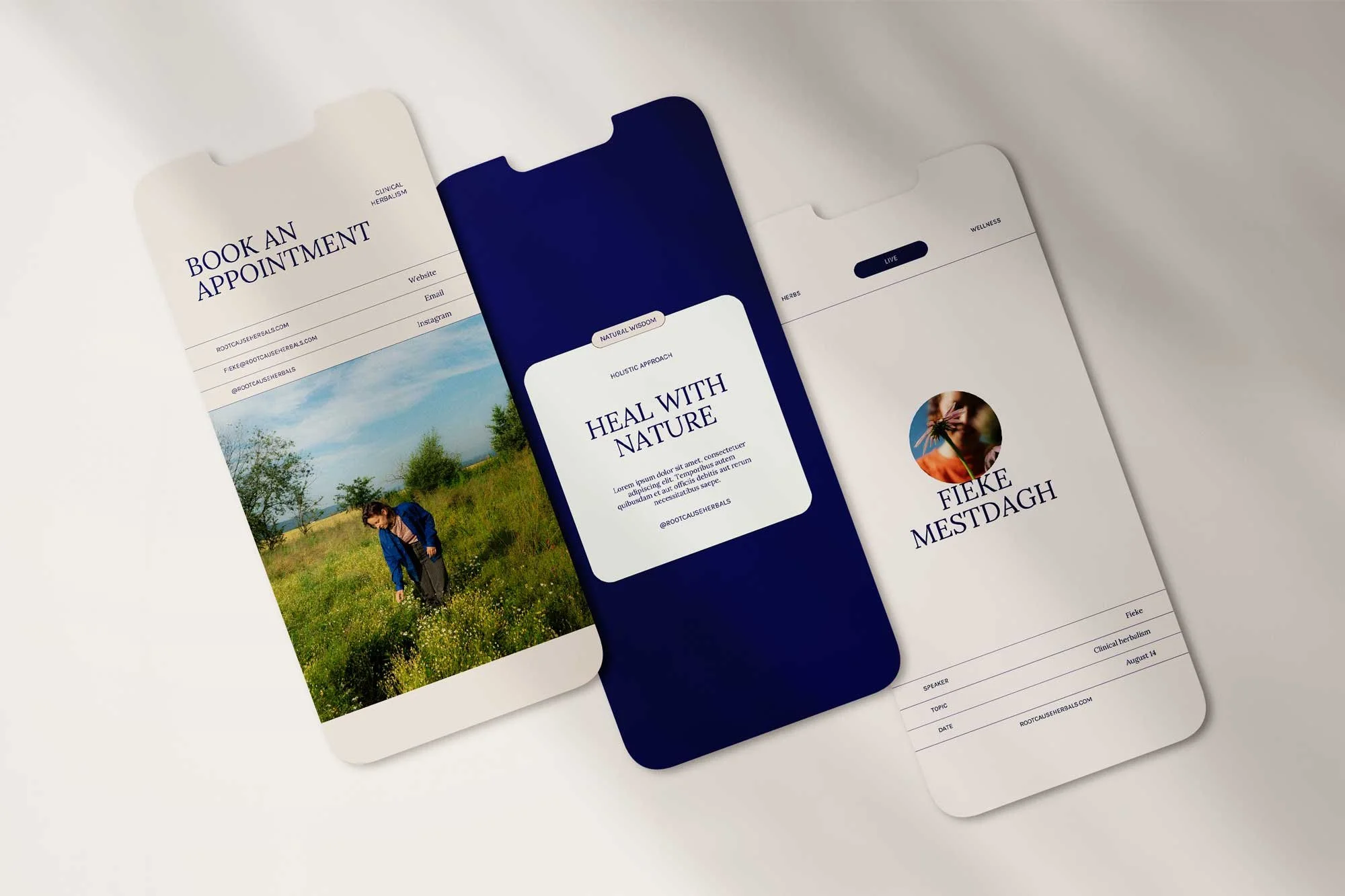
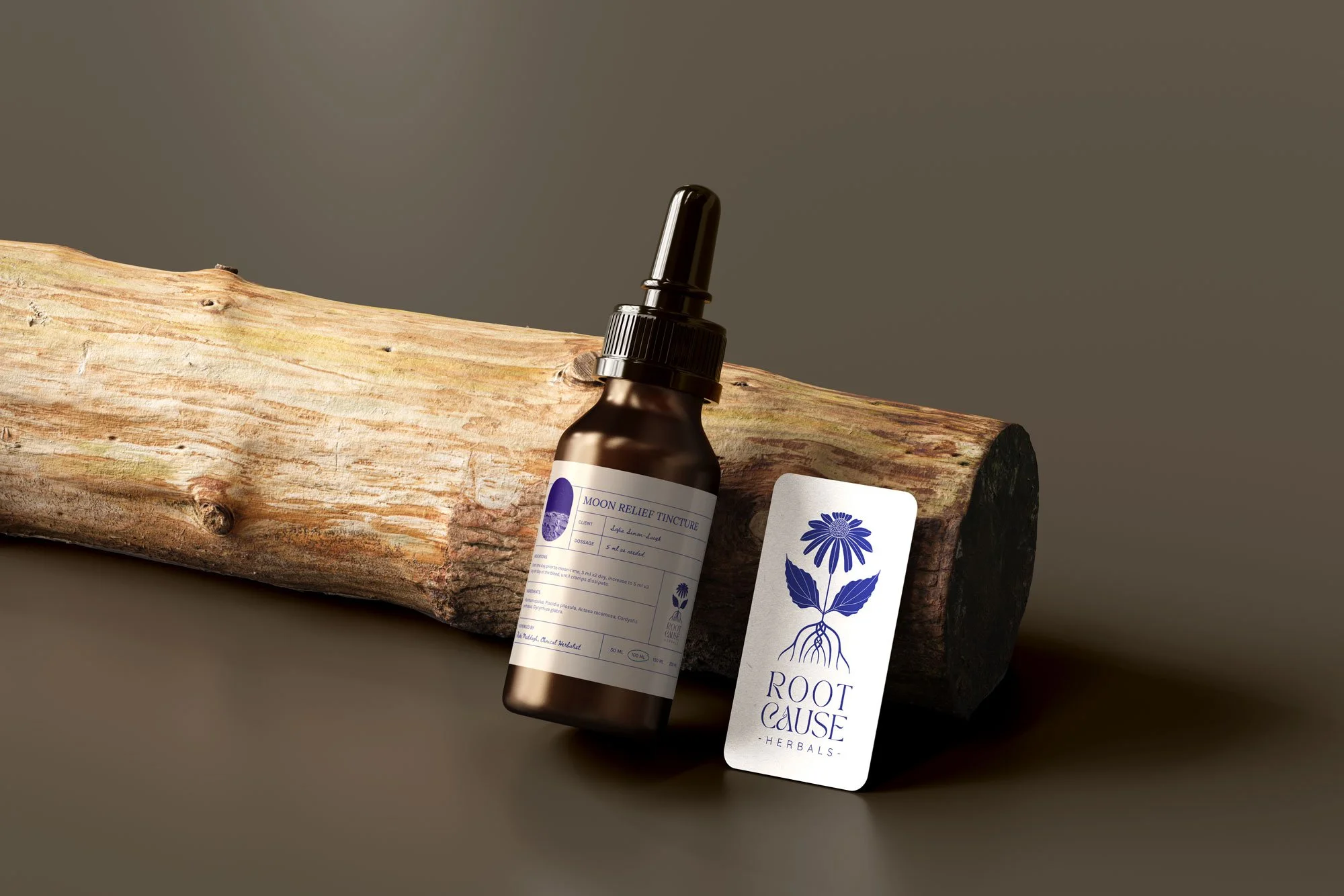
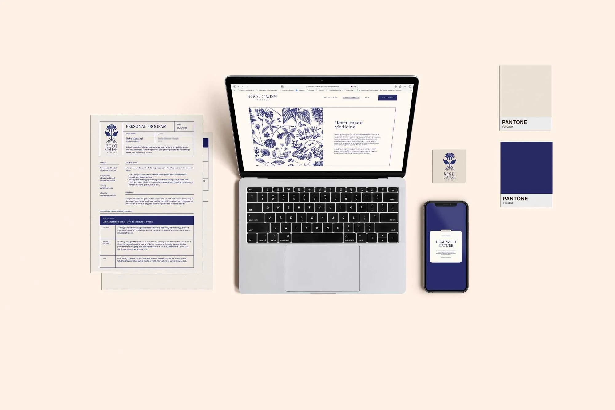
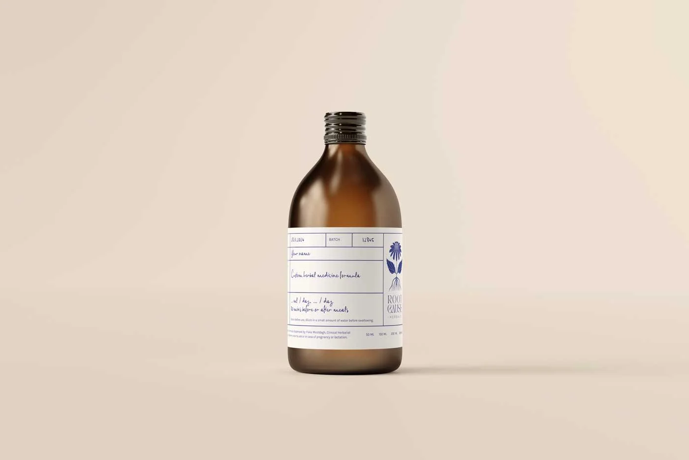
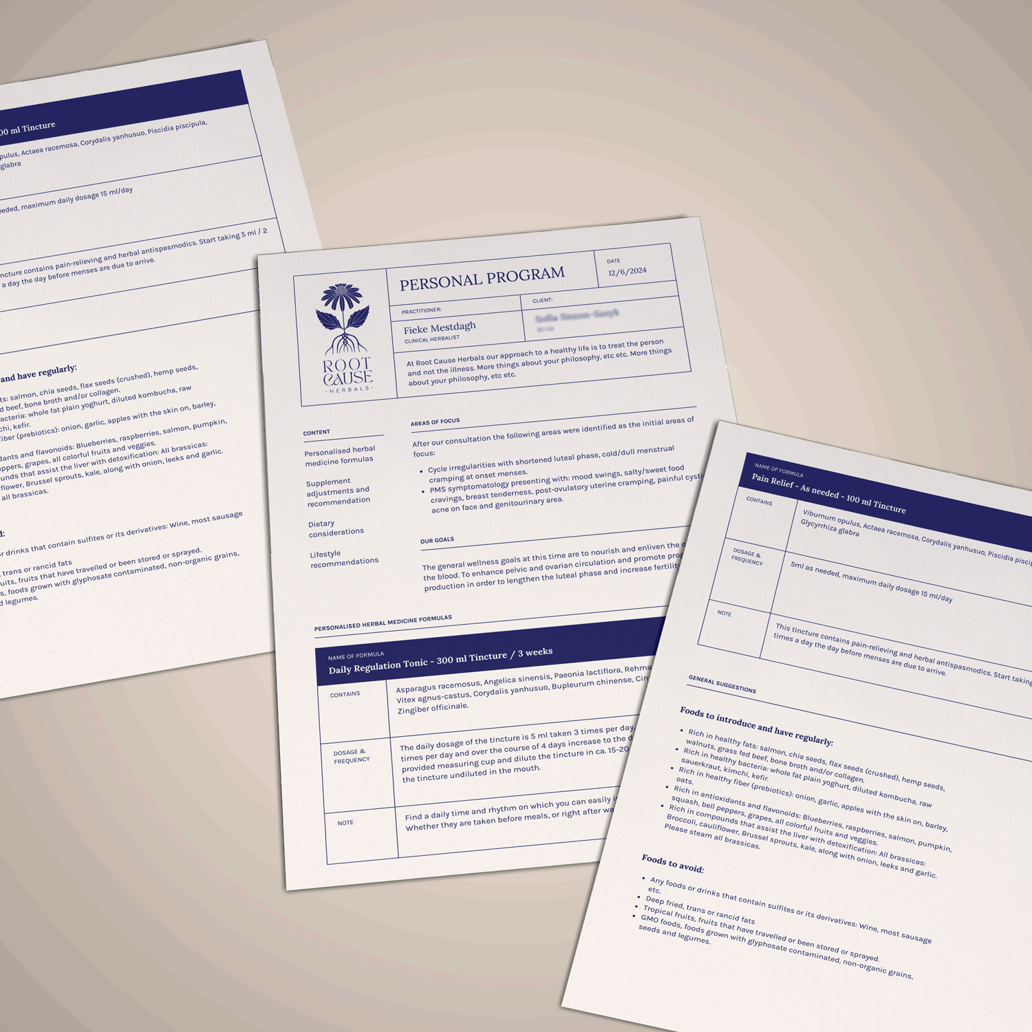
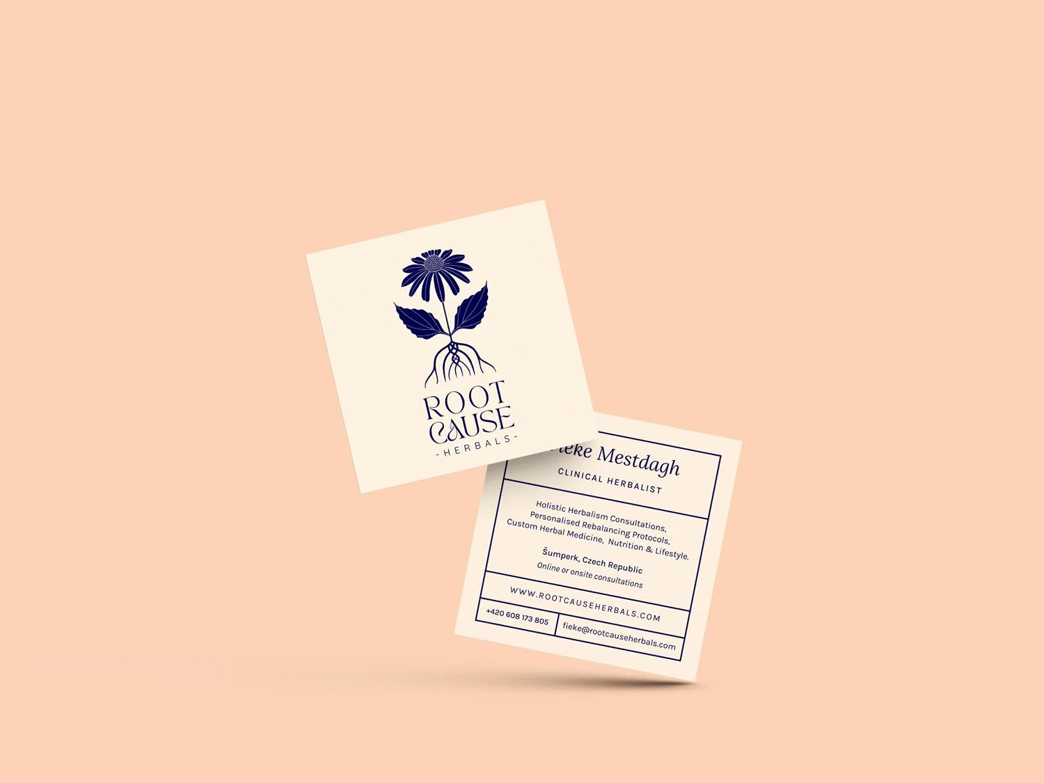
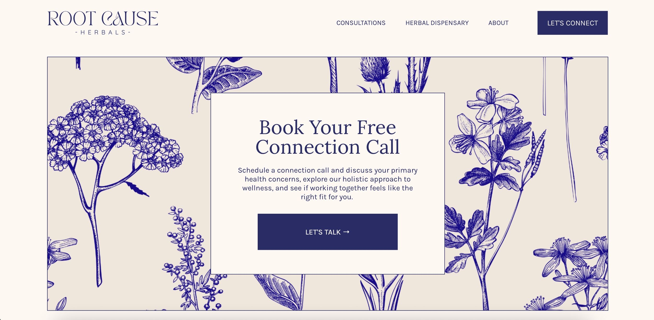
VISUAL IDENTITYCOLLATERAL DESIGNsocial mediaphotographywebsiteTHE PROJECTFieke Mestdagh is a clinical herbalist offering holistic, client-centered care — tailored herbal medicine, nutritional guidance, and lifestyle recommendations — working both in person in Šumperk and with clients across Europe through online consultations. The project was a complete brand build from the ground up: visual identity system, three distinct sticker systems for her bottles (custom-formulated tinctures, ready-made tinctures, and her apothecary ingredient jars), business card and email signature, a full client report document, social media templates for Instagram posts and stories, a workshop poster, a nature photoshoot for website imagery, custom illustrations, and a full website at rootcauseherbals.com. Everything a one-person practice needs to feel coherent, professional, and genuinely beautiful at every touchpoint.
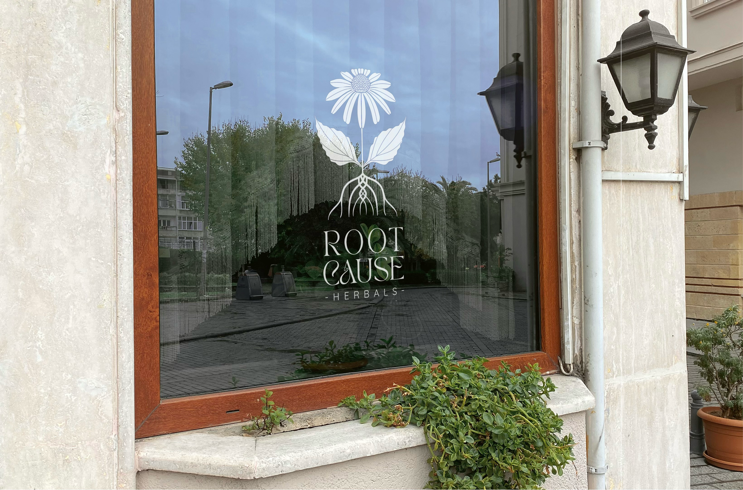
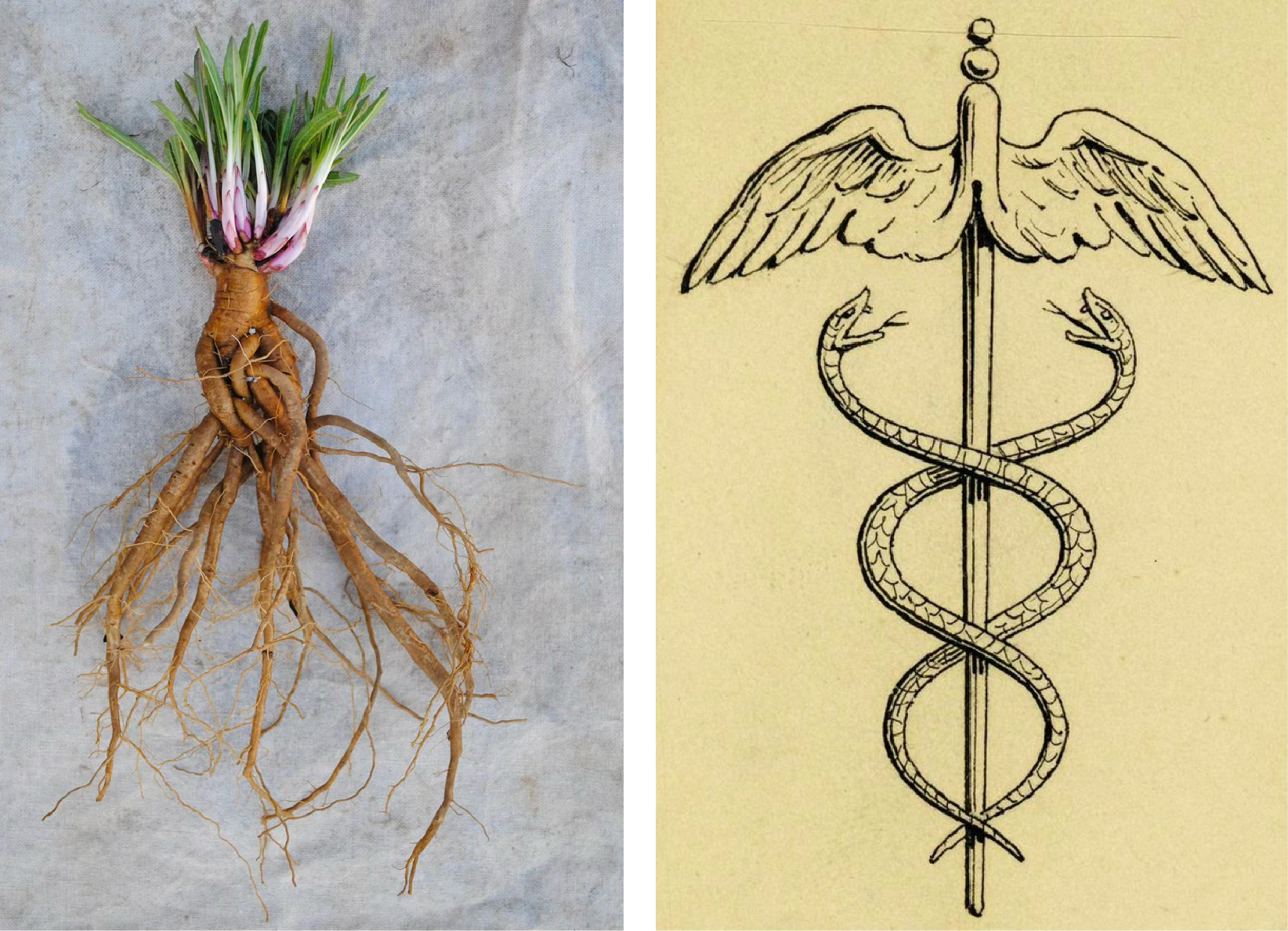
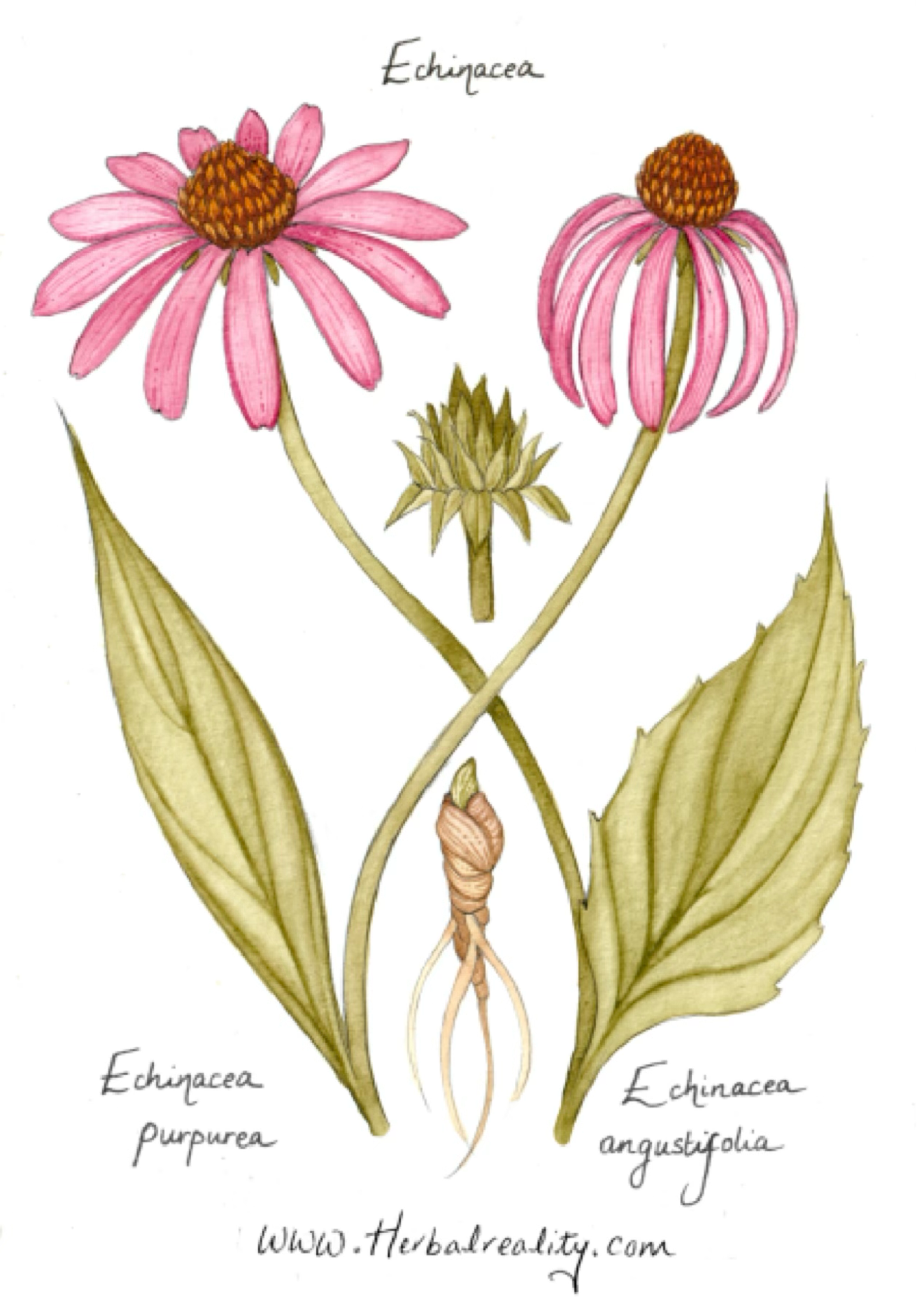
the conceptThe starting point was echinacea — used by Native Americans as a cure-all for centuries, and today a universal symbol of wellness and healing. But the real discovery came from looking at the root itself: its tangled, braided structure is strikingly similar to the caduceus, the ancient emblem of medicine. That connection was too resonant to pass up. The logo weaves both together — a full echinacea plant from flower to root, with the braided root quietly referencing the caduceus. Botanical and medicinal. Ancient and alive.
keywordsEclectic
Warm
Personal
Everyday Beauty
Positive
Calm
Knowledge
Tradition
VISUAL SYSTEM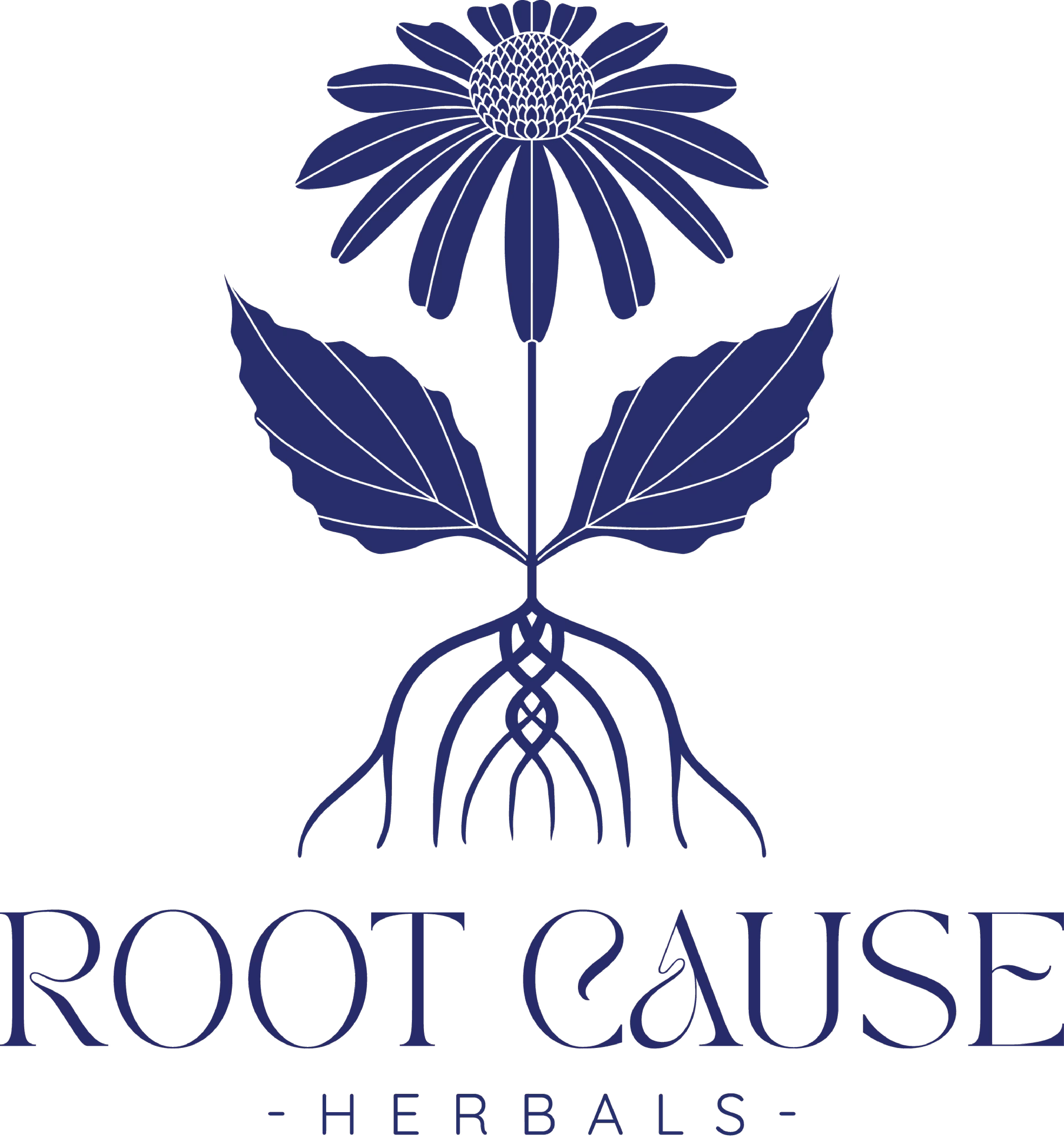
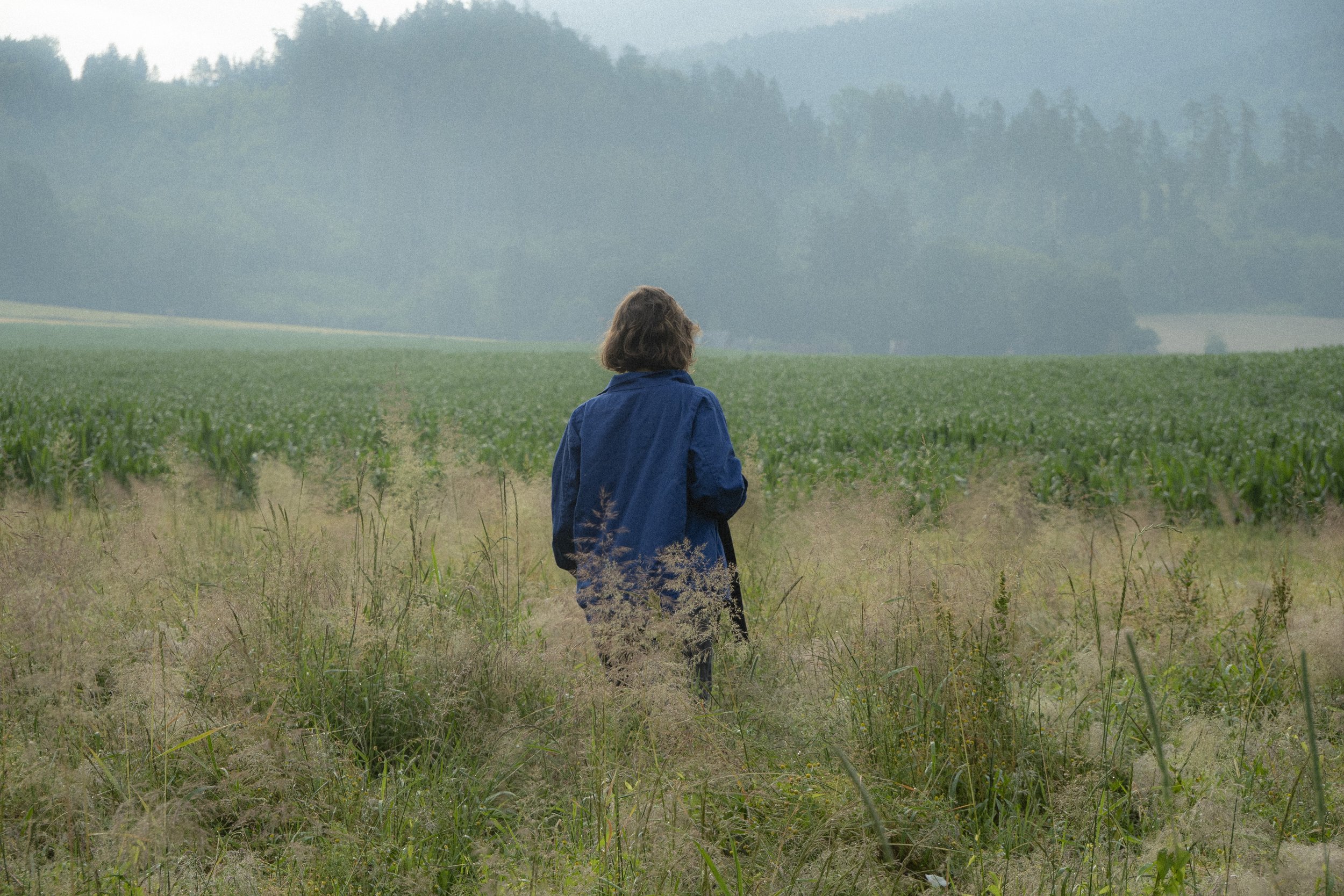
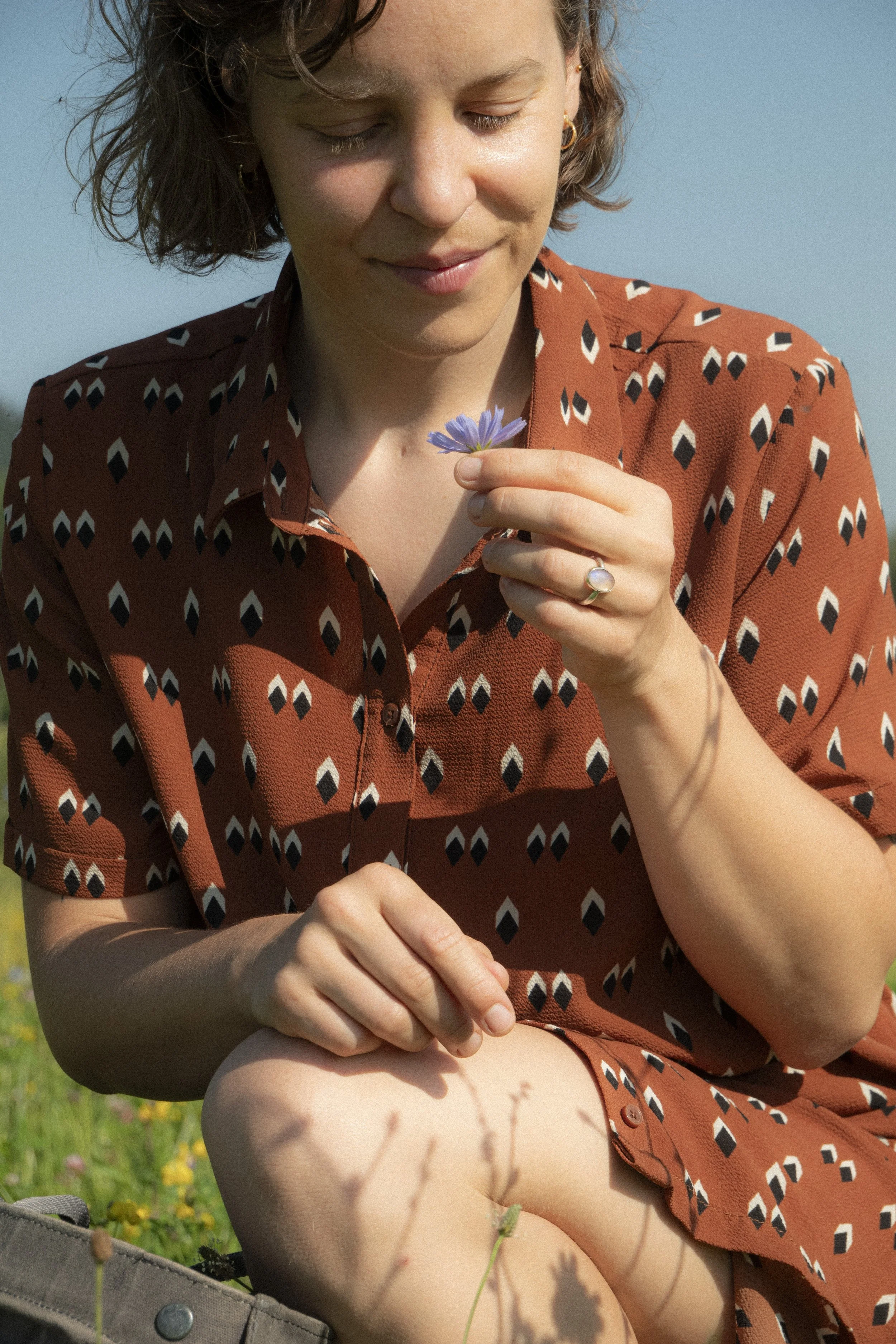
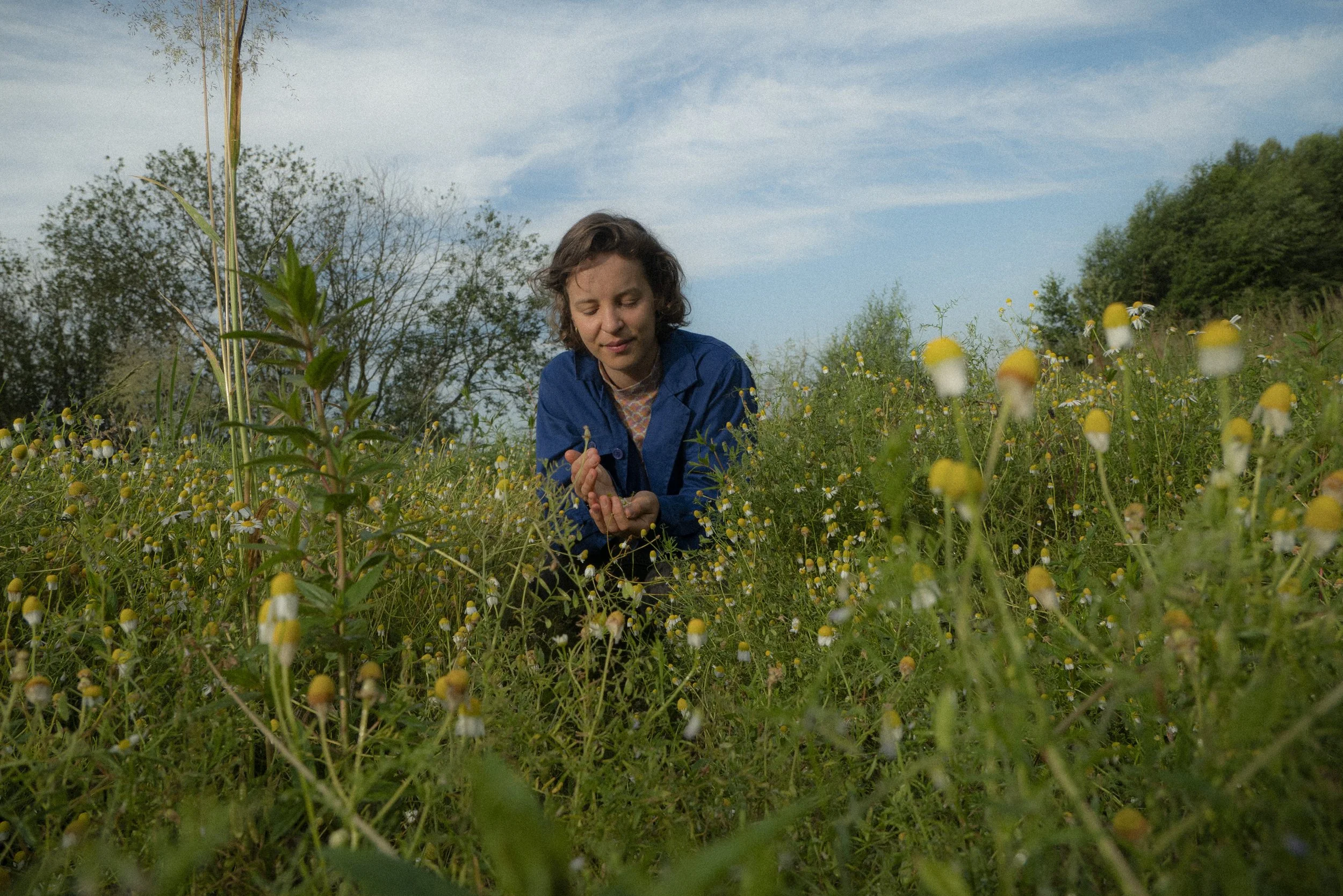
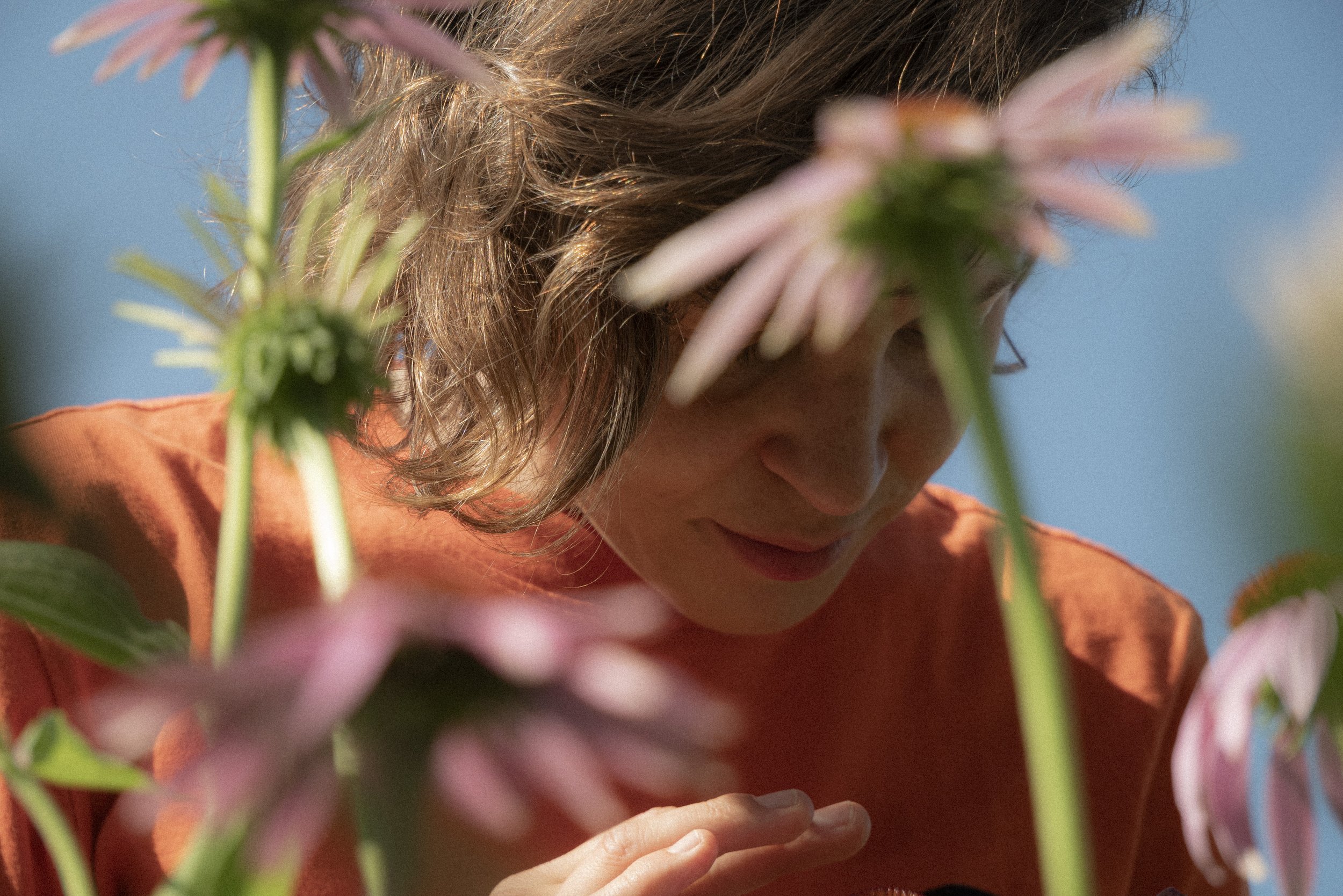
The broader visual language was built around the concept of eclectic balance — a nod to Fieke's practice of drawing on healing traditions from many cultures and parts of the world. Warm, personal, and grounded in everyday beauty. A trio of serif, vintage sans-serif, and script fonts creates hierarchy with soul. Deep indigo blue and warm peach work together with a cream base that feels at home in both a clinic and a kitchen. The photography direction — all shot on location in nature — leans into warm, slightly desaturated, analog-film tones. Poetic without being precious.

COLOR PALETTEThe color palette draws inspiration from both the rich history of botanical documentation and contemporary holistic practice. The carefully selected hues create a sophisticated system that speaks to both the scientific precision and natural wisdom of herbal medicine.

TYPOGRAPHYThe typographic system for Root Cause Herbals creates a harmonious balance between tradition and modernity, perfectly embodying the brand's connection to both historical herbal wisdom and contemporary holistic practice.
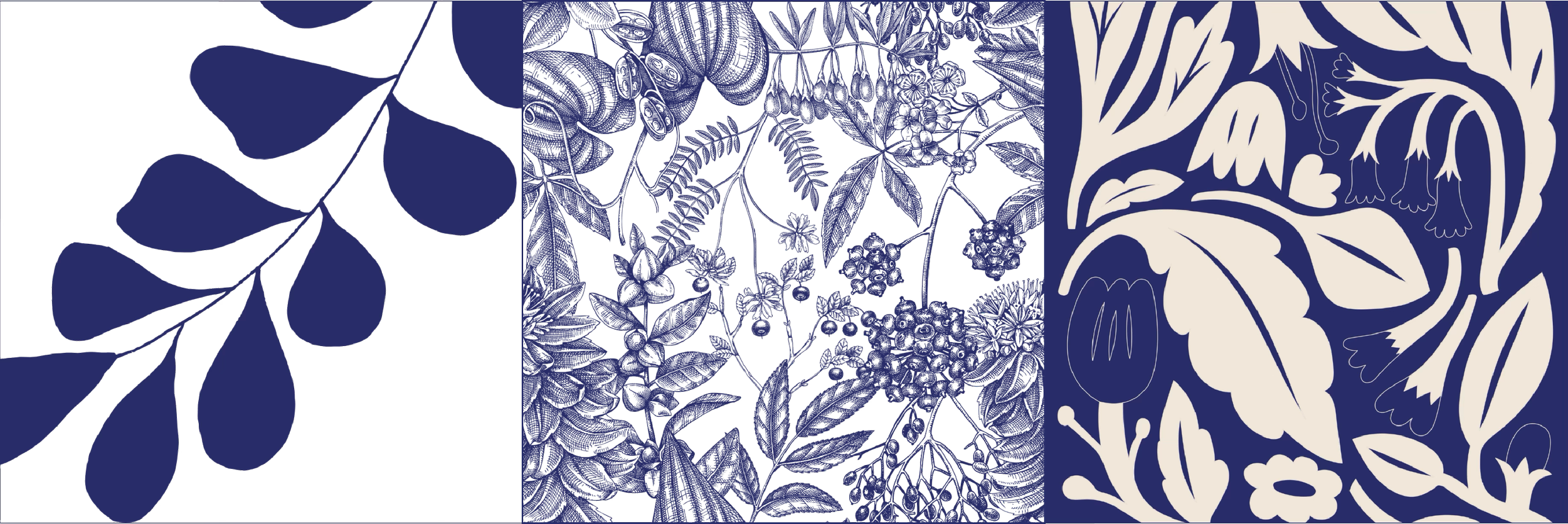
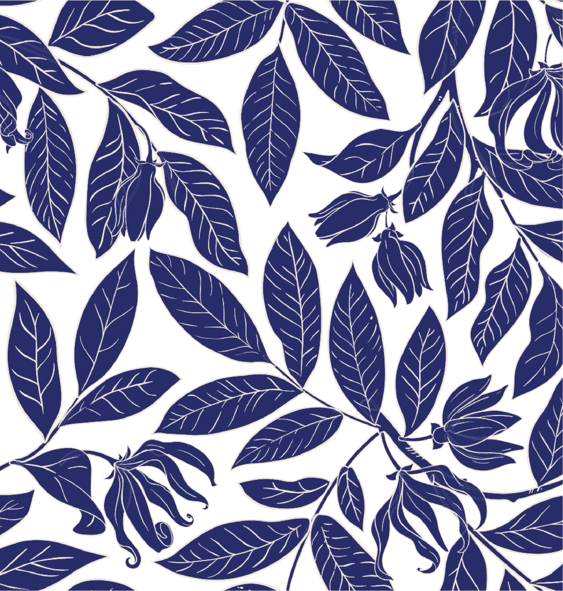
illustration styleRoot Cause Herbals embraces a dynamic approach to illustration that allows for creative expression while maintaining brand cohesion through consistent color application. This strategy creates a visual language that is both versatile and instantly recognizable.
CUSTOM ILLUSTRATIONCustom made illustration to represent Root Cause Herbal’s approach: how the branches of the tree are the symptoms that are visible, but under the ground lays the root cause of the health imbalance

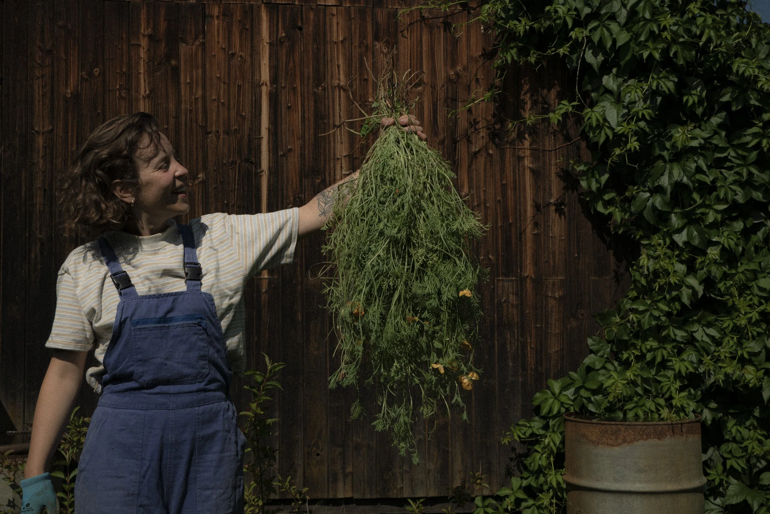
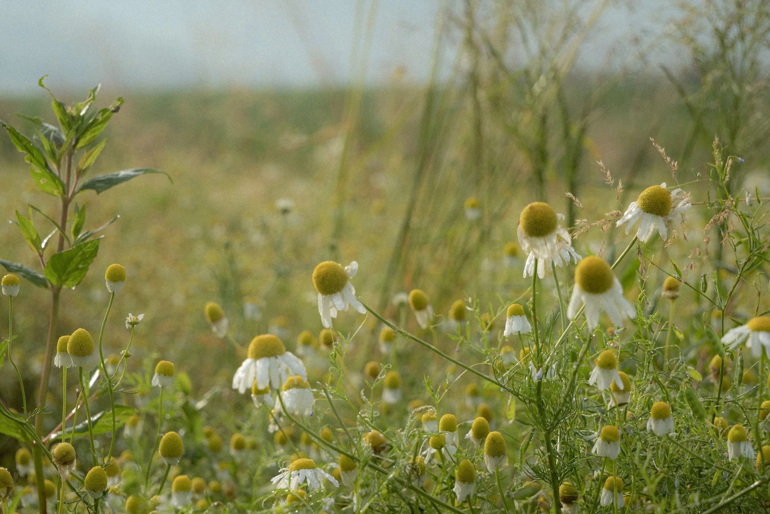
PHOTOGRAPHY SESSION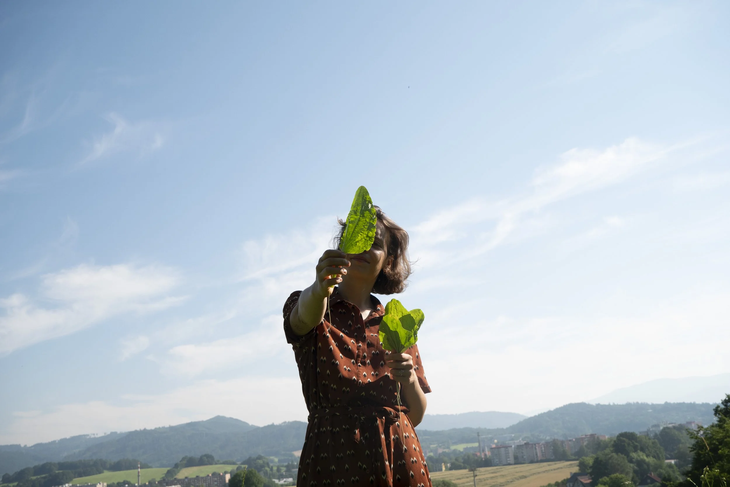

LABEL DESIGN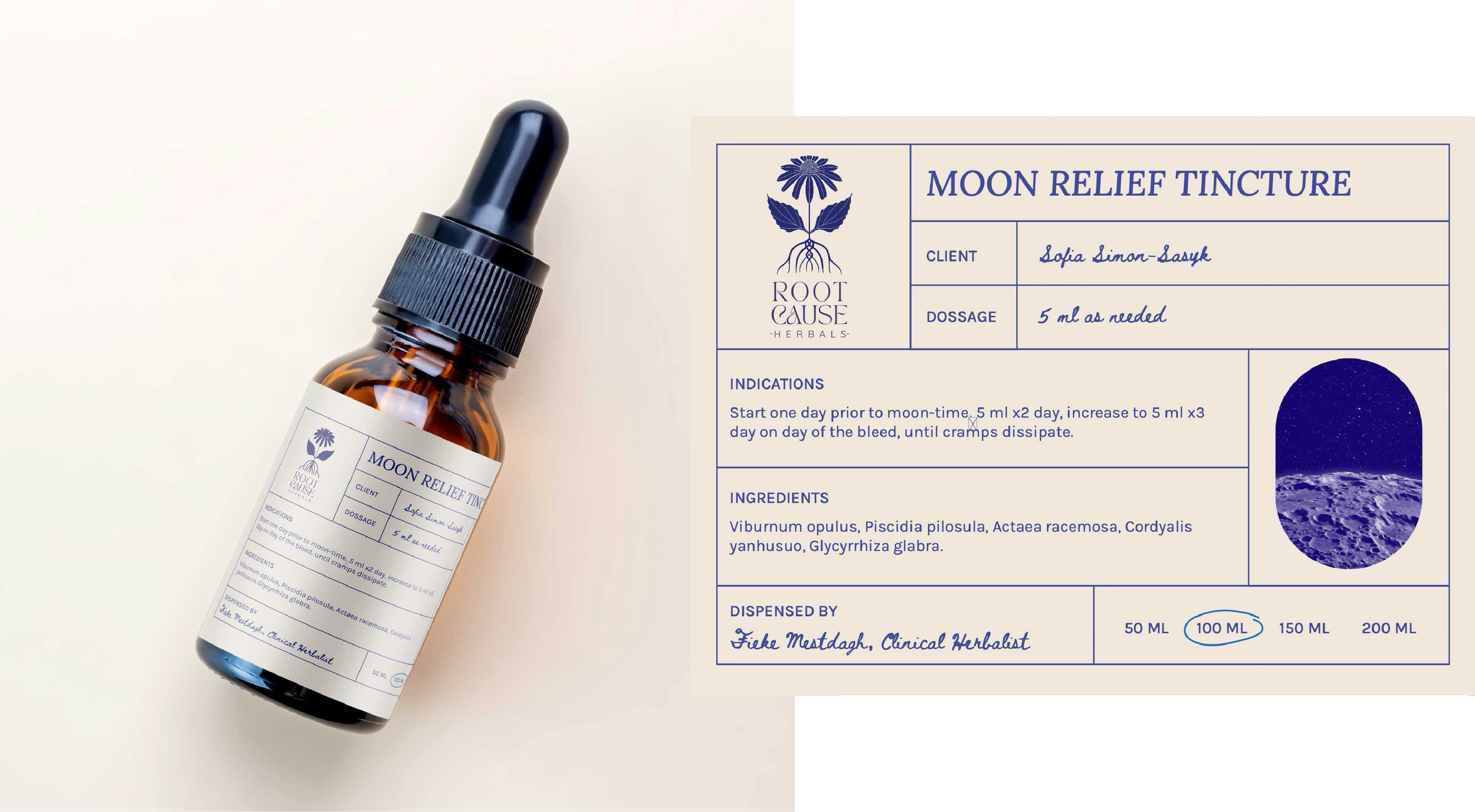
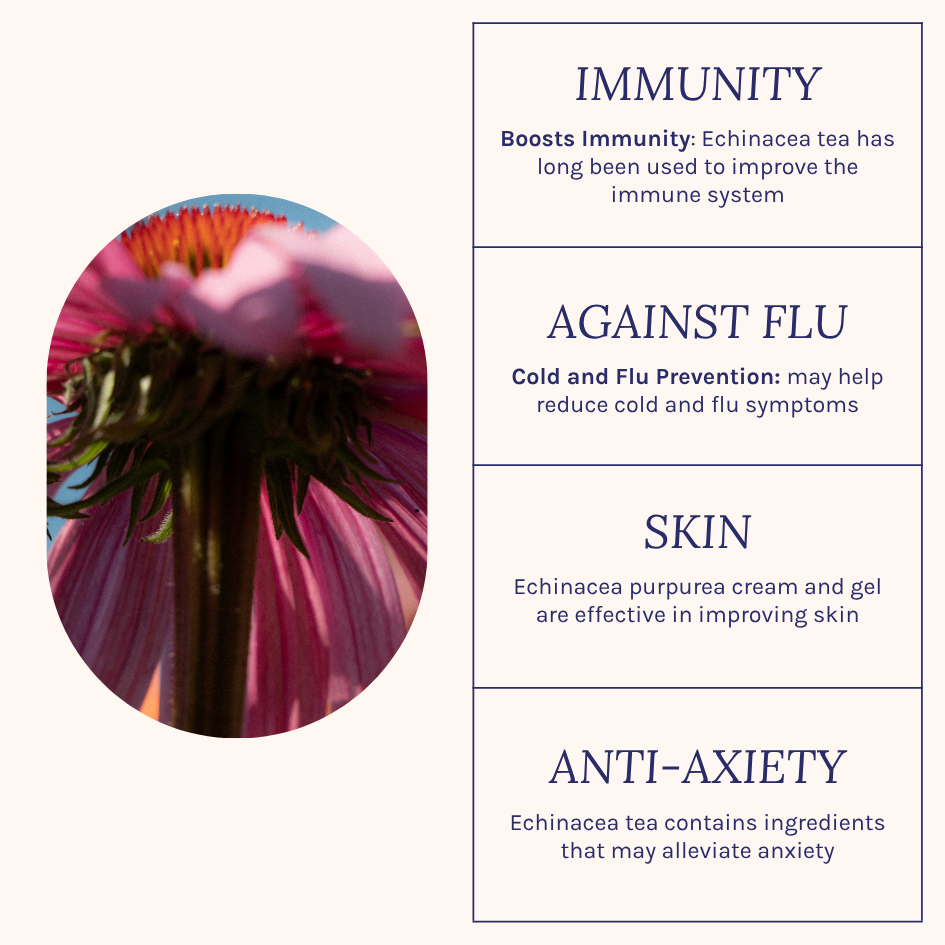
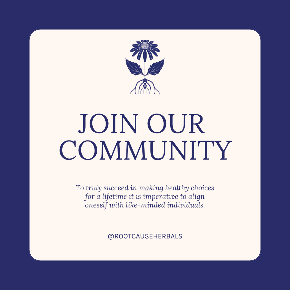
SOCIAL MEDIA