CZECH ORGANICS
ORGANIC AGRICULTURE CONSULTANCY
STARÉ MĚSTO, CZECH REPUBLIC
VISUAL IDENTITYCOLLATERAL DESIGNsocial mediaBRAND STRATEGYwebsiteTHE PROJECTCzech Organics are innovation brokers — the connective tissue between agricultural research and the farmers who put it into practice. They coordinate research, advise independently, and shape organic policy at both national and European levels. In other words, they don't just consult; they circulate knowledge between worlds that rarely speak the same language.
Their old identity didn't show this. It read like just another organic consulting company, flattening a genuinely rare role into something generic. The challenge was twofold: to capture both their groundedness — the reason farmers trust them — and their sophistication — the reason researchers and policymakers respect them, and to give their layered value proposition a visual language clear enough that any audience could grasp their impact at a glance.
They came to me to evolve the brand into something that finally matched the depth of what they do: organic farming rooted in tradition but built for the future.
BRAND FEELINGThese distilled into a single brand feeling —
Grounded Transformation
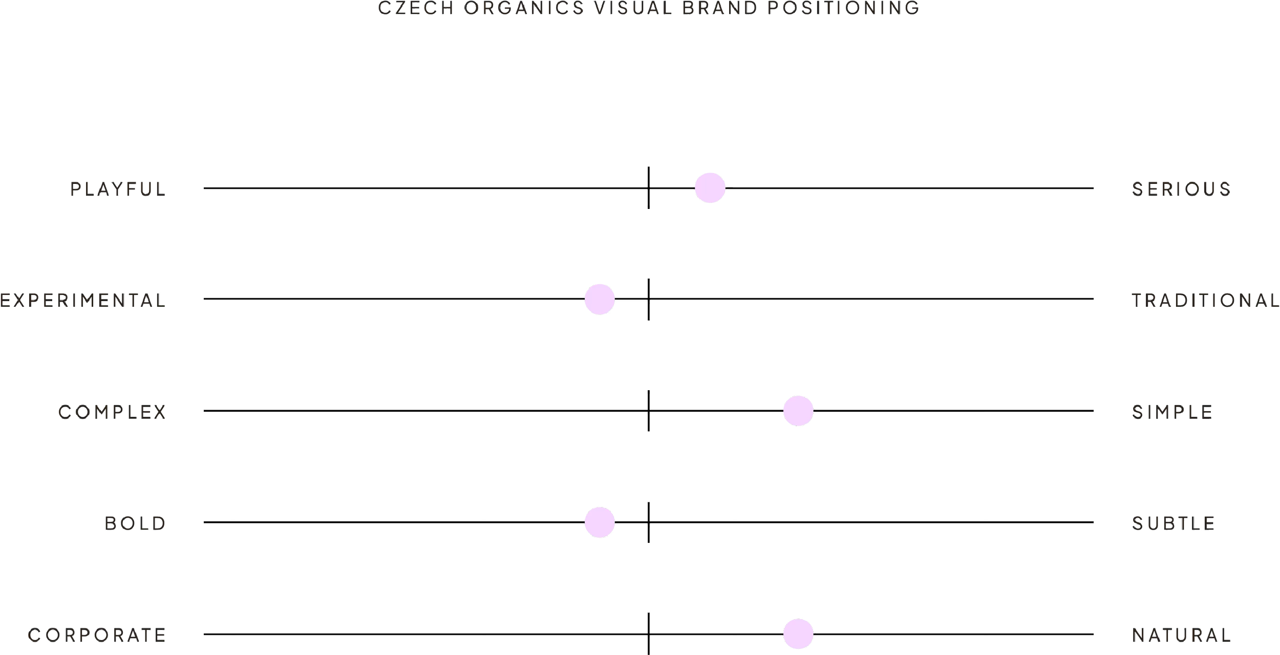
Earthy and stable enough to be trusted in the field, forward-looking enough to be credible in Brussels. On the visual positioning axes, the brand sits firmly on the side of serious over playful, natural over corporate, and simple over complex — confident, never loud.
keywordsBefore any design, we defined who Czech Organics is and how they speak. We landed on five keywords that became the compass for every visual decision:
Grounded
Strategic
Insightful
Accessible
Visionary.
the conceptKnowledge is packed into blocks. Blocks are stacked into systems. Systems enable growth and change.
This single idea drives the entire identity. It mirrors exactly how Czech Organics works — taking individual pieces of knowledge and assembling them into tailored systems for each context. The visual language is therefore modular by design: built from blocks that can expand, reconfigure, and grow while always holding their core structure. Not a static mark, but a living system.
VISUAL identity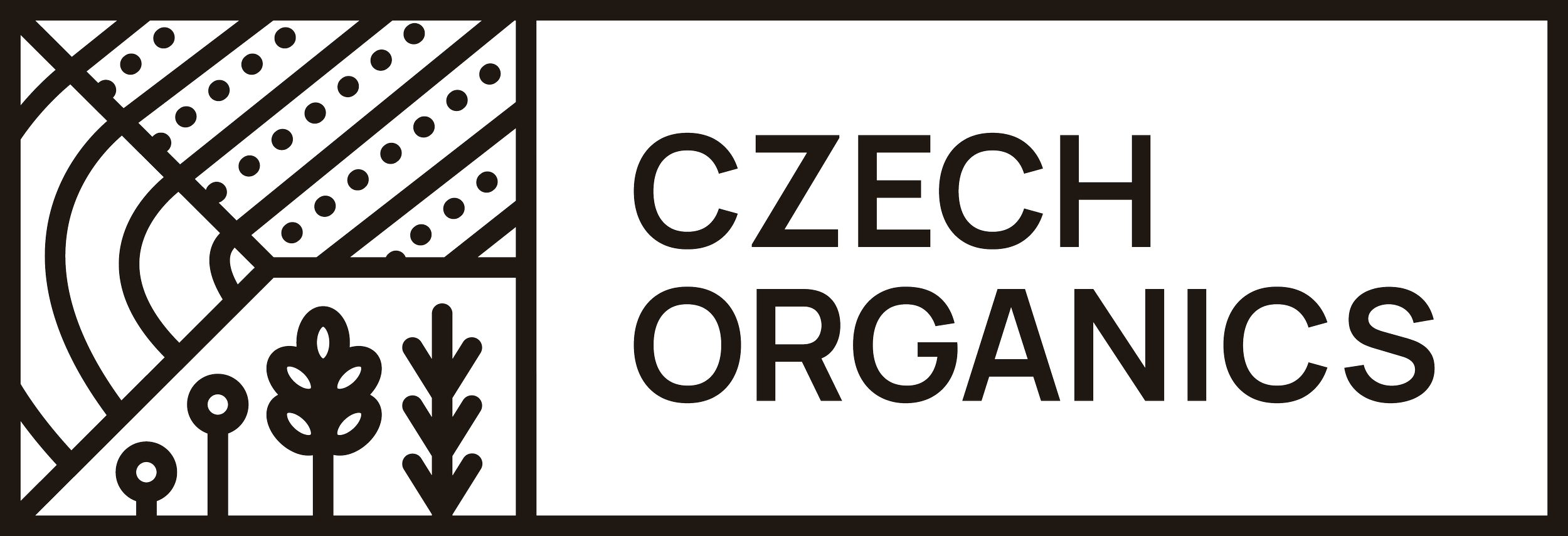
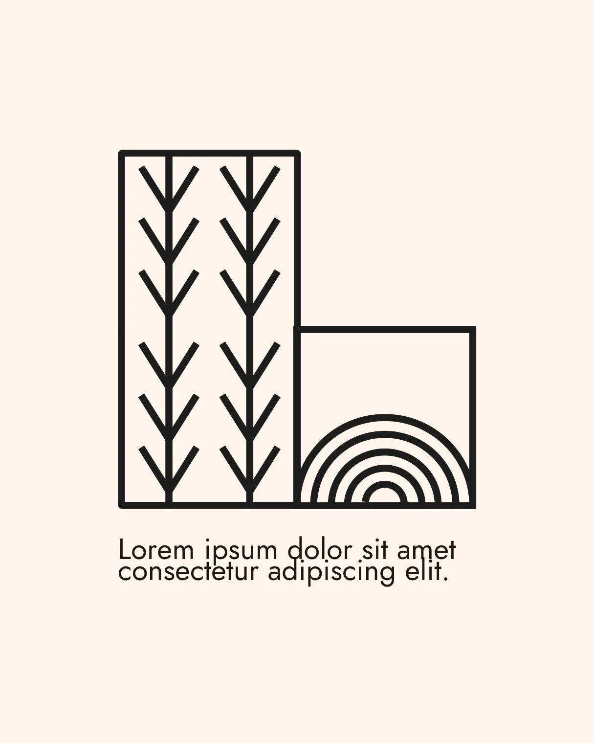
LOGOThe logogram is structured like the Czech flag — three sections, a direct reference to the name. One section is filled with different plants, for biodiversity. The other two show cultivated fields, kept from their old logo so the brand still feels like itself.
The fields carry the main idea: organic farming can be structured and scalable, not just small-scale. The straight rows are modern, machine-supported agriculture. The curved lines follow the land's natural contours instead of forcing everything into a grid.
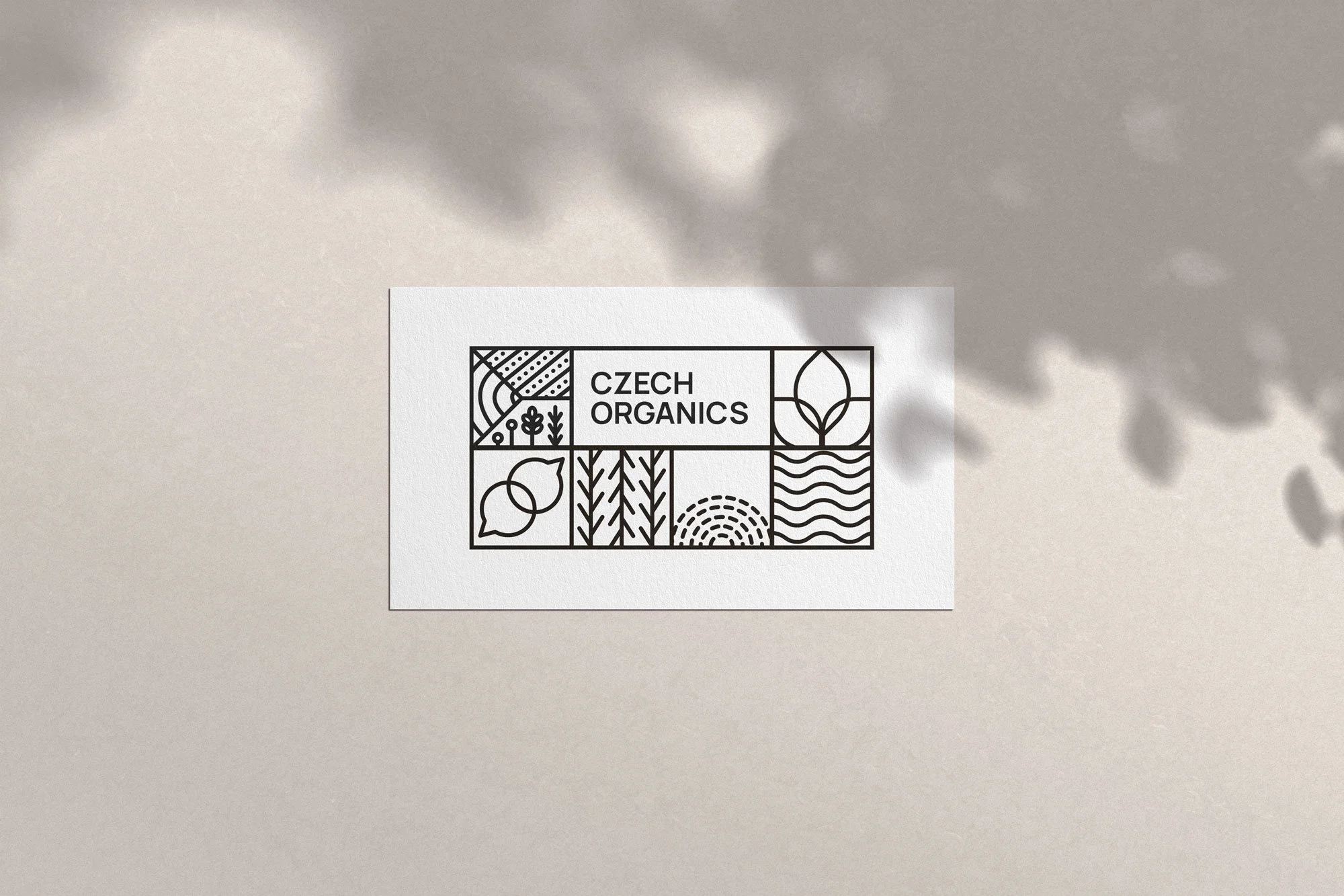
The logo is modular, so it isn't fixed. It can be a single compact mark or extend into a longer composition of blocks, and it still reads as the same logo. There's also a simpler version (Option B) using only the cultivated field, for small sizes and digital use where legibility matters most.

COLOR PALETTEThe palette is natural and alive, but still mature and professional. Rust orange grounds it in both people and place — sun-worked skin and fertile soil. Sky blue brings openness and looking ahead. Green carries the resilience of plants and shelterbelts. Golden yellow is the ripening of cereal crops and the promise of harvest. Light cream warms the whole system so it never feels cold or empty.Together: warm, grounded, vibrant without being frivolous.
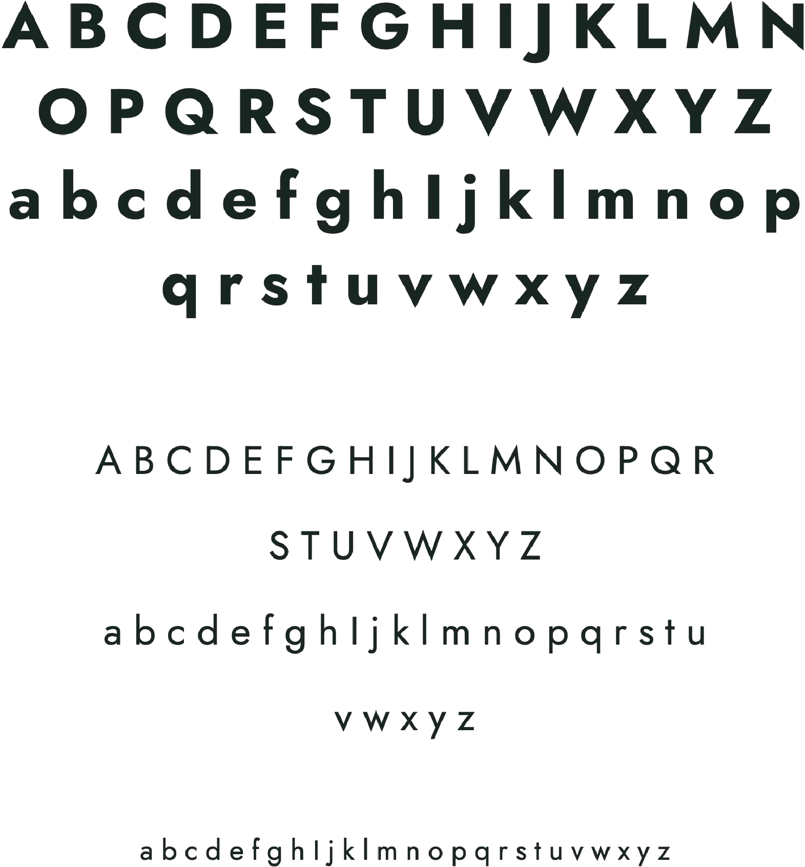
TYPOGRAPHYA geometric sans-serif. Clean and legible at any size, from long reports to short digital posts. The geometry keeps it precise and credible; the rounded letterforms keep it approachable. It also fits the building-block concept: structured, but flexible.
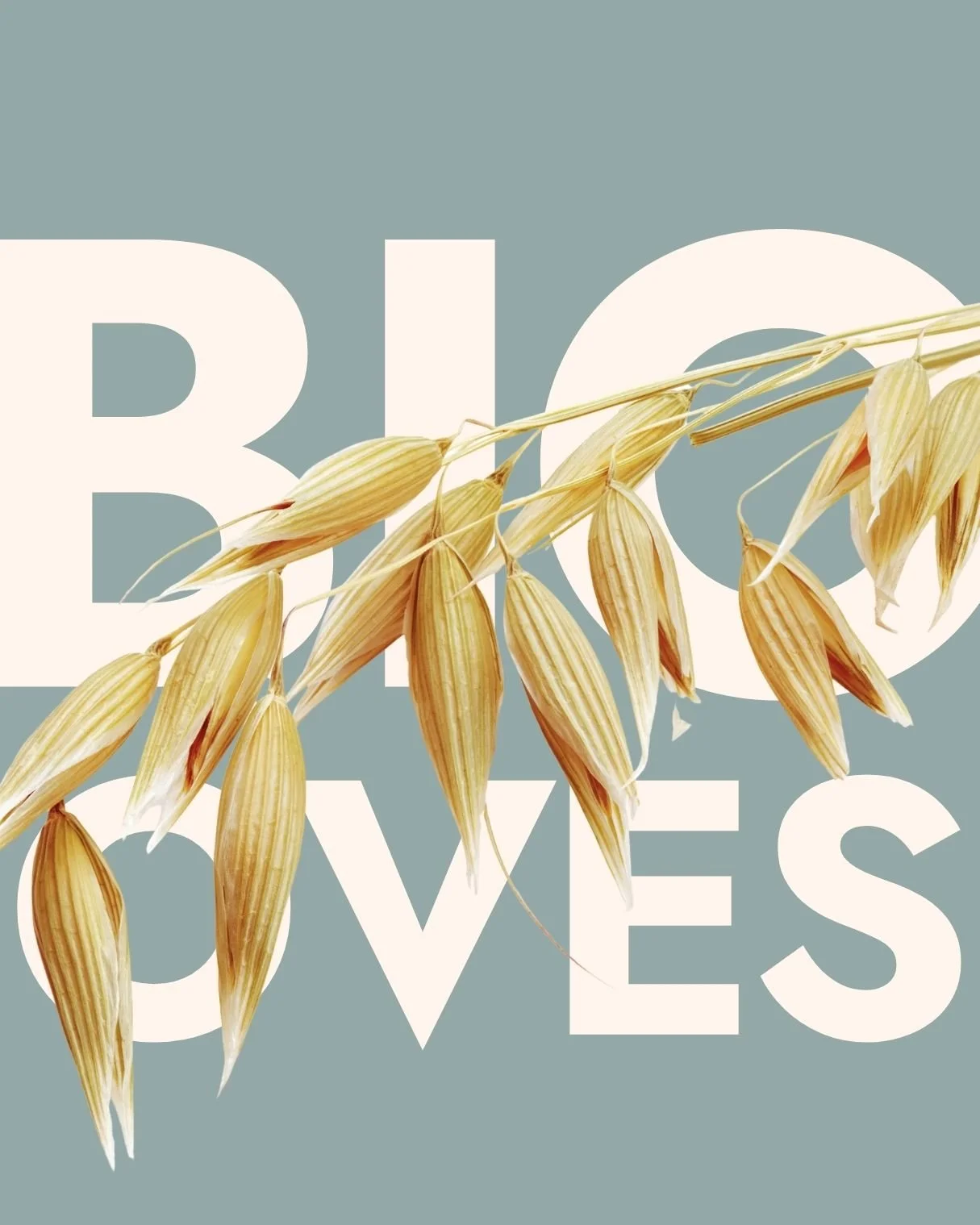
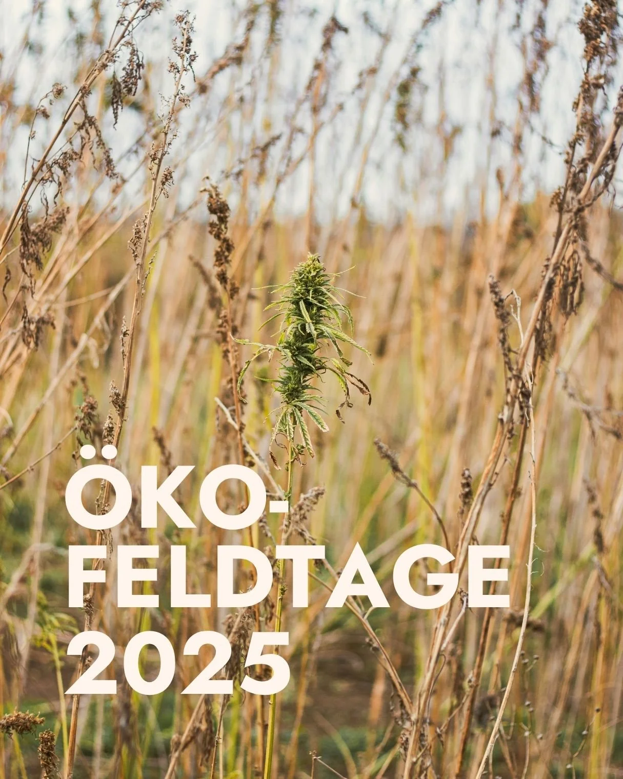
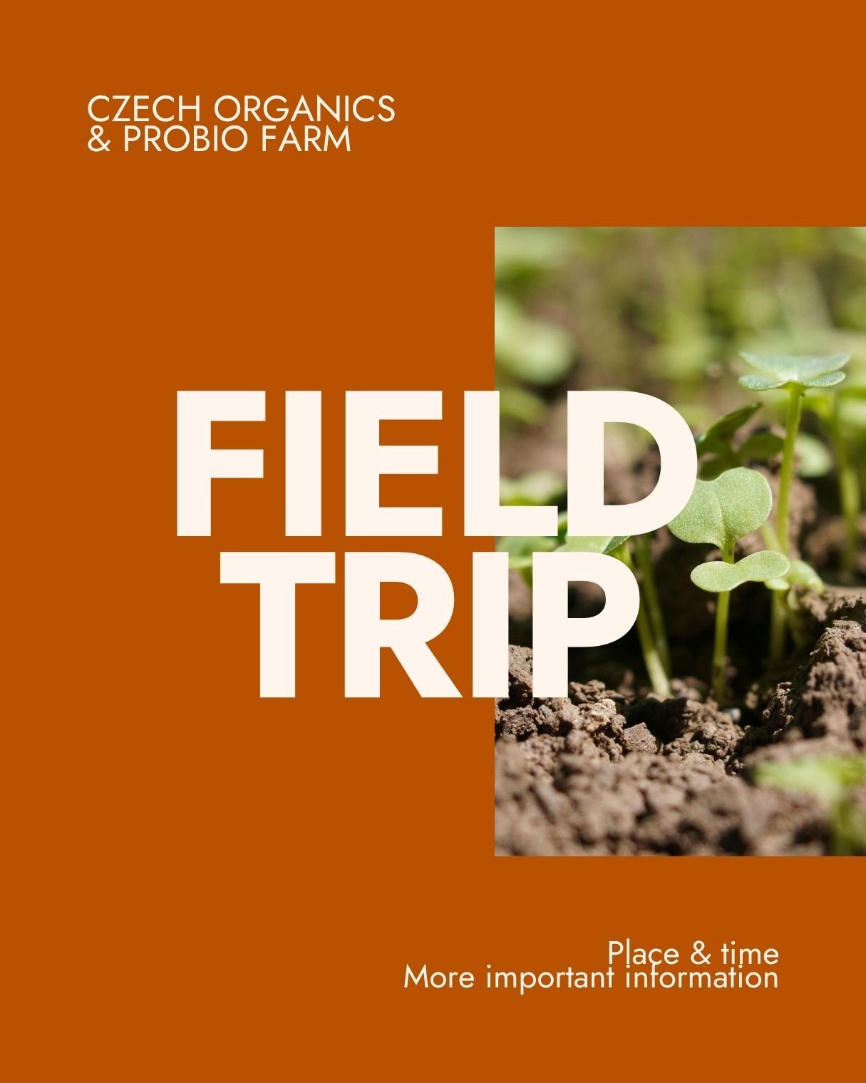
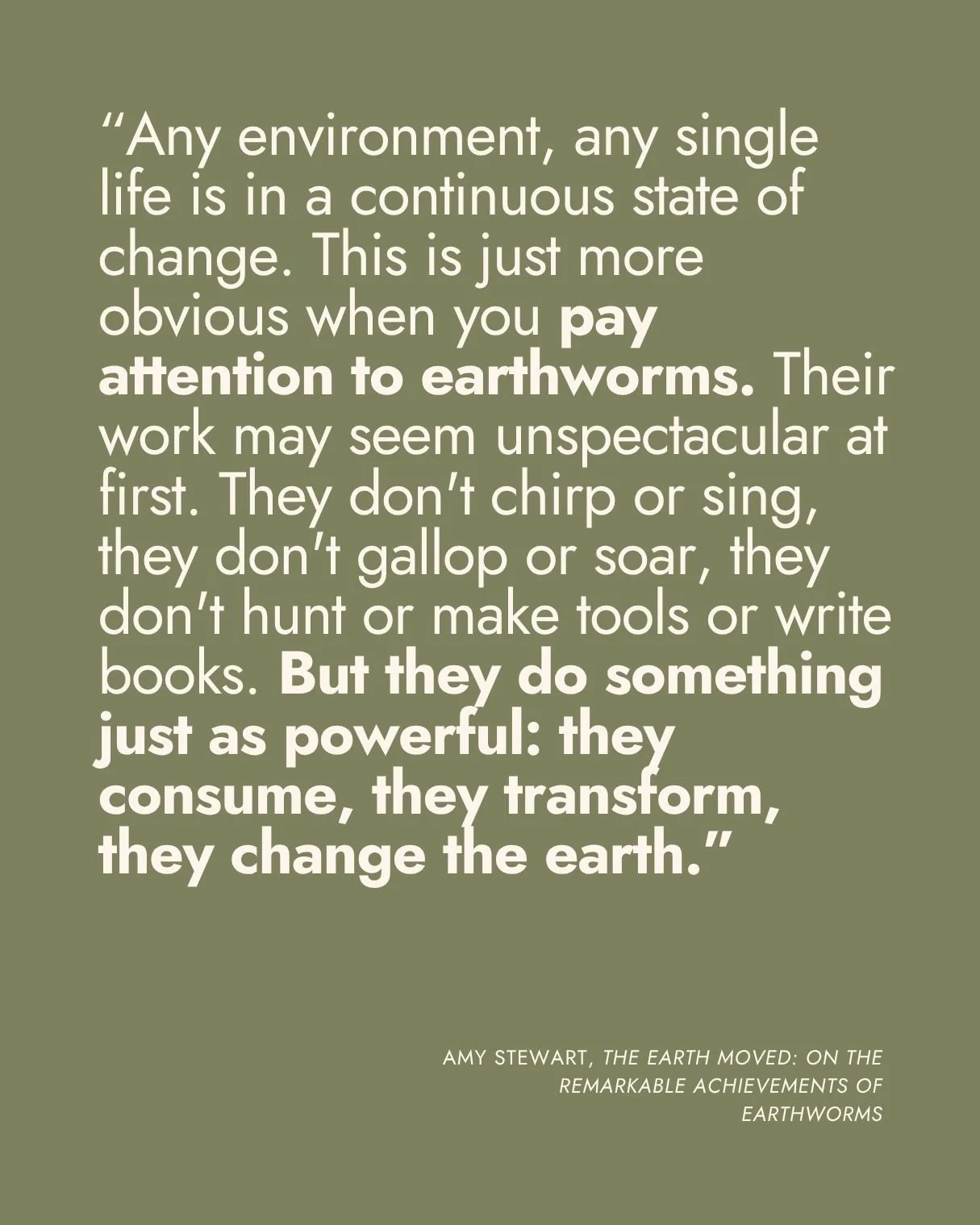
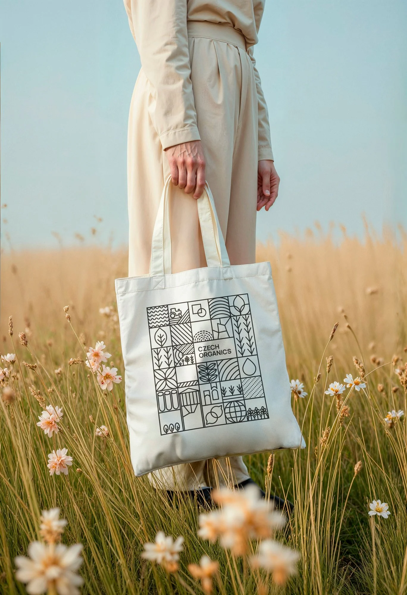
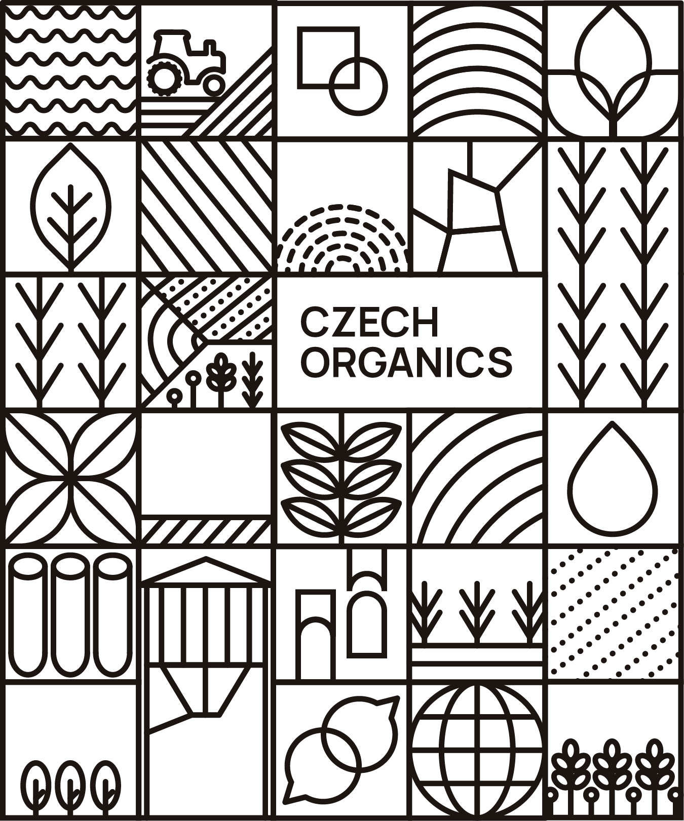
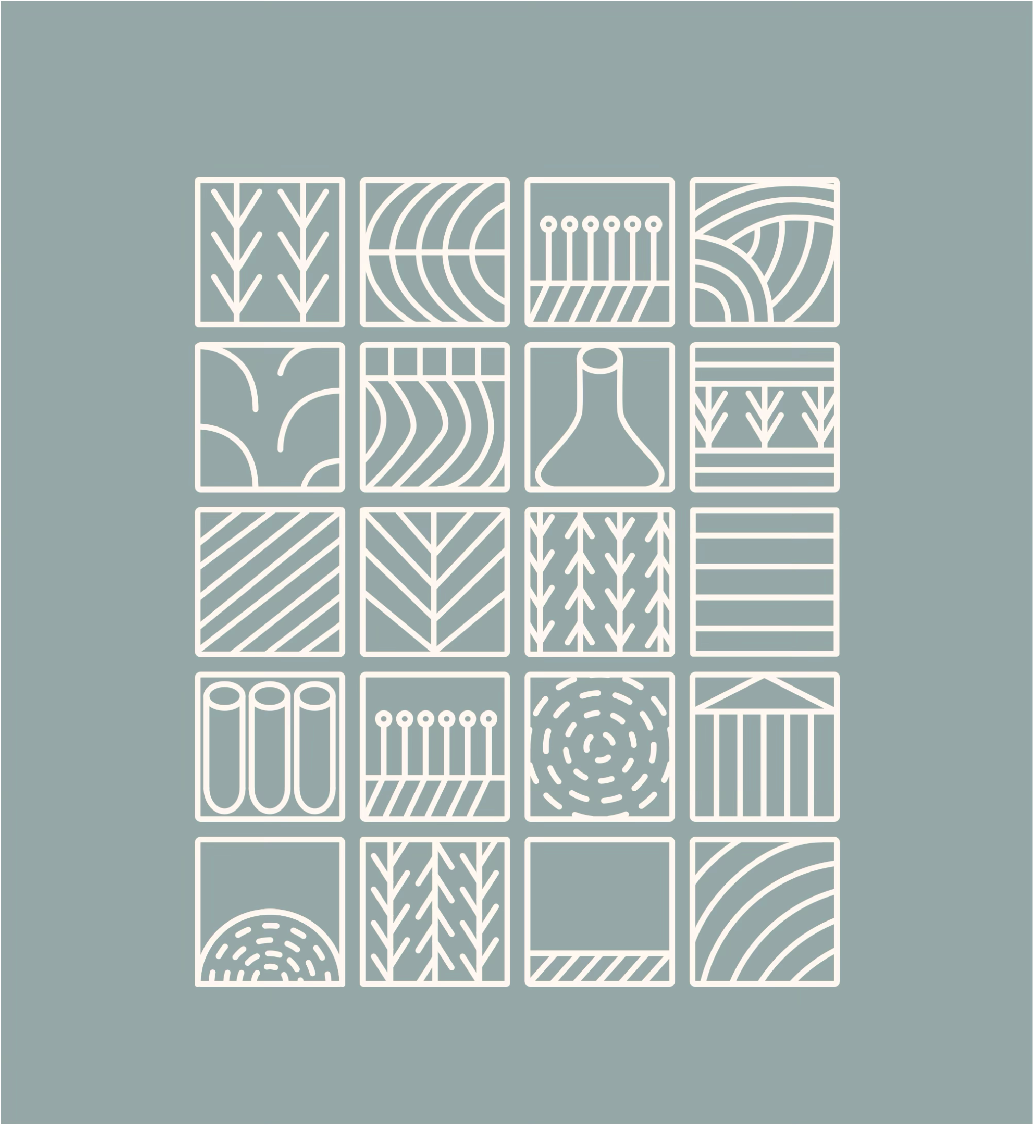
THE VISUAL SYSTEMA custom icon set extends the logo — square blocks in the same thick geometric lines. Each icon covers a theme in their work: crops, soil, science, systems. They can be used on their own or combined into a larger grid, the same way Czech Organics combines knowledge into systems.
Overall the identity is modular, geometric, and warm: structure for consistency, color for humanity.
website

www.czechorganics.com

an eight-page bilingual site built in Wix, applying the new identity and giving each audience a clearer path to understand what Czech Organics does.
SOCIAL MEDIA