PEČUJ O ZRAK
EYE CARE PROGRAM
ŠUMPERK, CZECH REPUBLIC
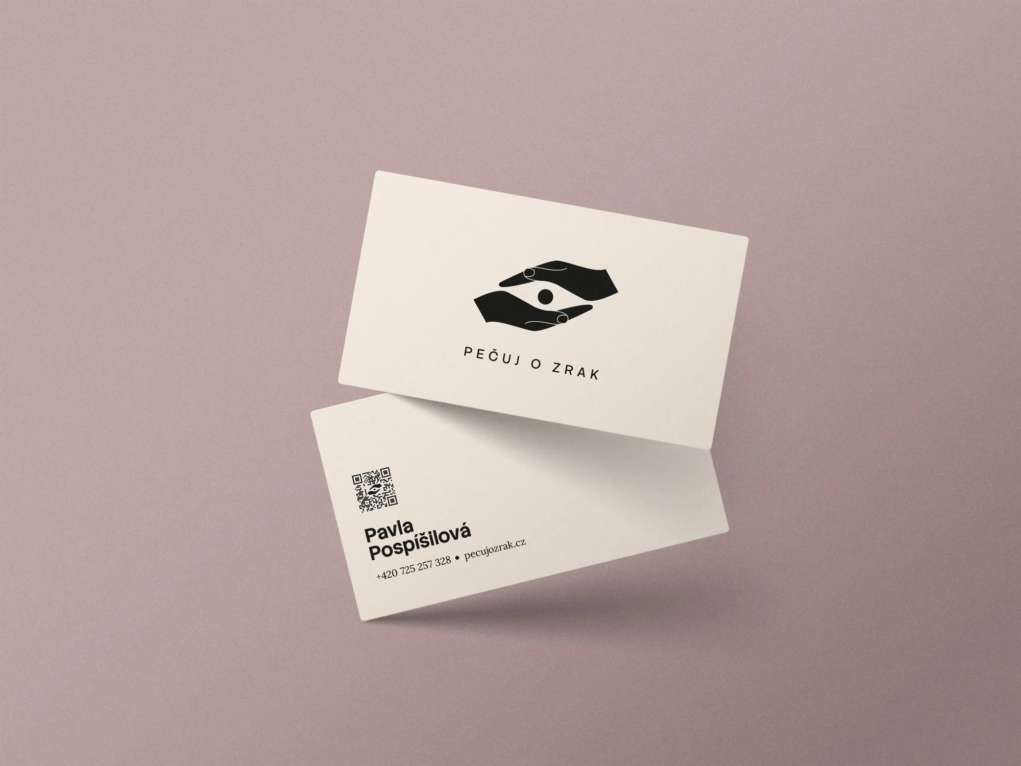
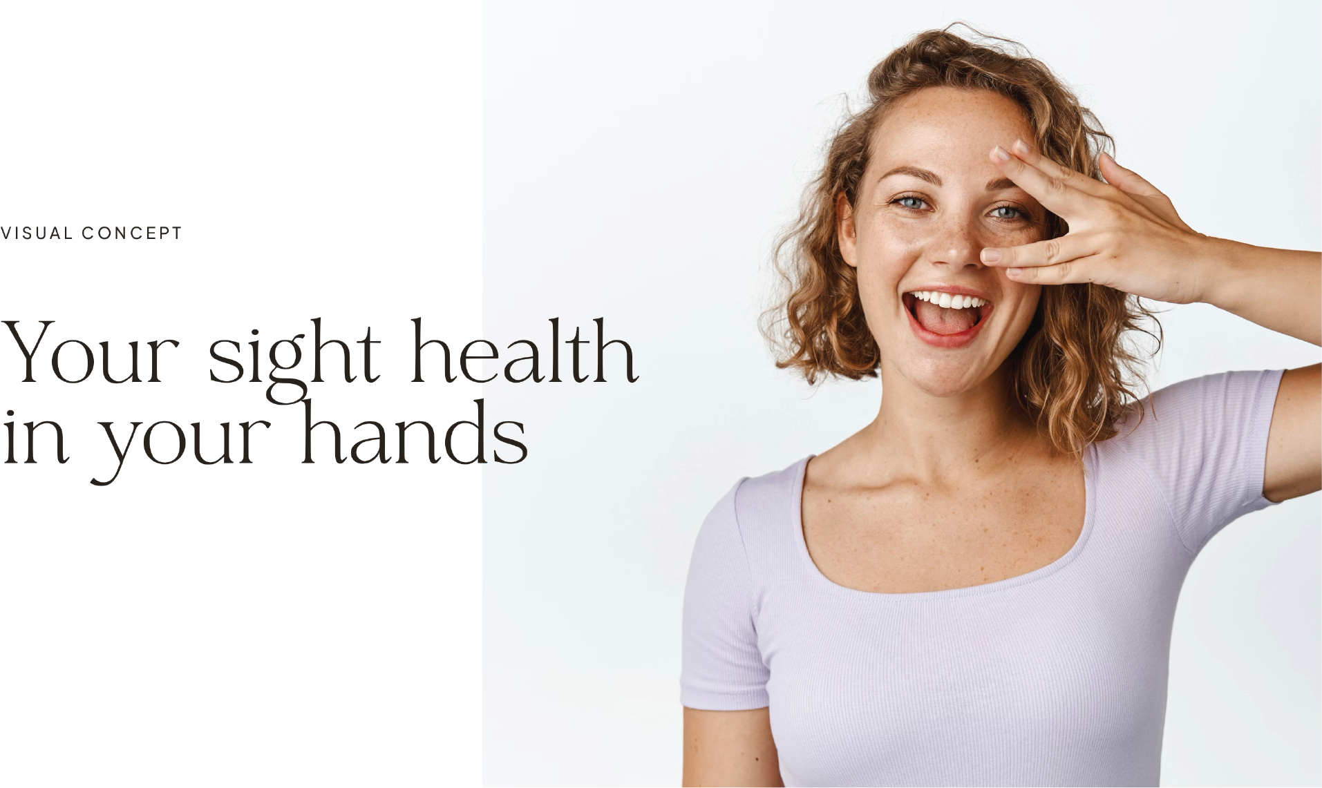
creative conceptVISUAL IDENTITYWEBSITECOLLATERAL DESIGNTHE PROJECTPečuj o zrak — which translates to Take Care of Your Sight — is a Czech holistic eye care practice founded by Pavla, a practitioner dedicated to natural vision improvement through eye yoga, conscious movement, and lifestyle guidance.
The brief was to build a visual identity and website from scratch for a practice that sits at an unusual intersection: it is both medically informed and deeply human, both empowering and gentle. The challenge was to create something that felt credible and trustworthy without slipping into clinical coldness — and warm and approachable without losing seriousness.


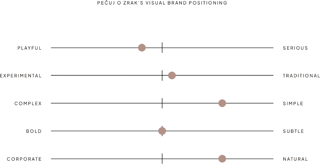
THE BRAND FEELINGEMPOWERED SIGHT
We want people to feel capable, responsible, and hopeful. We want them to understand that their choices matter. That their effort counts. That they have agency.
When someone interacts with Pečuj o Zrak—whether through our website, our content, or our classes—they should feel inspired to take action and trust in their own capacity to improve their vision. With Pečuj o Zrak's guidance, they discover that better sight is achievable, practical, and entirely within reach.
keywordsCaring
Supportive
Accessible
Gentle
Light & Airy
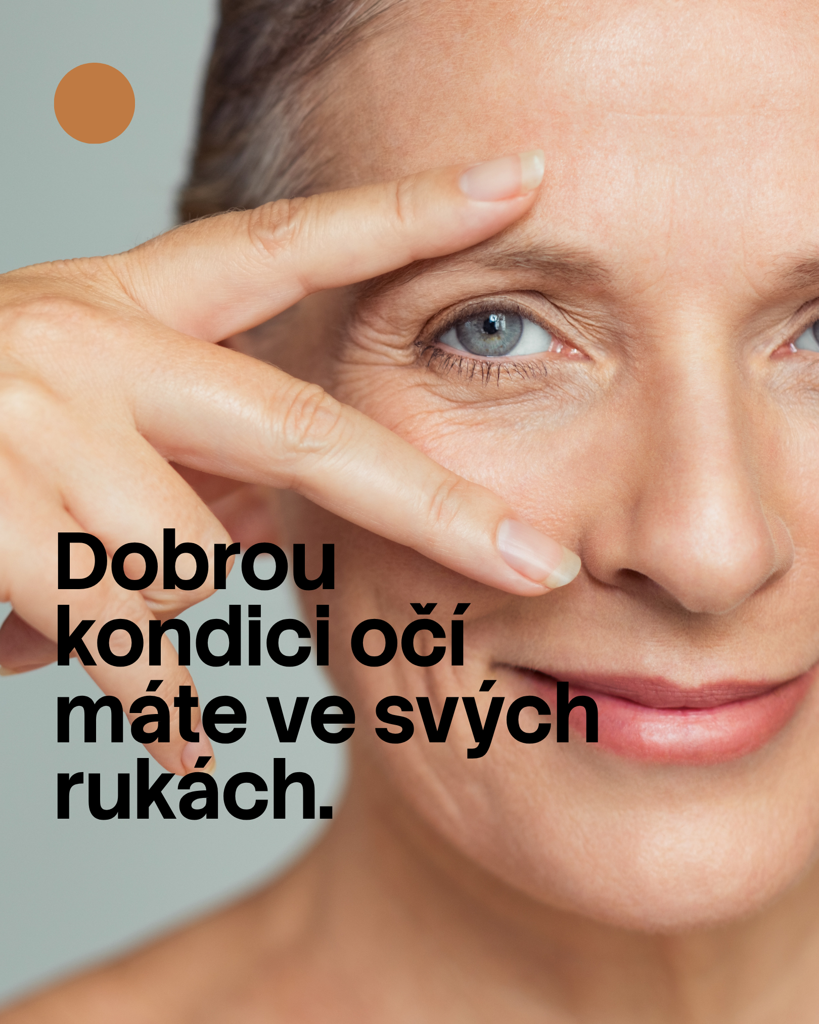
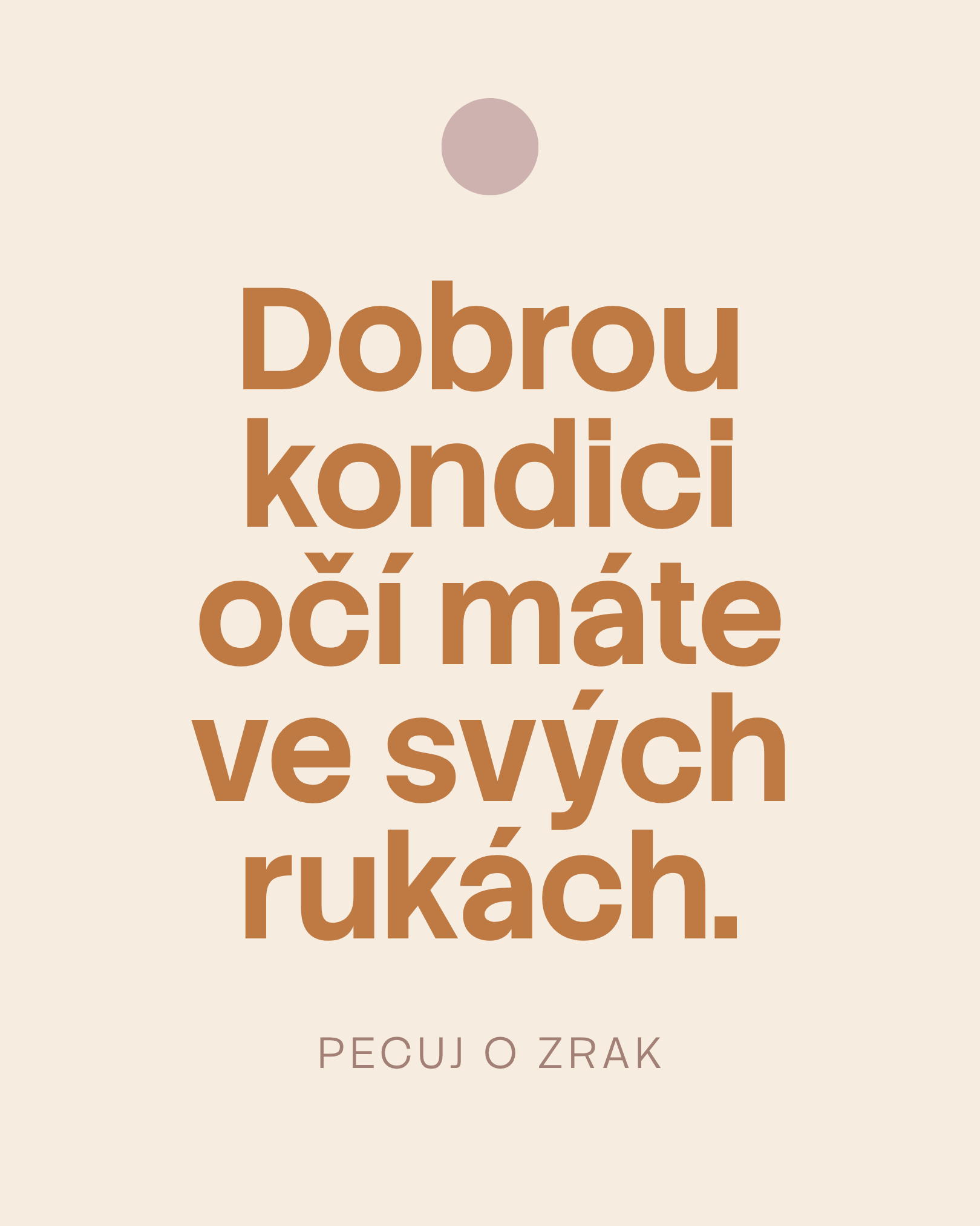
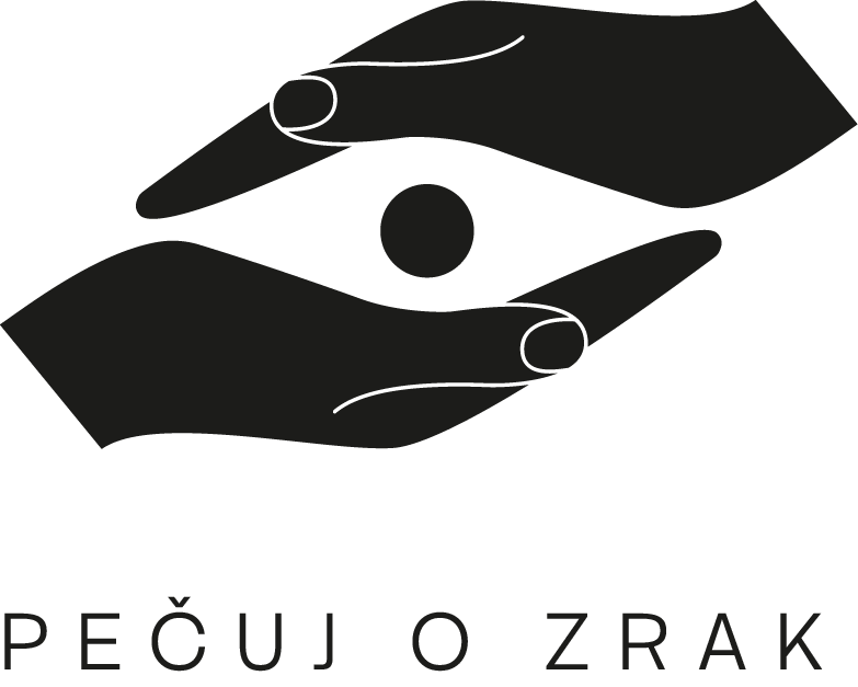
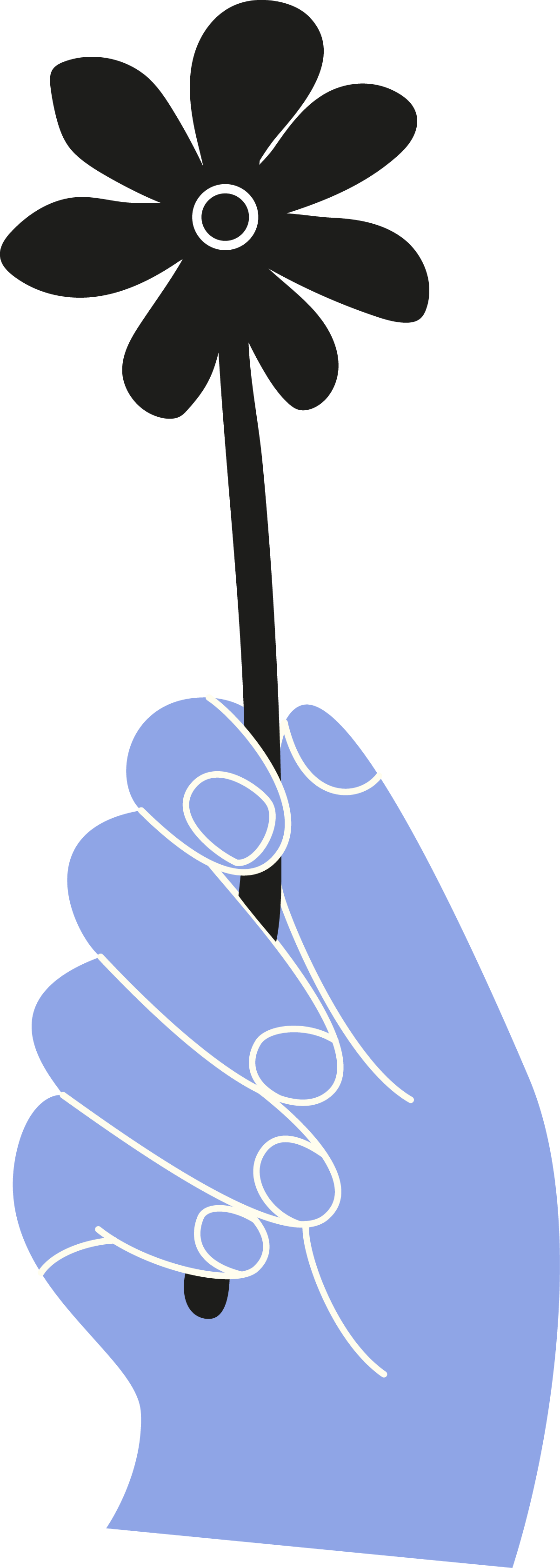
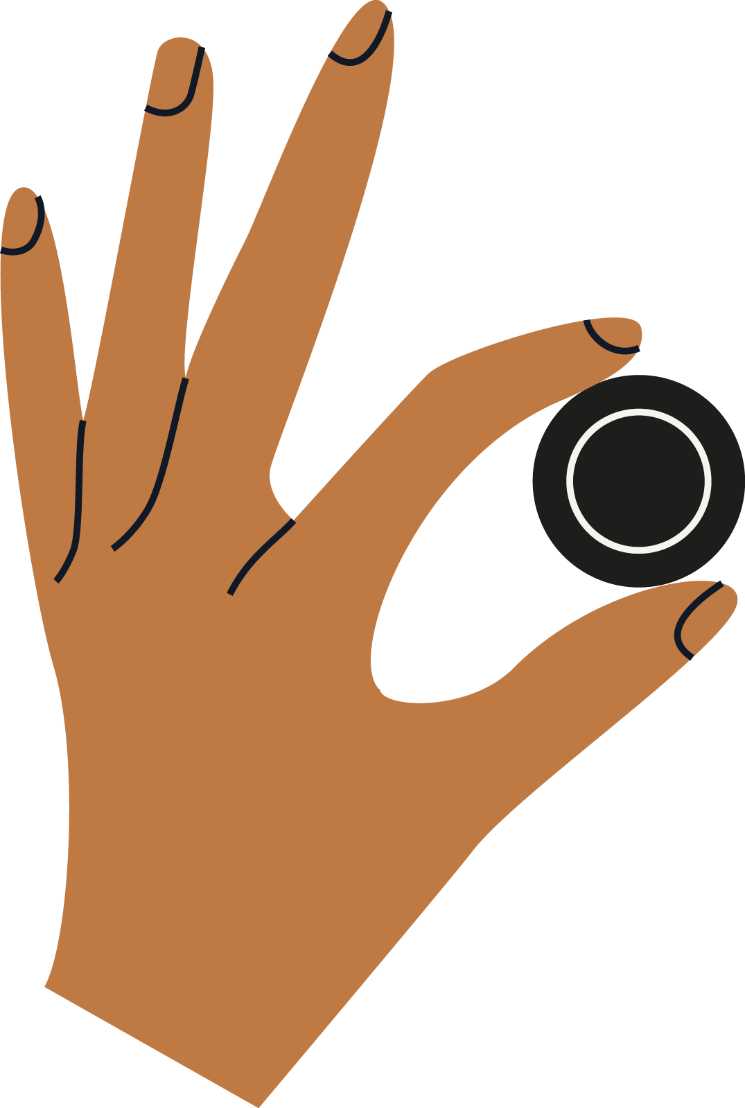
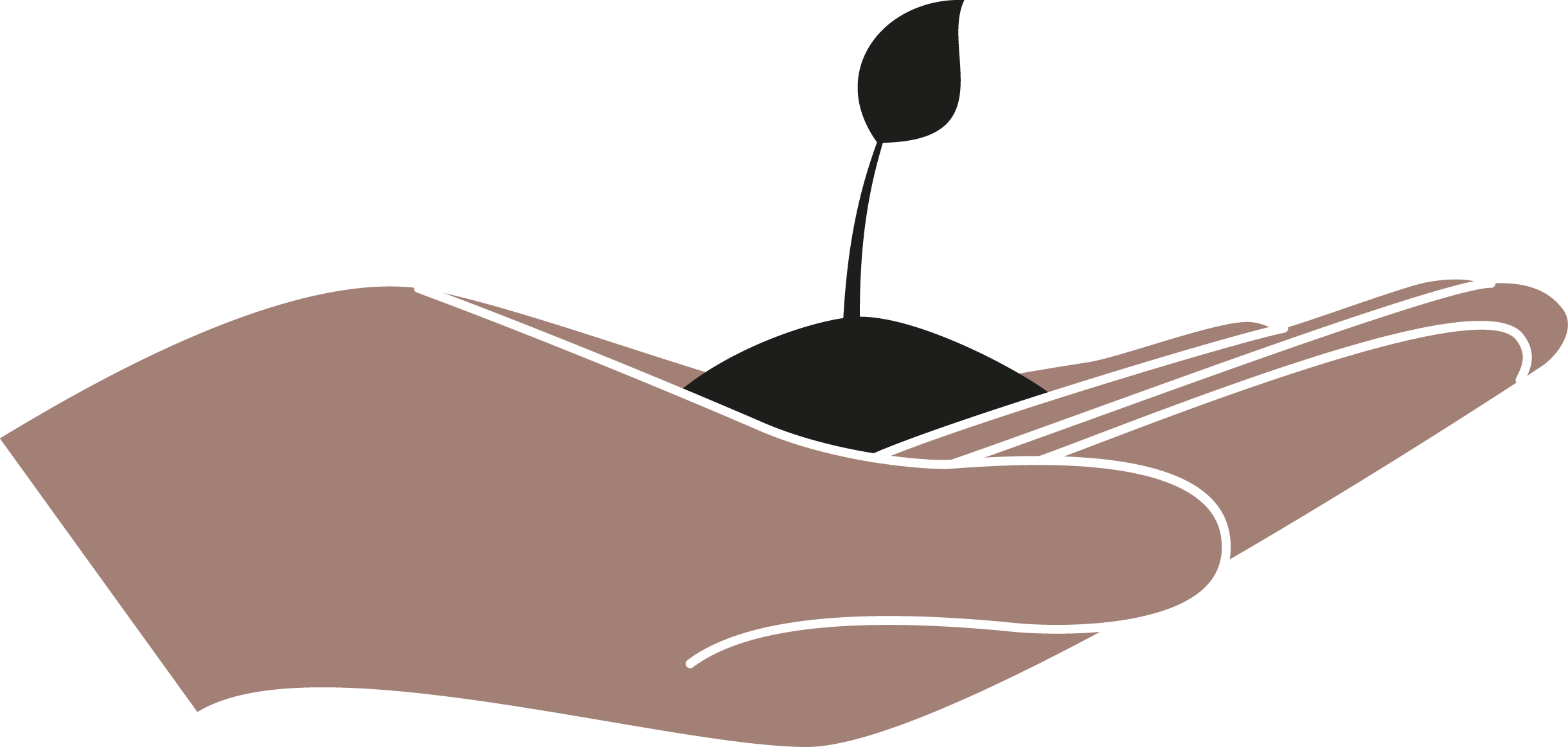
VISUAL SYSTEMYour vision care isn't passive—it's something you actively shape with intention and responsibility. The hands shaping the eye represent this fundamental truth: your eyesight is sculpted by what you do, the care you take, the choices you make. This isn't symbolism for its own sake; it's a visual declaration that you have agency in your own healing. The hands don't simply hold—they actively form, refine, and transform. They suggest both the practical work required and the gentleness needed.
A better sight is in your own hands.
color paletteThe color palette for Pečuj o zrak balances warmth with clarity, reflecting the brand's grounded yet empowering approach. The palette consists of warm, earthy tones—soft blues, warm browns, and gentle peachy-clay hues—that evoke trust, groundedness, and natural healing. These are anchored by a deep charcoal for strong contrast and readability. The colors work together to create a calming, accessible environment that feels neither clinical nor overly soft. Each color can stand alone or work in combination, allowing flexibility across applications while maintaining visual coherence.
fontsThe typography system pairs two distinctive voices. Stack Sans Headline brings geometric precision and modern confidence to headings—it's bold, clear, and commands attention without aggression. Lora, our body typeface, offers warmth and readability with subtle serif details that add sophistication and approachability. Together, they create a dialogue: clarity meets accessibility, structure meets humanity. This pairing reinforces the brand feeling of empowerment grounded in support—strong direction paired with gentle guidance.
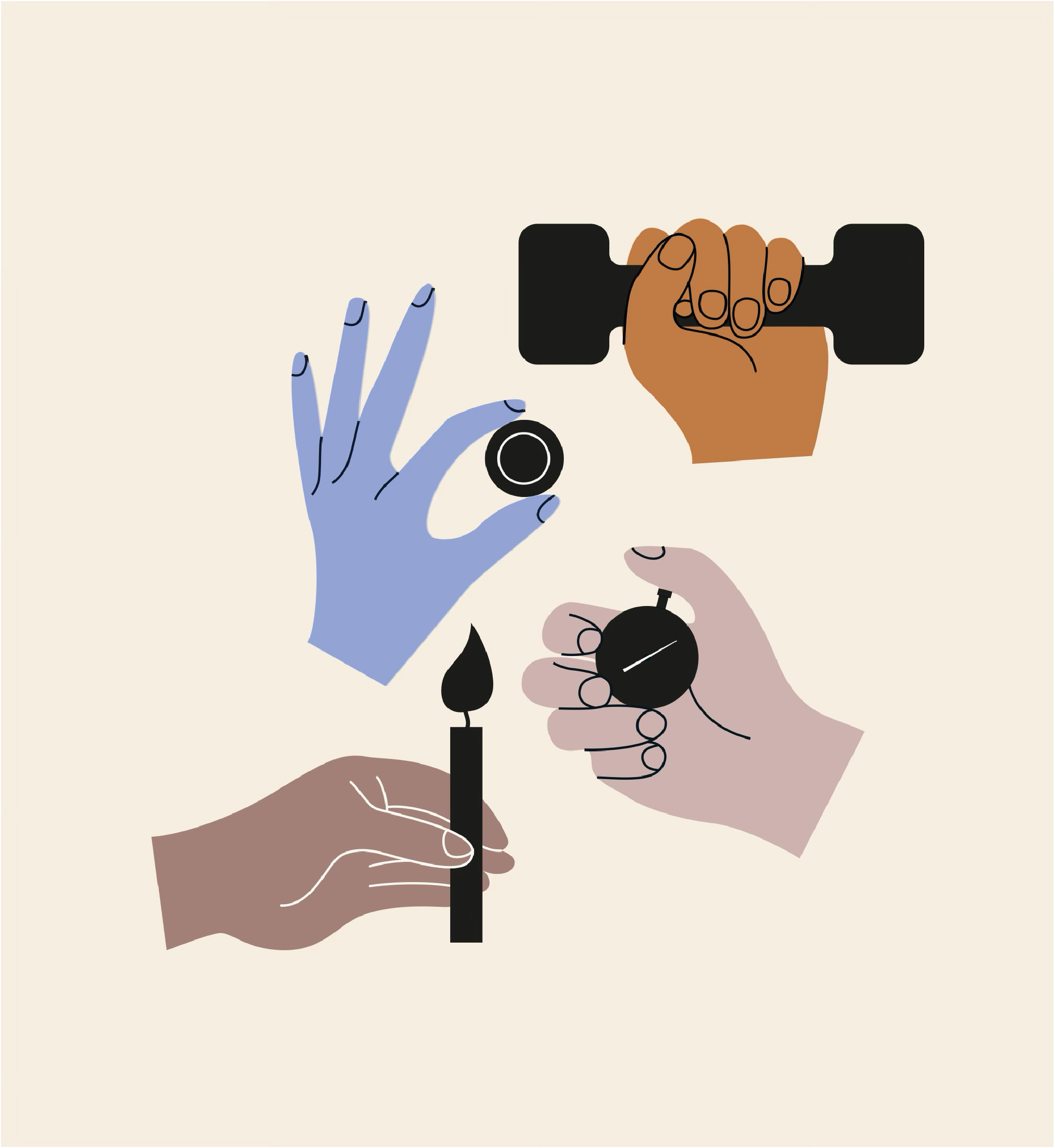
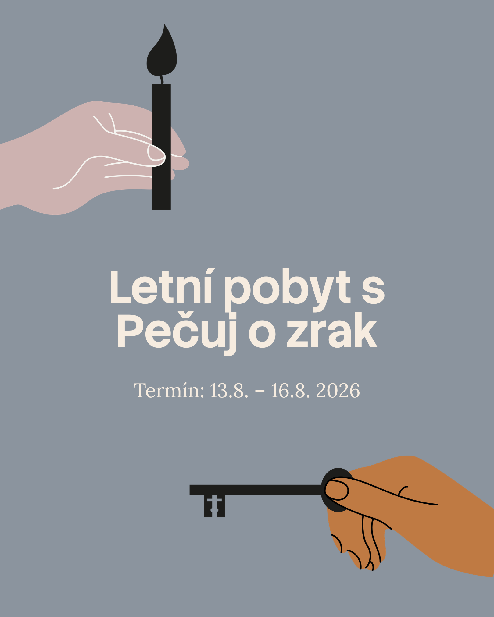
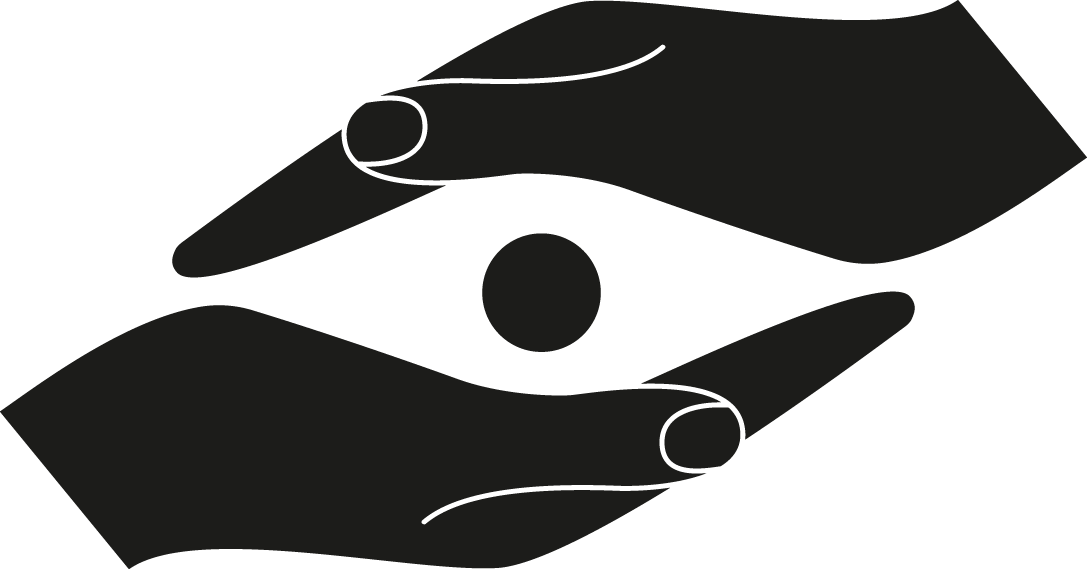
graphicsWe designed this visual system to be intuitive and independent—you shouldn't need a designer every time you want to communicate with your audience. We design systems for freedom, not constrain. That's why we created a pack of hand illustrations that work as standalone visuals or as supporting elements for your content. They clarify complex topics, maintain engagement, and add authentic character to everything you create.
These illustrations carry the brand's core message: empowerment and agency. Each hand gesture—whether cradling the eye, framing it, or engaging with vision care tools—reinforces that your visual health is something you actively shape. The hands inspire action and personal responsibility, reminding people that they have the power to make a difference in their own sight.
The illustration style is organic and gestural, rendered with visible details that balance tenderness with precision. This approach keeps the work feeling human and approachable while maintaining the rigor and care that vision improvement requires.
websitesocial media