
INSIGHT HQ
FMCG EMERGING MARKETS CONSULTANCY
AMSTERDAM, NETHERLANDS
VISUAL IDENTITYwebsite designTHE PROJECTInsight HQ is a boutique consultancy based in Amsterdam specializing in commercial and sales strategies for FMCG companies operating in emerging markets across Africa, the Middle East, Asia, the Caribbean, and Latin America. Their clients include major global players like Heineken, Diageo, and Rémy Cointreau. When they came to us, they needed a visual identity that could credibly represent a highly technical, data-driven business — one that builds proprietary digital tools, conducts market research, and manages complex field operations across some of the world's most challenging markets. The brand needed to feel sharp, modern, and internationally credible without losing the human, partnership-driven quality that sets them apart from larger consulting firms.

THE CONCEPTInsight HQ is a B2B intelligence platform dedicated to closing the distance between data and the people who need it. The core concept asked a single question: what does insight actually look like?
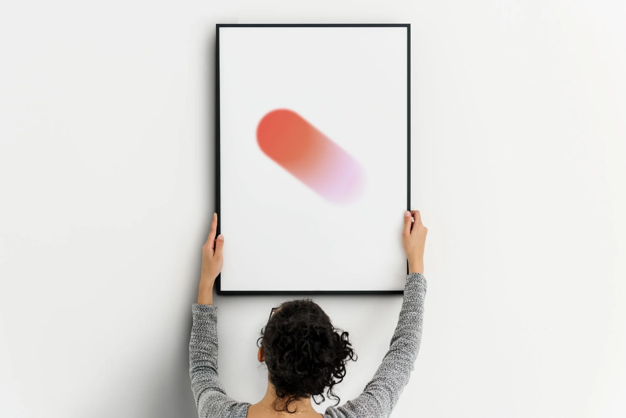
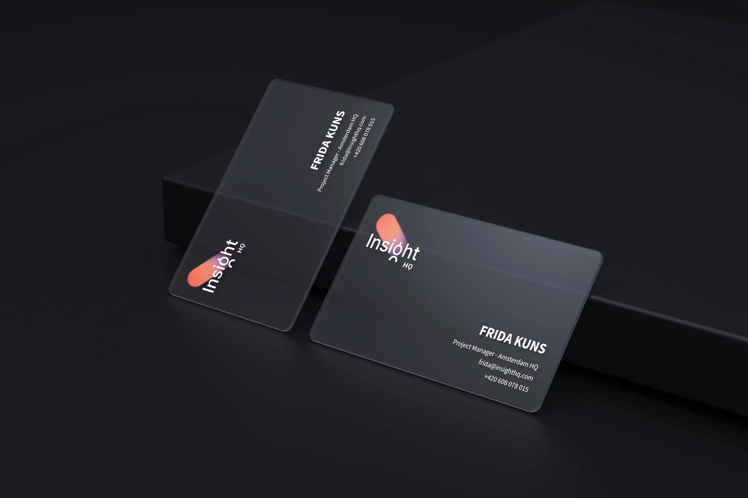
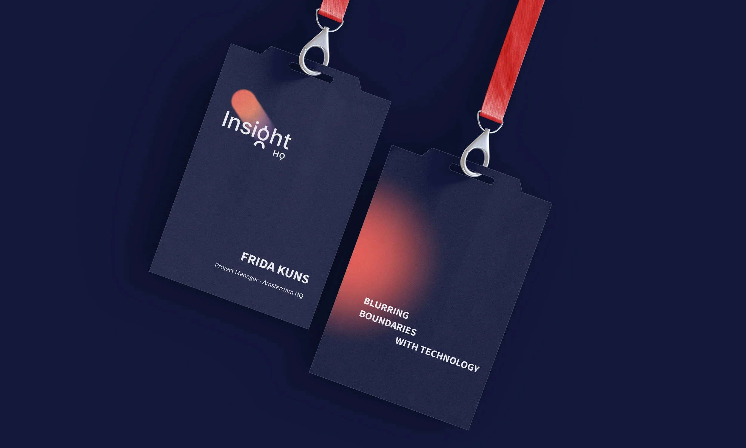
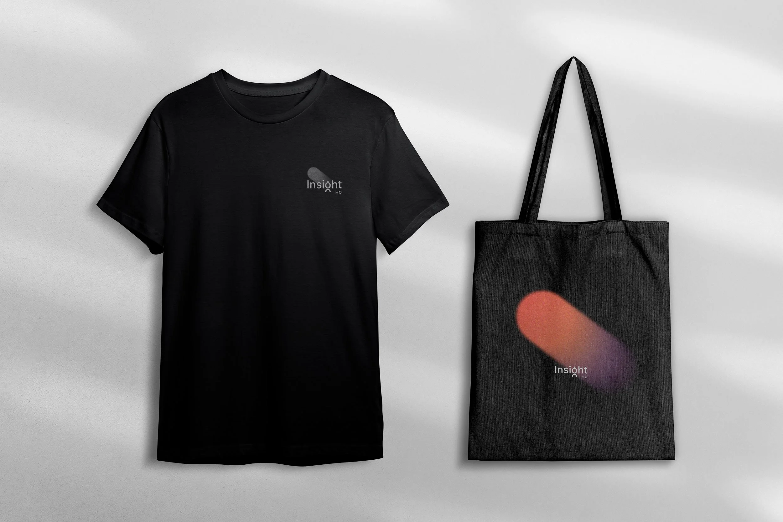
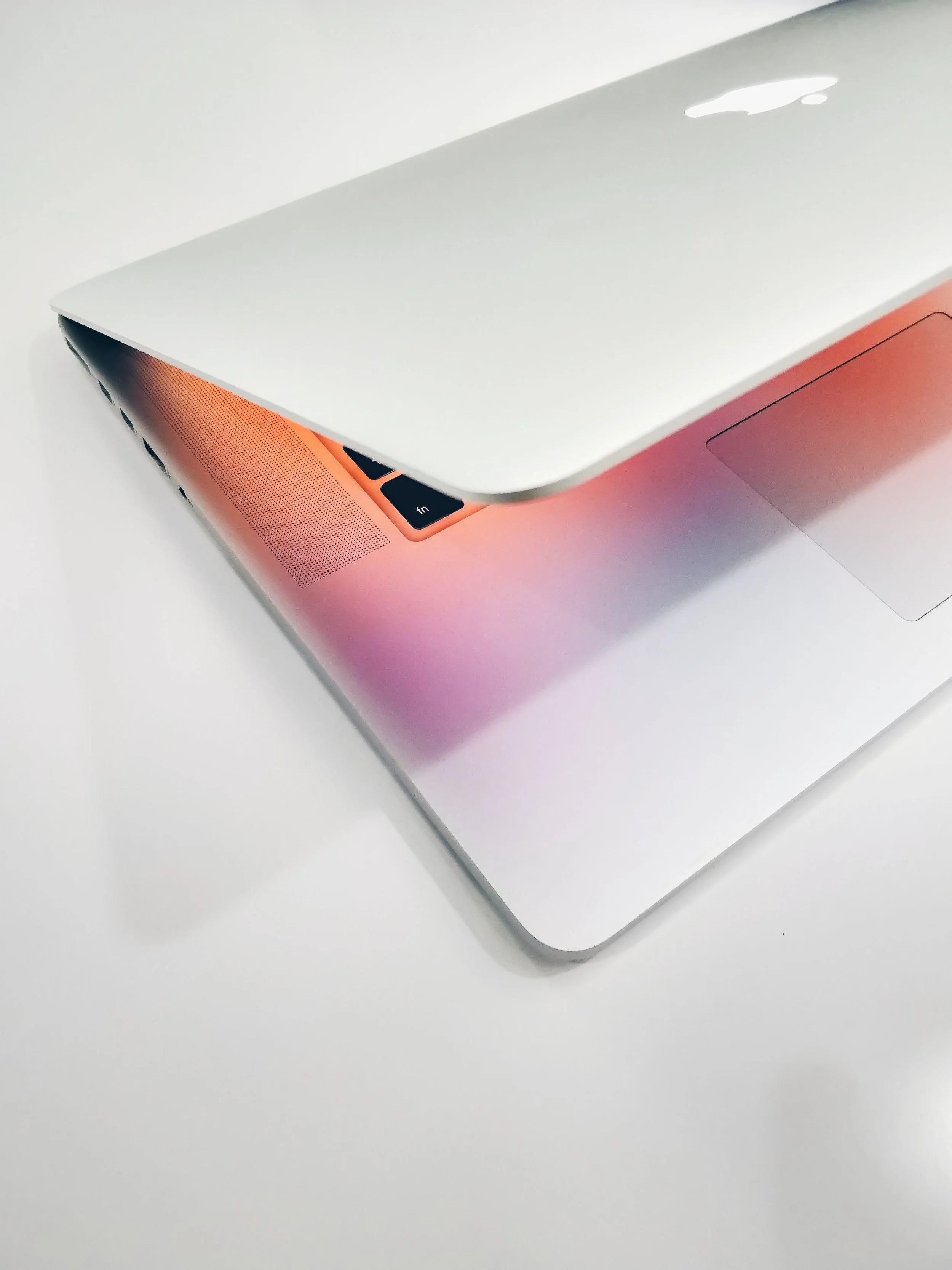
Light. Digital screens don't just display information — they emit it, casting color into the space around them. This became the visual metaphor at the center of the identity: gradients that suggest movement and transformation, luminous colors that radiate rather than sit still, and blurred edges that echo the brand's own philosophy of bridging worlds, blurring boundaries.
The result is an identity that feels both technological and human — precise in its thinking, fluid in its expression.
KEYWORDSLight
Reflection
Transparency
Blurred boundaries
Undefined spaces
Digital & technology
Intersection
Knowledge
Hands-on approach

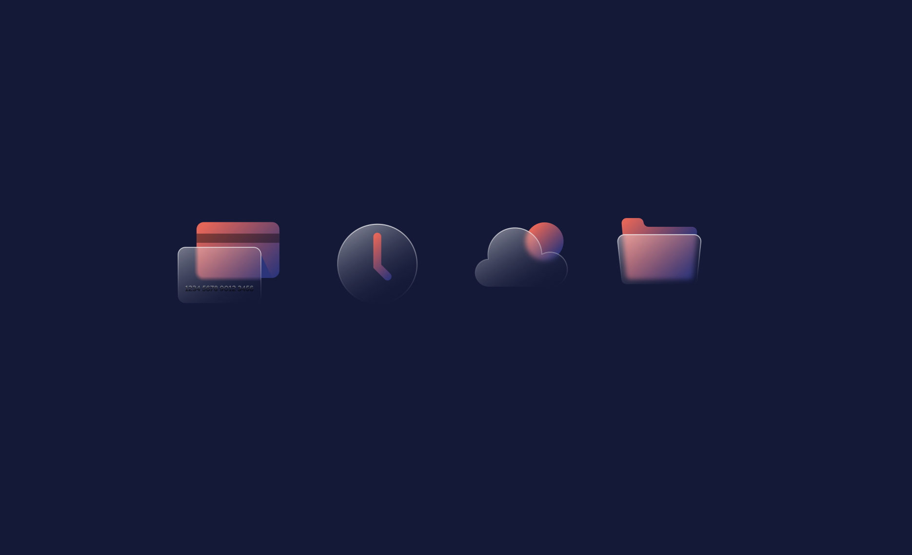
Reflecting the LightDigital information on screens reflects light, illuminating its surroundings in a very unique way. This analogy represents how Insight HQ provides information and guidance to their clients, lighting the way forward through complex problems. To visually represent this concept, we have incorporated elements like glows, gradients and bright, luminous colors.
Though the Digital LensAnother idea we’ve explored is how Insight HQ helps clients see things through a new lens, providing fresh perspectives and tools for growth. We've incorporated elements that suggest the idea of looking at things from a different angle. Gradient colors suggest movement and filtering of light, which in itself implies perspective and looking at things differently.
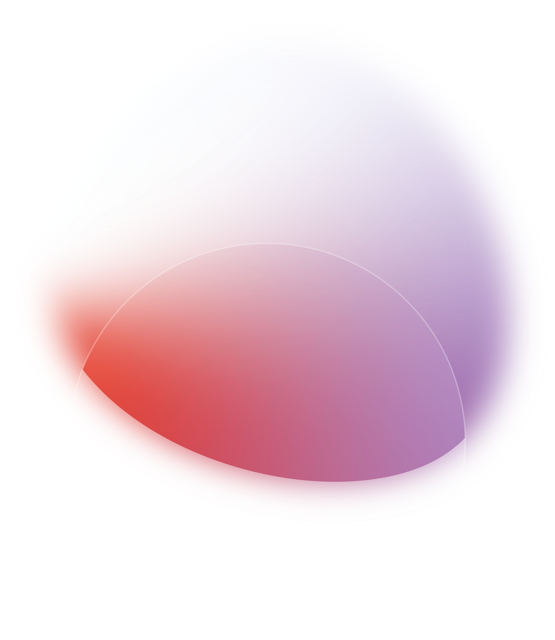
Merging WorldsIn order to visually portray the concept of merging aspects and blurred lines, we are using color gradients to create smooth transitions between different colors.
The use of gradients allows for a seamless blend of hues, creating a metaphor of the merging of ideas or concepts. This helps us to visually communicate fluidity and transformation in an appealing and modern way. They subtly reinforce the idea of transition and transformation while providing a beautiful and clean aesthetic that suits the visual identity style of Insight HQ.
COLOR PALETTE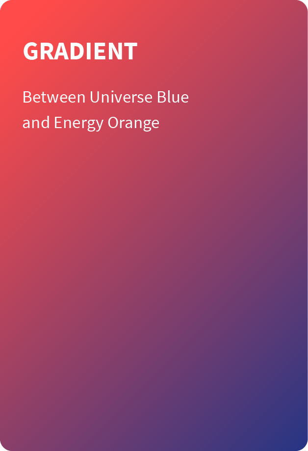
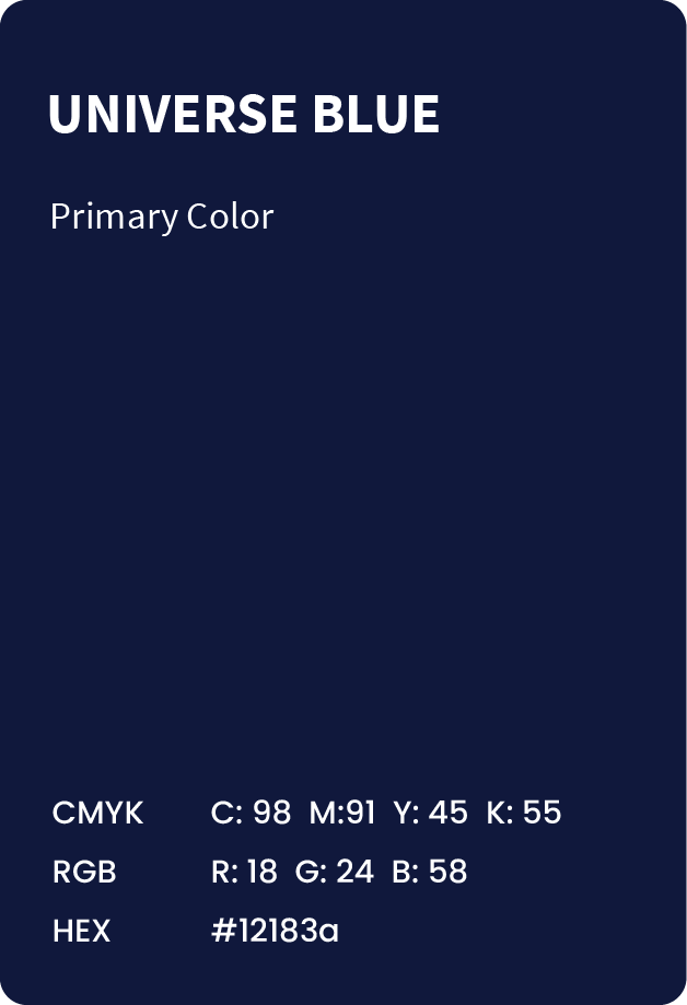
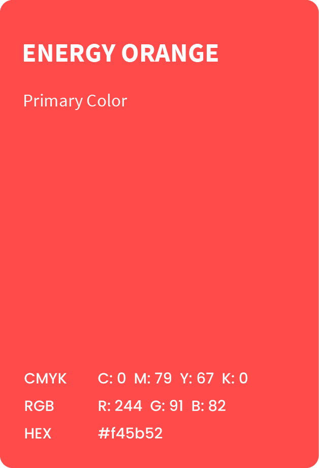
Insight HQ's main colors are contrasting, vibrant and dynamic. They are expressions of the brand's energetic modern approach, but also personable and approachable.
website