MYSIREN
PERSONAL PORTABLE ALARM
PERTH, AUSTRALIA
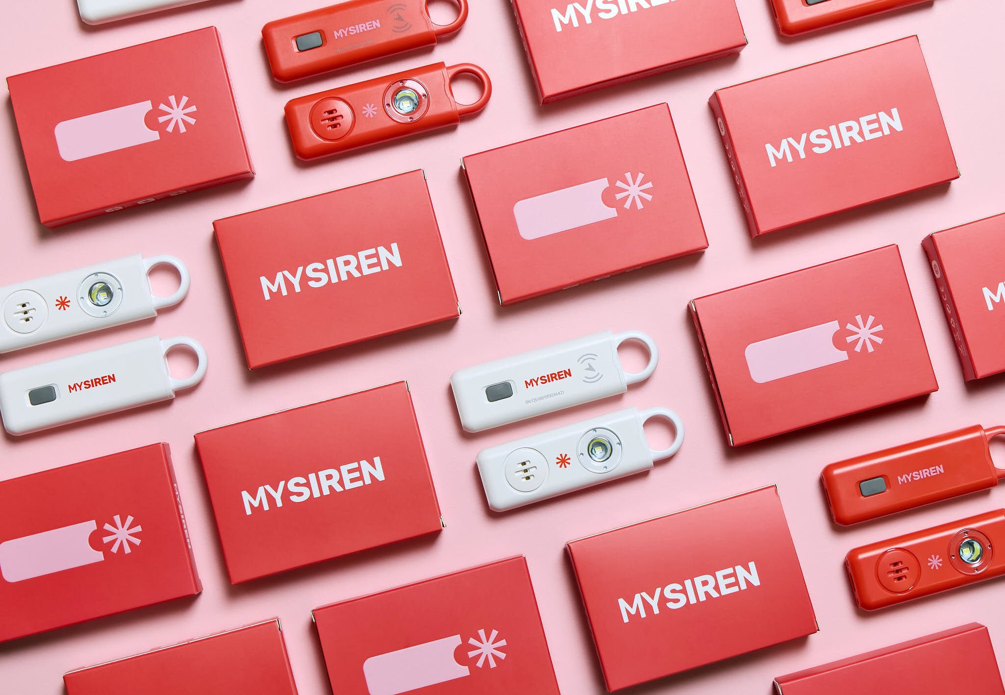
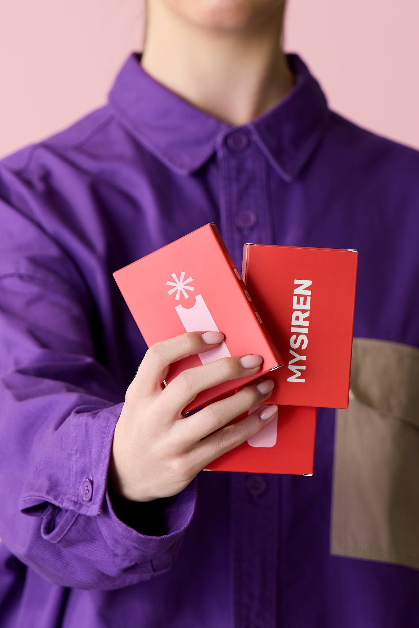
VISUAL IDENTITYPACKAGINGCOLLATERAL DESIGNPHOTO GUIDELINESWEBSITETHE PROJECTMySiren is a personal safety alarm designed for women — a compact, wearable device built to help its users feel safer in every space they inhabit. The founder came to us needing a complete visual identity built from scratch, with a scope that extended well beyond the logo: art direction and photography guidelines for the campaign shoot, color and finish guidance for the physical device, packaging design, an instructions booklet, and a website to bring it all together as a launch-ready brand.
The core challenge of the project was one of reframing. Personal safety products almost inevitably communicate through fear — and fear-based design tends to produce brands that feel anxiety-inducing. But the opposite reaction is equally common in this space: brands that overcorrect into something way too soft and feminine, drowning the product in pastels and delicate typography in an attempt to feel approachable. Neither extreme was the answer. The brief required something spicy — a brand with real energy and confidence, that treated safety as something active and empowering rather than something fearful or fragile.
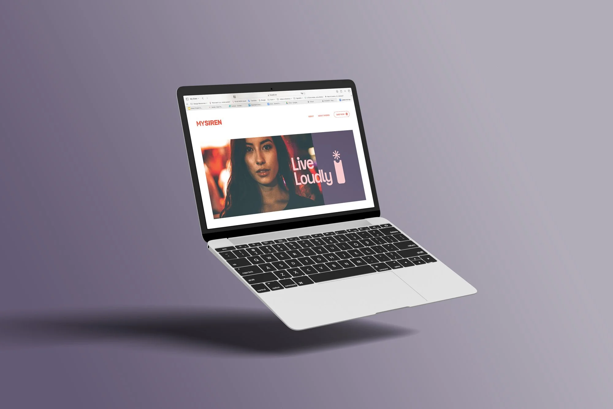
the conceptThe answer to the design problem wasn't to avoid urgency — it was to reframe it. Rather than treating safety as something defensive, we built the brand around the idea of freedom: the freedom to move, to go out, to take up space without a second thought.Live Loudly became the conceptual spine — a declaration that MySiren isn't about fear management, it's about confidence in motion.
That shift dictated every creative decision that followed. The brand needed to feel loud, bold without feeling threatening, and modern without losing warmth. The result is an identity that borrows the visual energy of fashion and lifestyle brands — vibrant, direct, unapologetic — while still carrying the credibility and urgency the product demands.
keywordsBold
Energetic
Vibrant
Powerful
Empowered
Modern
Confident
Inspiring
VISUAL SYSTEMMy Siren’s visual identity is a bold, confident shout. We are vibrant, outspoken and unmistakably modern. Our visual identity embodies independence and strength, reflecting the spirit of those who refuse to be allowed to live with freedom. Individually, each design element inspires power, dynamism and energy. It was our intention to create an aesthetic that would make users feel cheerful and inspired to embrace their right to move with more confidence— to feel safe in every space they inhabit.
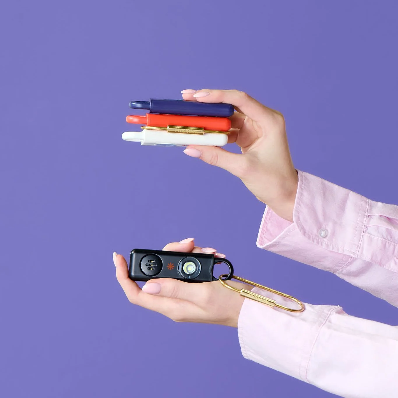
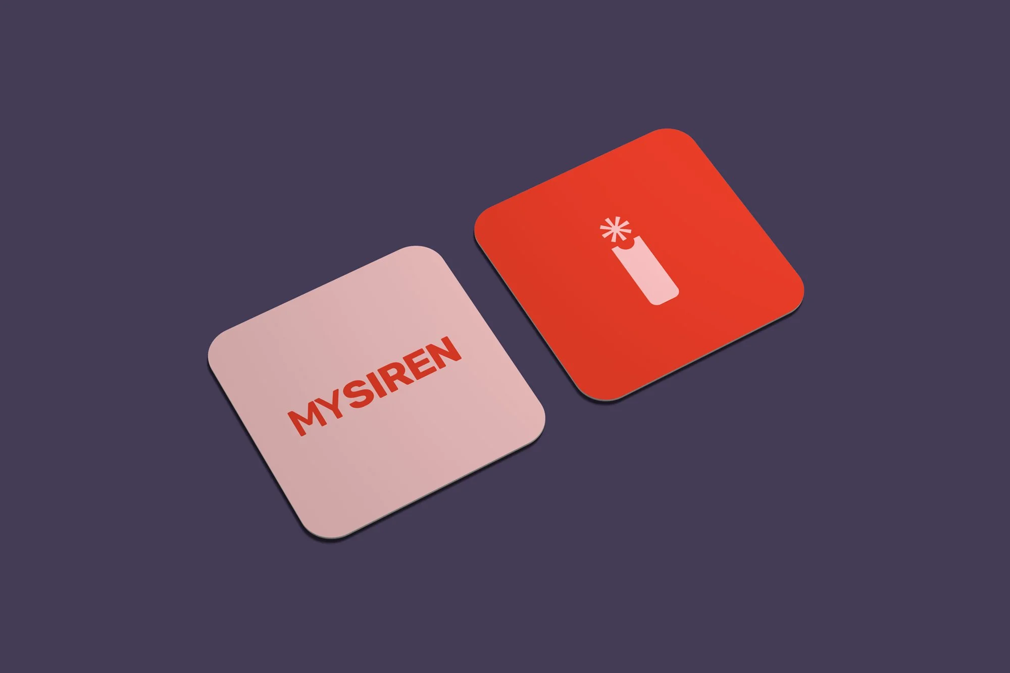
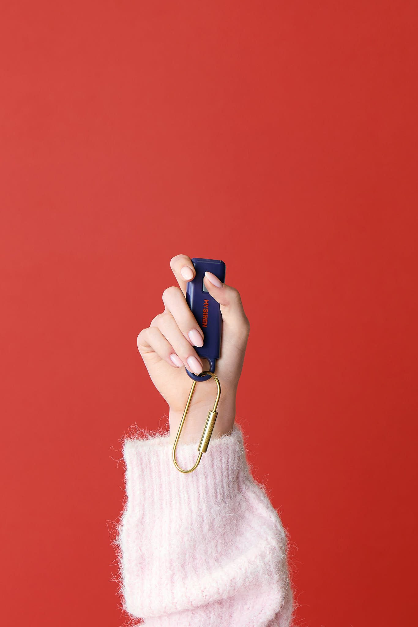
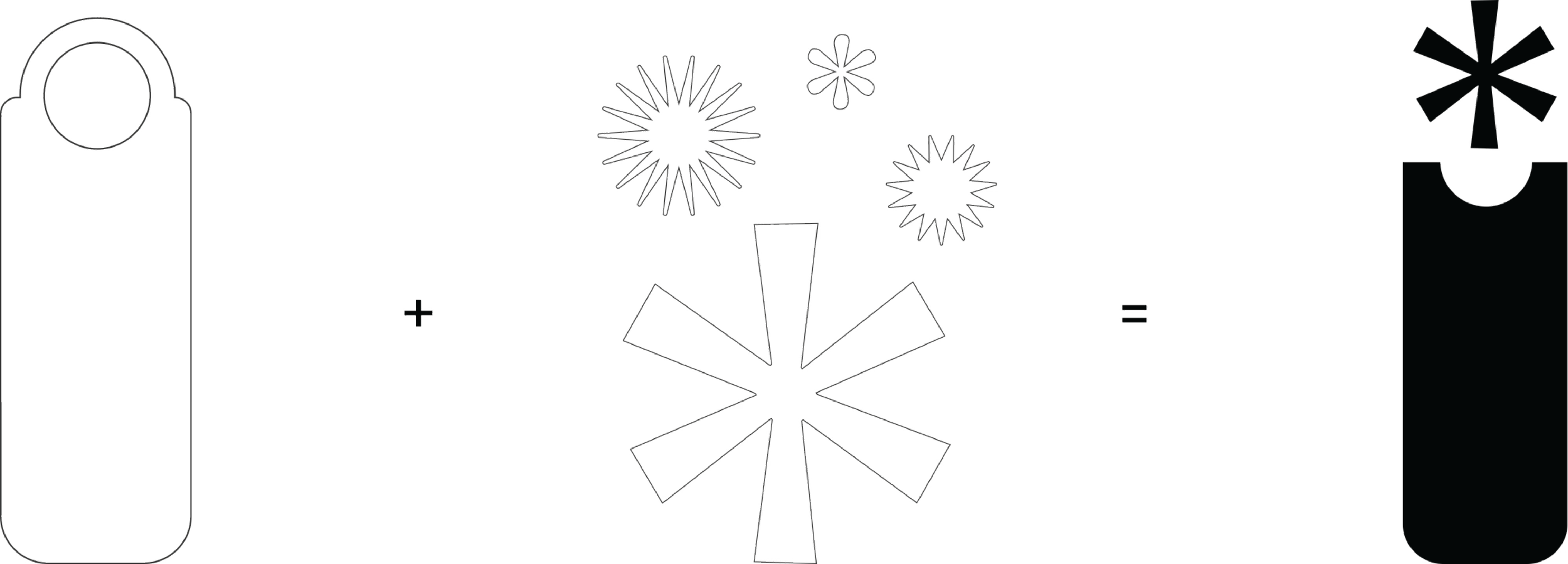
THE PROCESSThe process started with the physical shape of the device. From there, the challenge was translating sound into form — specifically, a loud, piercing, unavoidable sound. In visual language, rounded shapes read as soft and contained, while rays and pointed edges pierce and radiate. Shapes that expand outward from a center mimic the way sound actually travels. That logic led us directly to the asterisk: a mark that sits on the device silhouette and does exactly what the product does. It radiates. It demands attention. It is, visually, a shout.

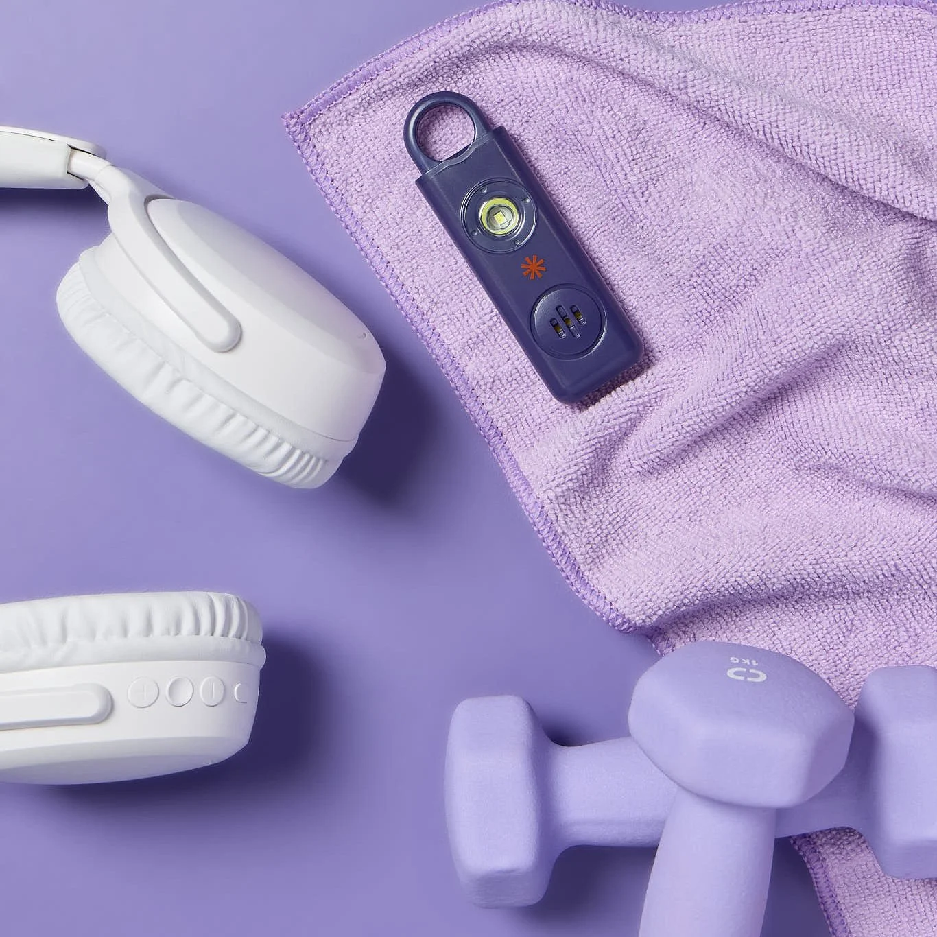
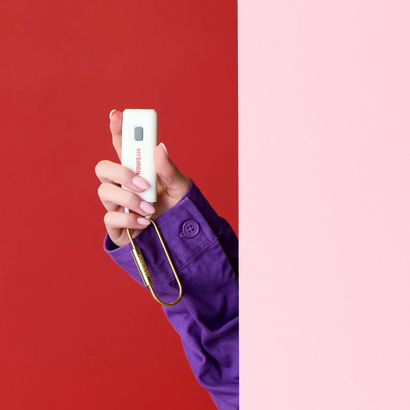
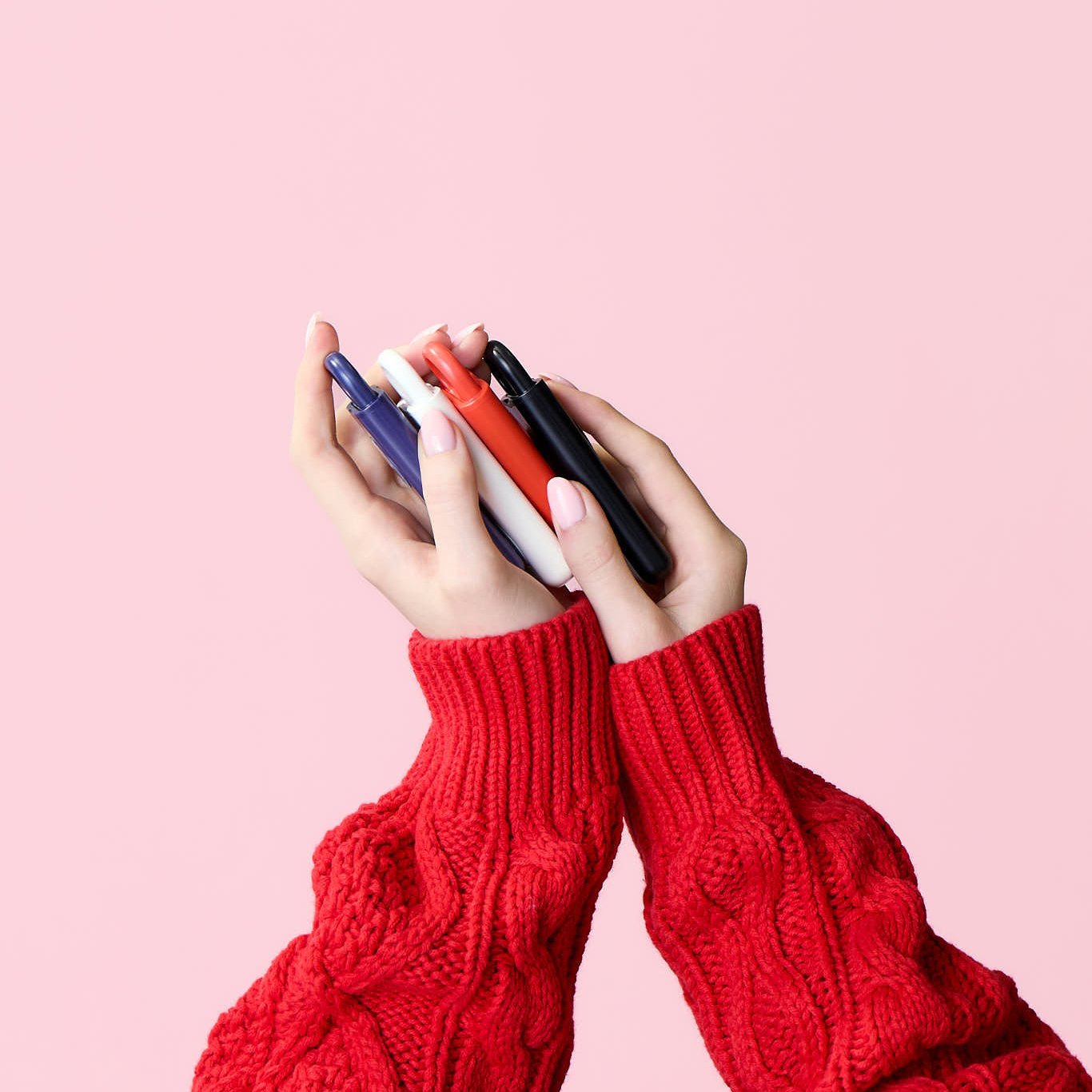
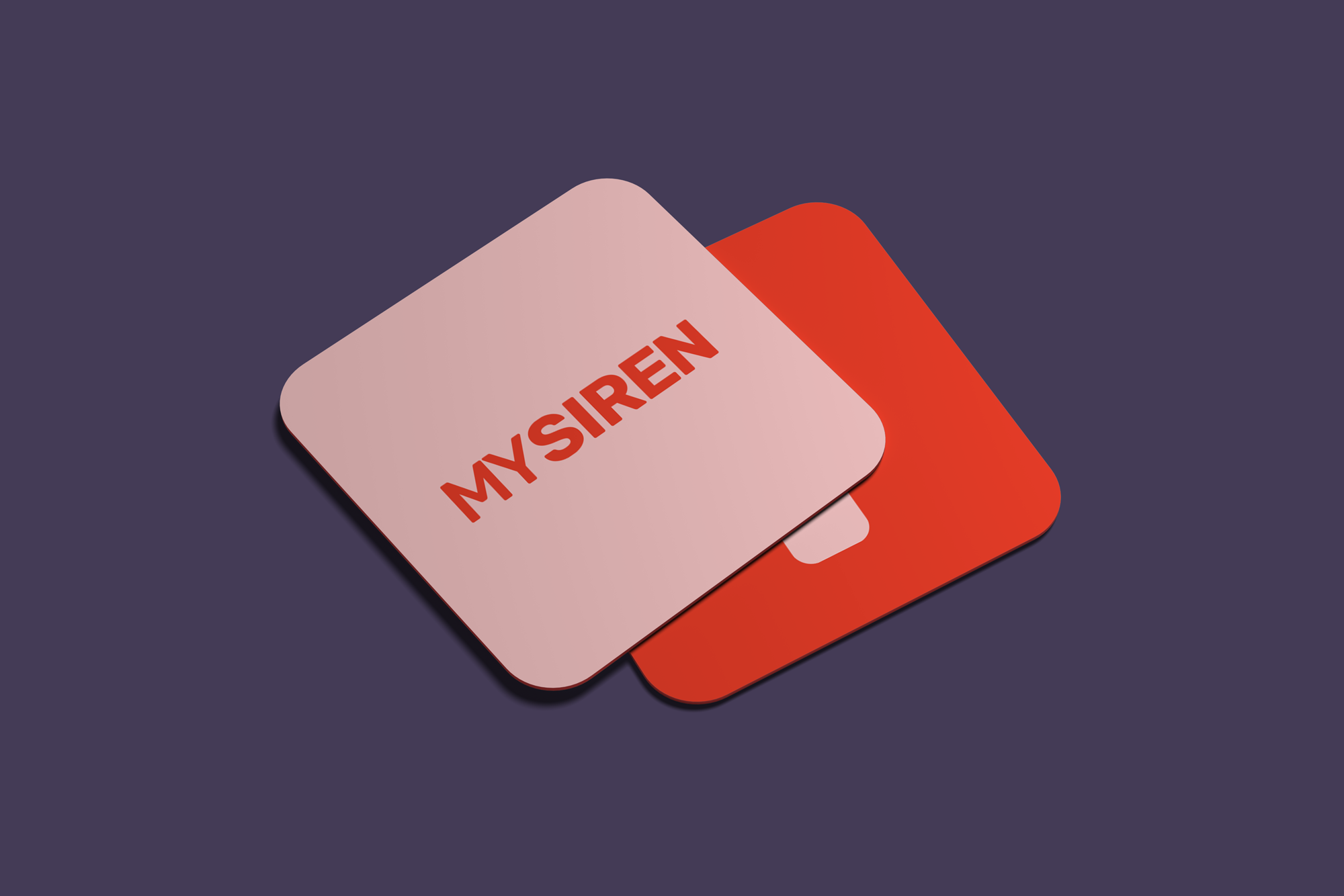
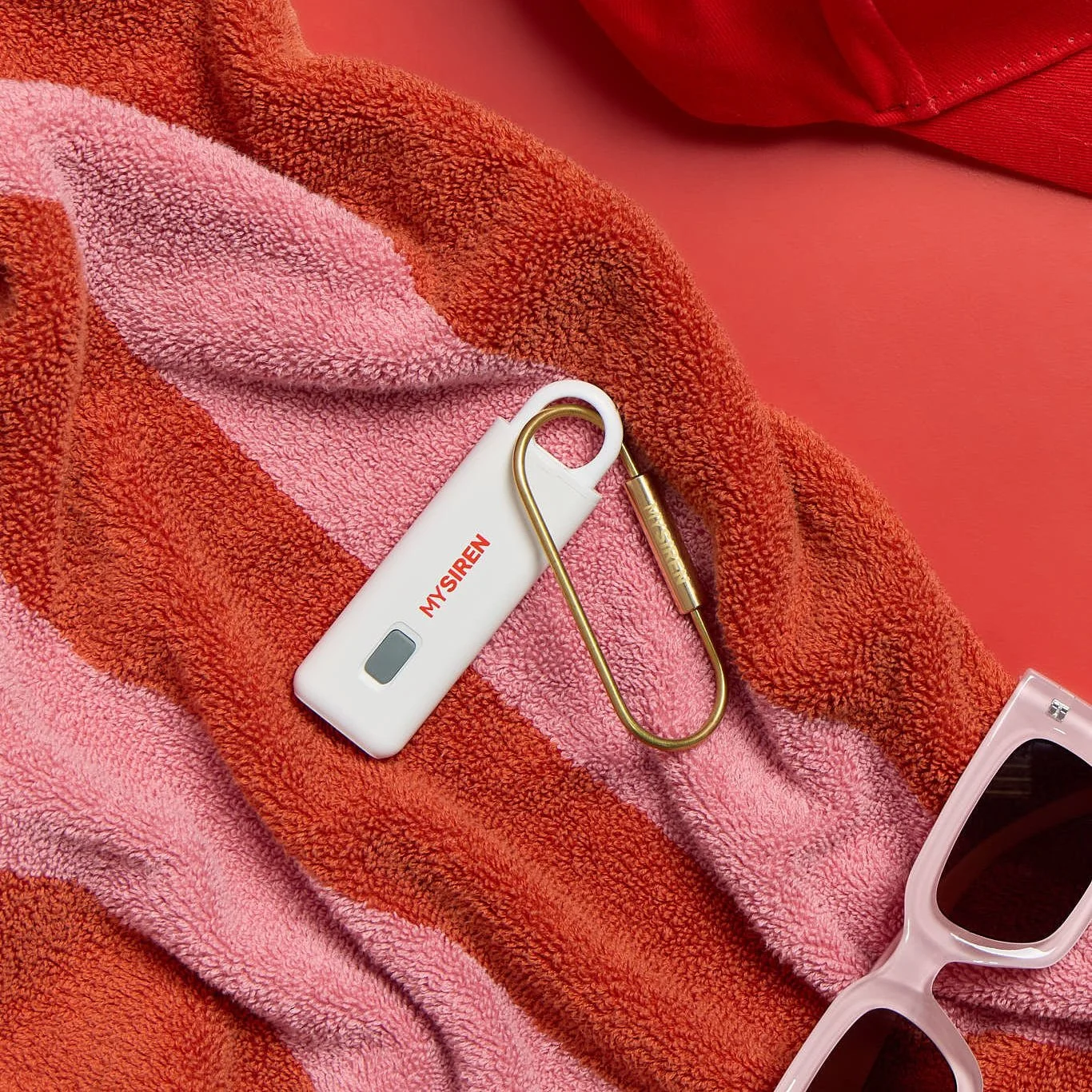
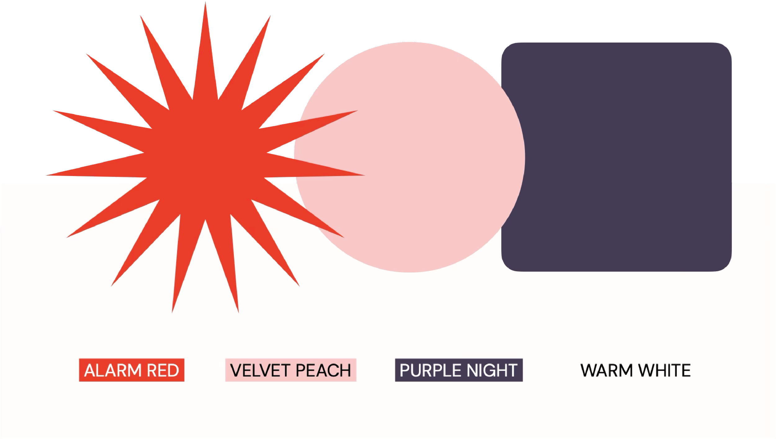
color paletteThe palette does the heaviest conceptual lifting. Alarm Red — vivid, urgent, impossible to ignore — anchors the identity and carries the brand's core tension between danger and confidence. Velvet Peach introduces warmth and approachability without tipping into fragility, and Purple Night adds sophistication and grounding, preventing the system from reading as purely reactive. Together the three colors occupy a space that neither fear-driven nor overly feminine brands typically reach: bold, warm, and credible all at once.
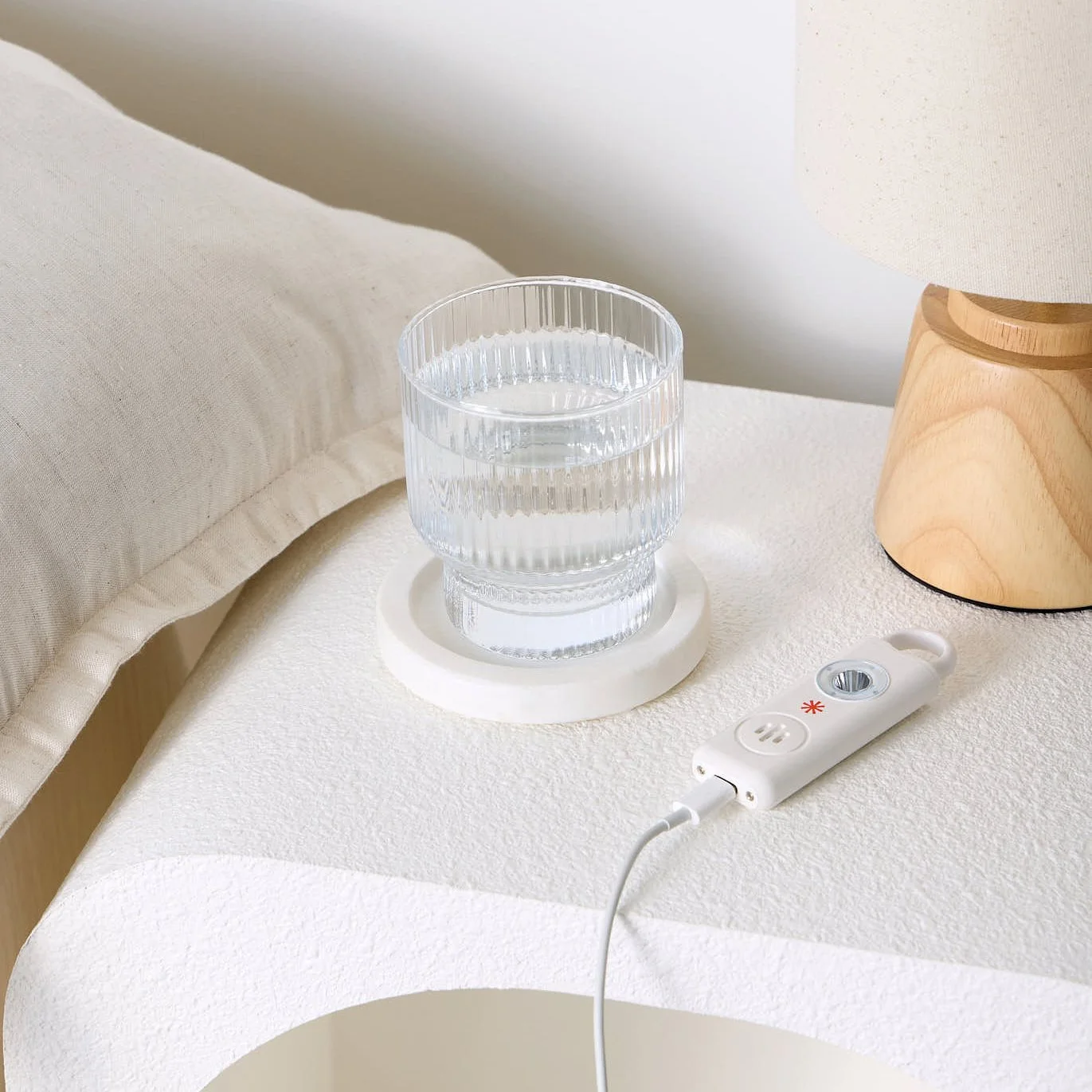
PHOTOGRAPHY DIRECTIONThe project included a full photography art direction system to prepare the client for their campaign shoot. The guidelines covered three tiers of product photography, lifestyle scene direction across nightlife, outdoor, and urban environments, casting direction, and lighting approach — all designed to keep every image firmly inside the brand world. The consistent thread throughout was authenticity: imagery that feels lived-in, confident, and as far from clinical safety-product photography as possible.