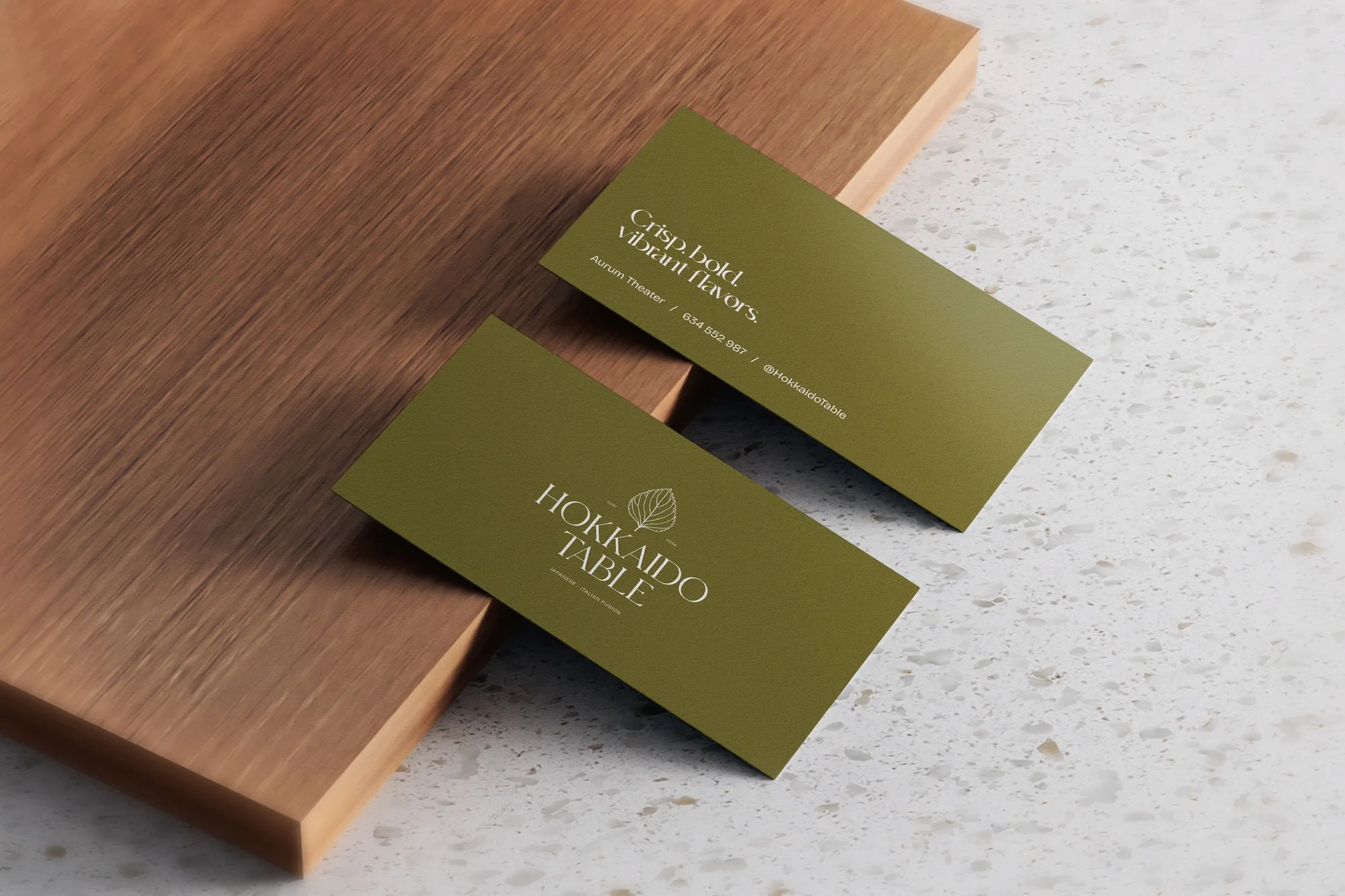
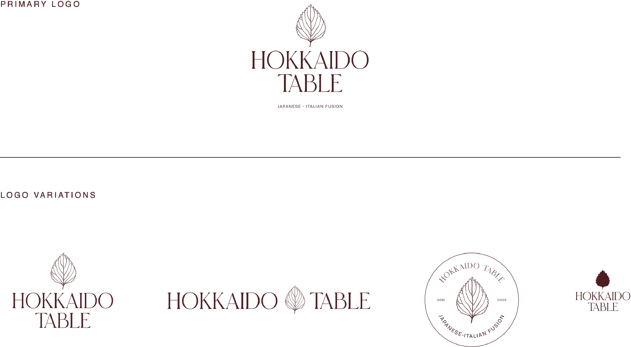
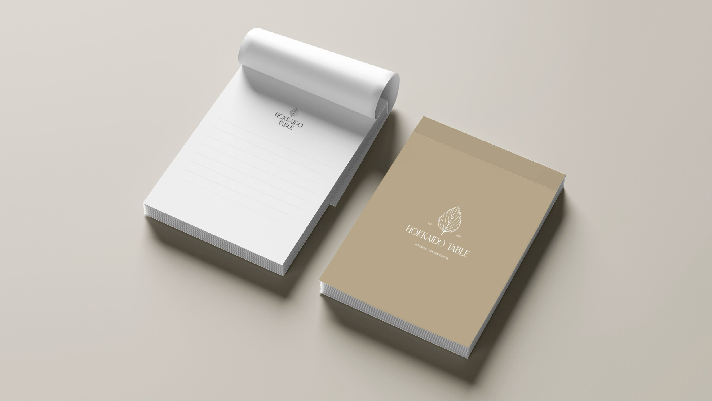
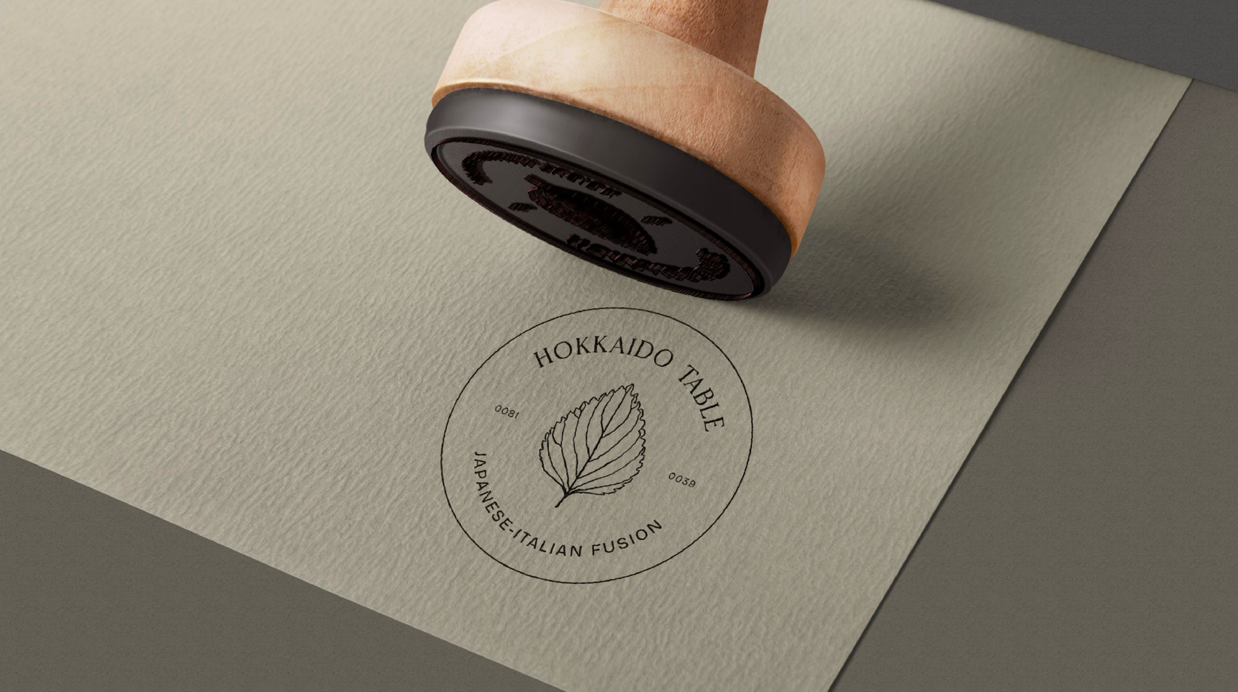
HOKKAIDO TABLE
JAPANESE ITALIAN FUSION RESTAURANT
AURUM THEATER, KL - MALAYSIA
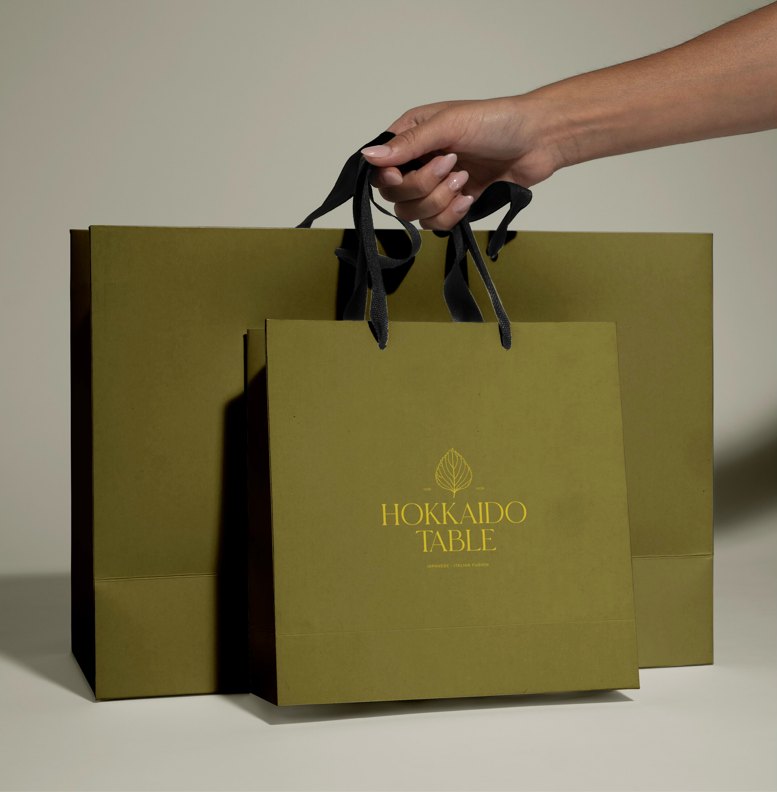
VISUAL IDENTITYSUB-BRANDS CREATIONCOLLATERAL DESIGNMENU DESIGNsocial mediaphoto guidelinesuniform designTHE PROJECTOur client, GSC Cinemas, a prominent name in Malaysia's cinema industry, approached us to develop brand identities for the restaurants at their luxury venue, Aurum Theater. Their gastronomic proposal is a Japanese-Italian fusion that focuses strongly on the freshness and simplicity of excellent quality ingredients.
While some might see the cultures of Japan and Italy as worlds apart, Hokkaido Table celebrate their differences by showcasing how their ingredients and culinary traditions dance together in perfect fusion.
They want their customers to taste the freshness of Hokkaido's produce, the precision of Japanese cooking, and the boldness of Italian cuisine.
INSPIRATION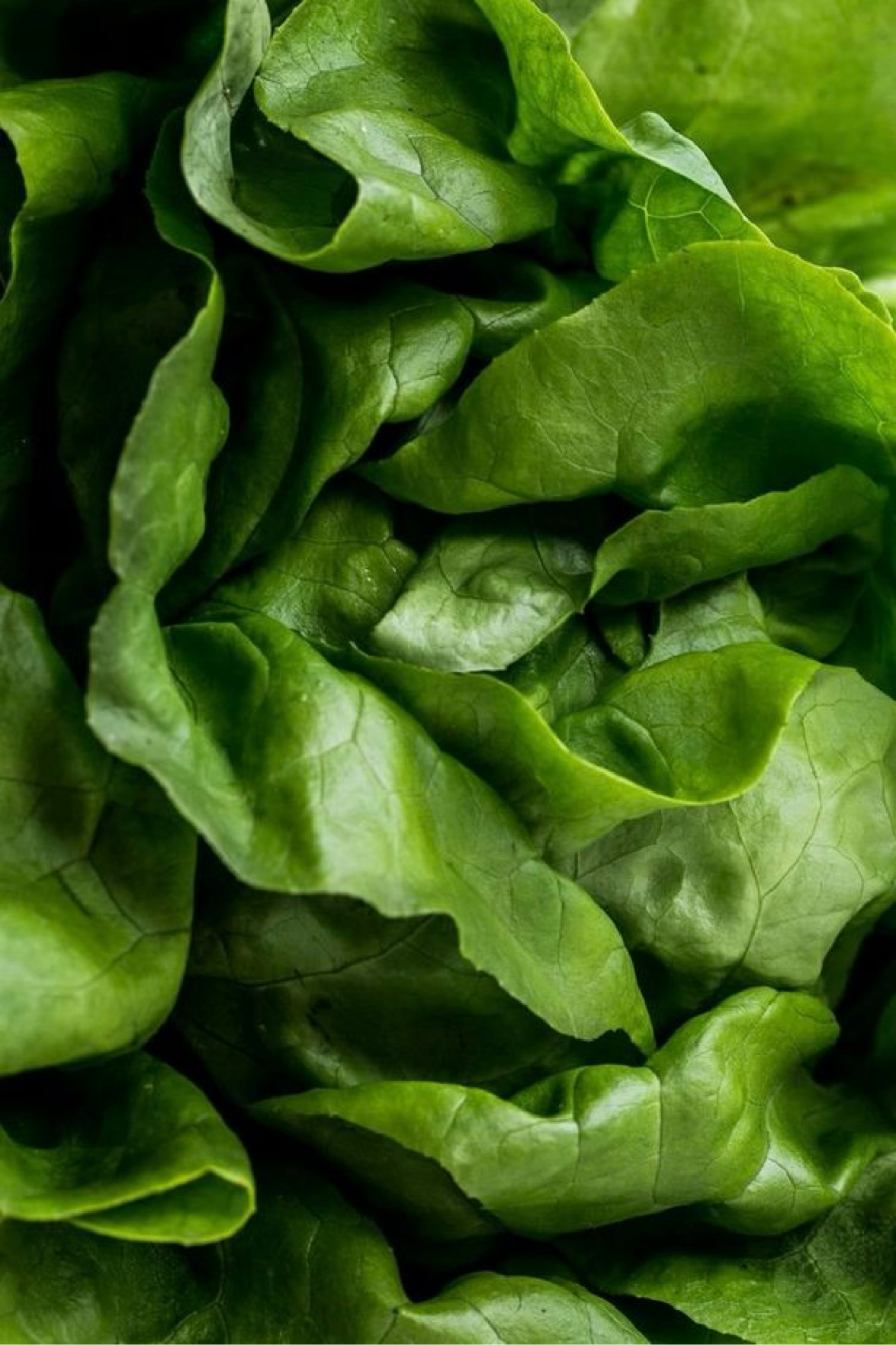
The crispness and freshness of natureThrough Hokkaido Table’s Visual Identity, we seek to pay homage to nature's flawless ingredients. We remain faithful to the very spirit of the brand, where each element is elevated for the inherent splendor of its unprocessed, natural form.
ESSENTIALISMEssentialism revolves around the notion of distilling a visual or conceptual idea down to its most fundamental aspects. It allows for more expressive design elements than minimalism— it's about capturing the essence and emotion of a concept. In relation to experiences, essentialism is about the possibility of fully enjoying one single thing at a time, in its pure, natural, raw state.
the conceptThe visual identity pays tribute to nature's bounty — celebrating every element for its raw, unadorned beauty. Japanese essentialism became the guiding philosophy: distilling ideas and forms to their essence, while Italian warmth and vibrancy were woven in to create balance between two cultures that share more than they seem.
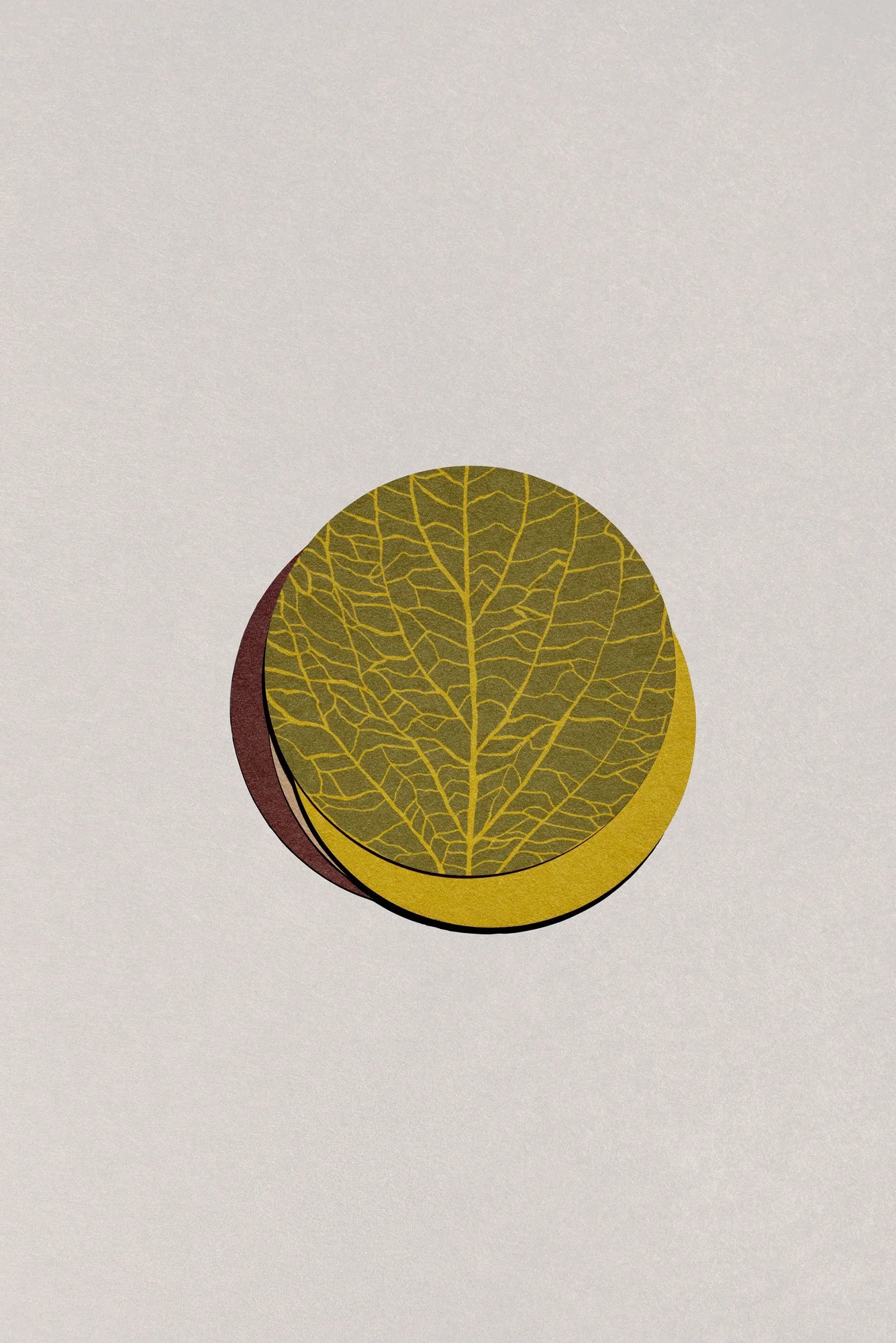
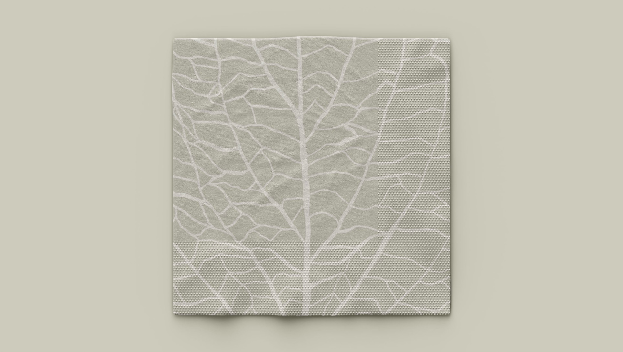
The icon concept began with herbs — their quiet power to transform a dish entirely, to carry a flavor memory in a single leaf. Shiso emerged as the natural bridge: its flavor profile (mint, oregano, basil, citrus) makes it at home in both Japanese and Italian cooking, while its distinctive leaf — used as garnish, wrapper, vessel — became a symbol capable of holding two cultures in one form.
keywordsFreshness
Tradition
Japanese Simplicity
Italian Warmth
Spaciousness
Clean
Crisp

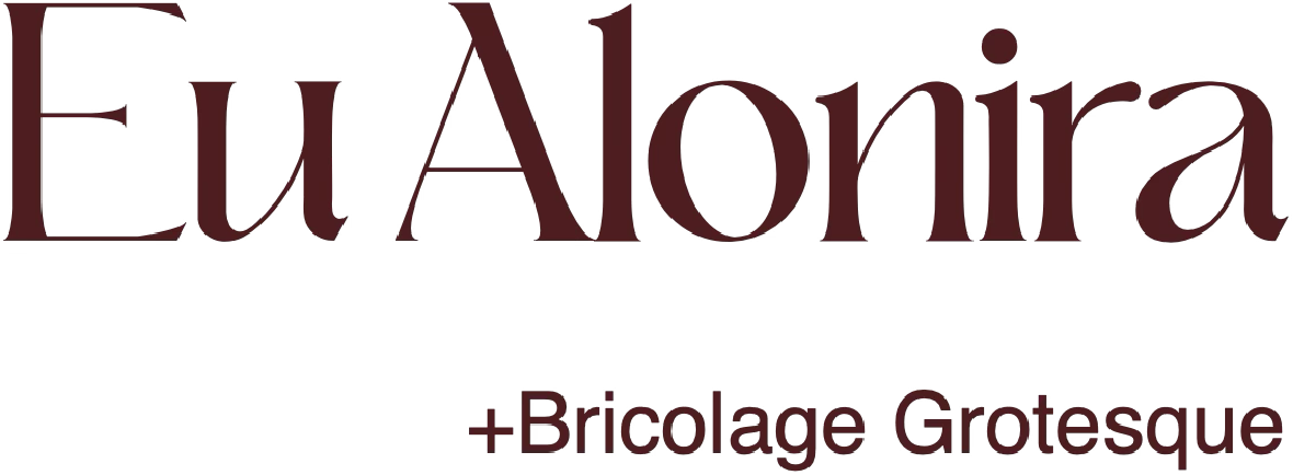
font pairingOur goal was to select typefaces that convey elegance but also warmth and personality. While other brand components are simple and clean, our font selection has been designed to convey warmth and dynamism. It features a fusion of classical and modern traits that suit our brand really well and provide a counterbalance to the mire minimalistic aspects.
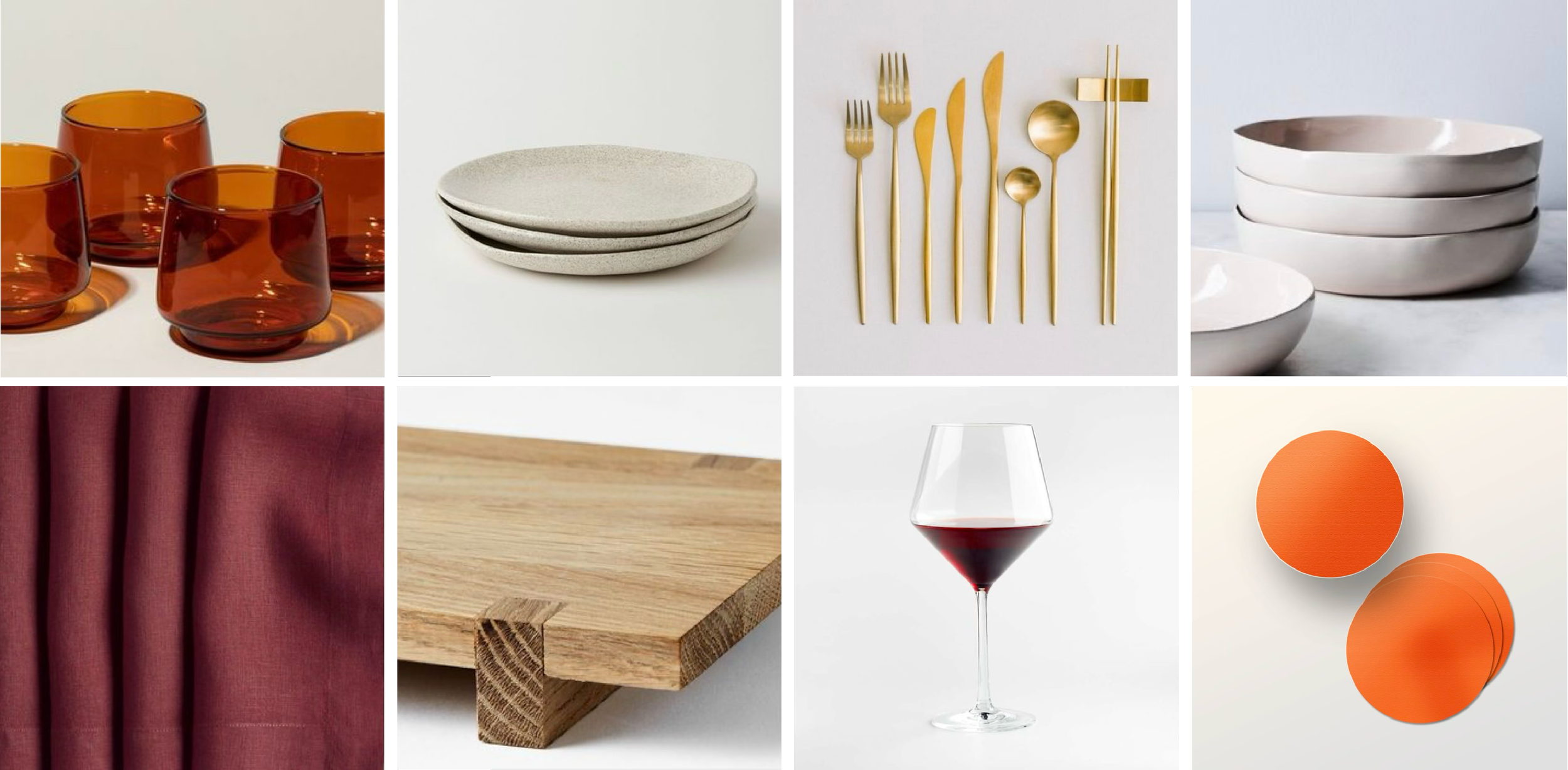
color paletteWe've curated a harmoniously contrasting color palette that combines all our core concepts. We've selected grounded earthy tones, refreshing natural ones, neutral, serene hues and splash of color, representing Italian warmth and allure.

PHOTOGRAPHY GUIDELINES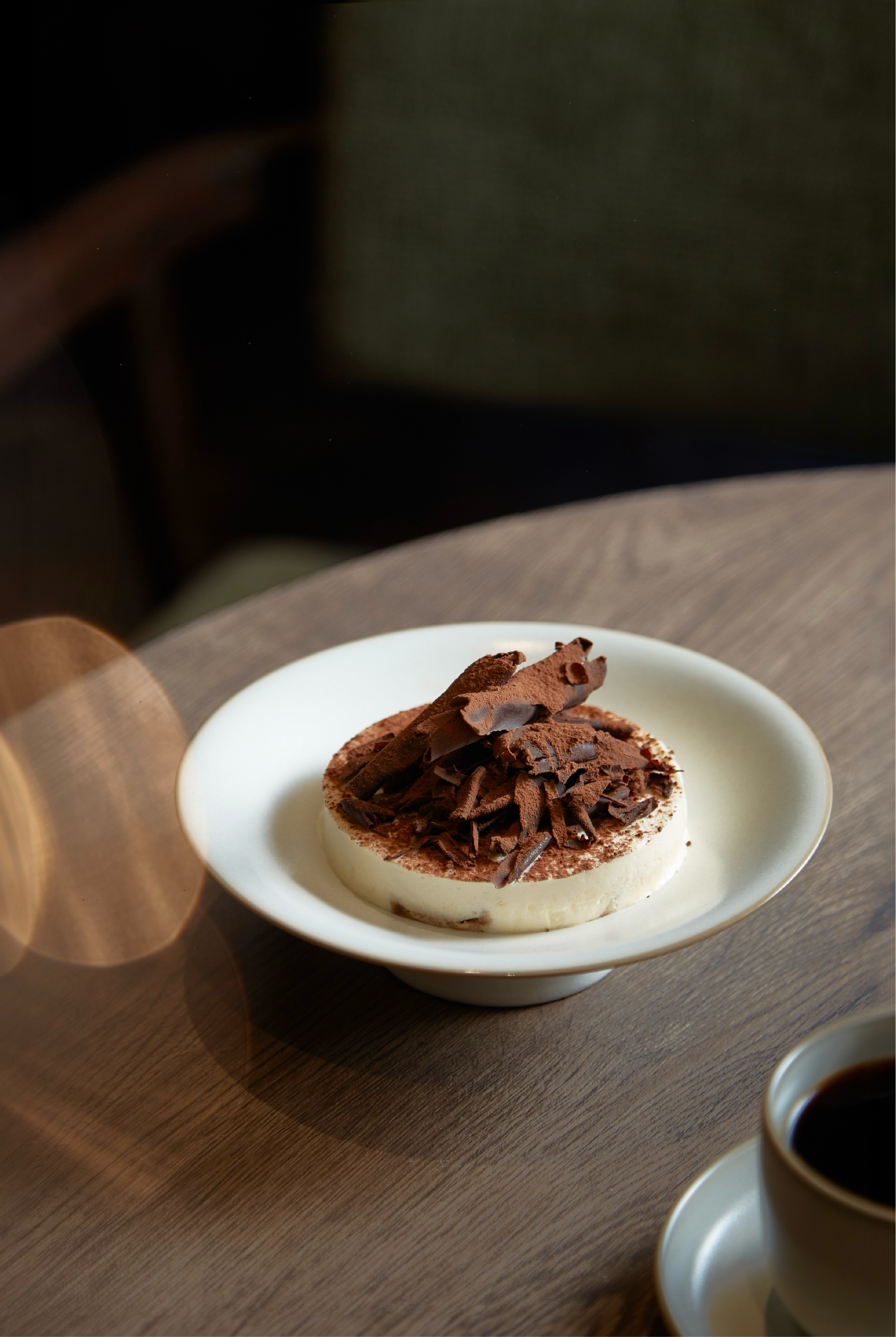
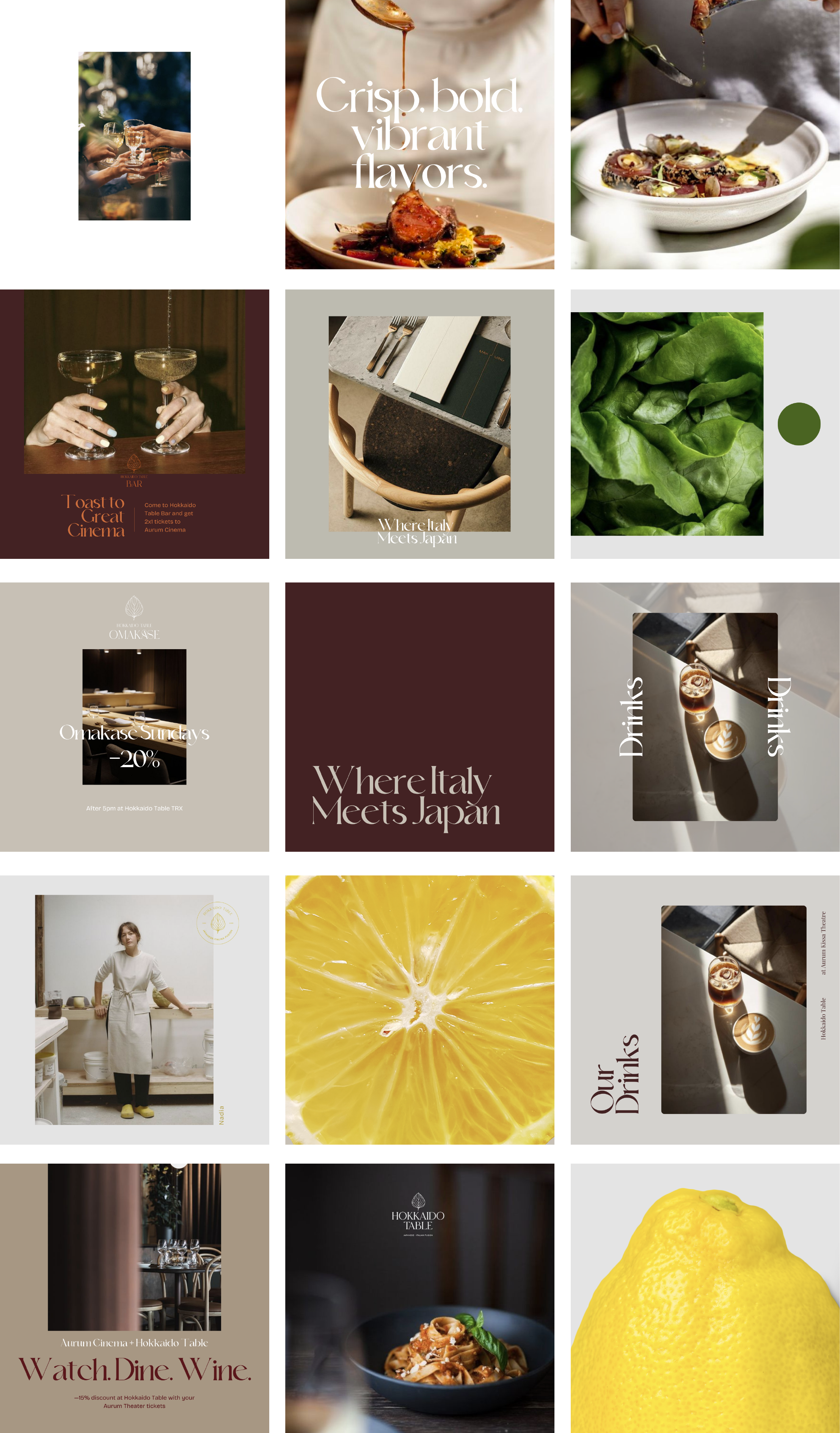
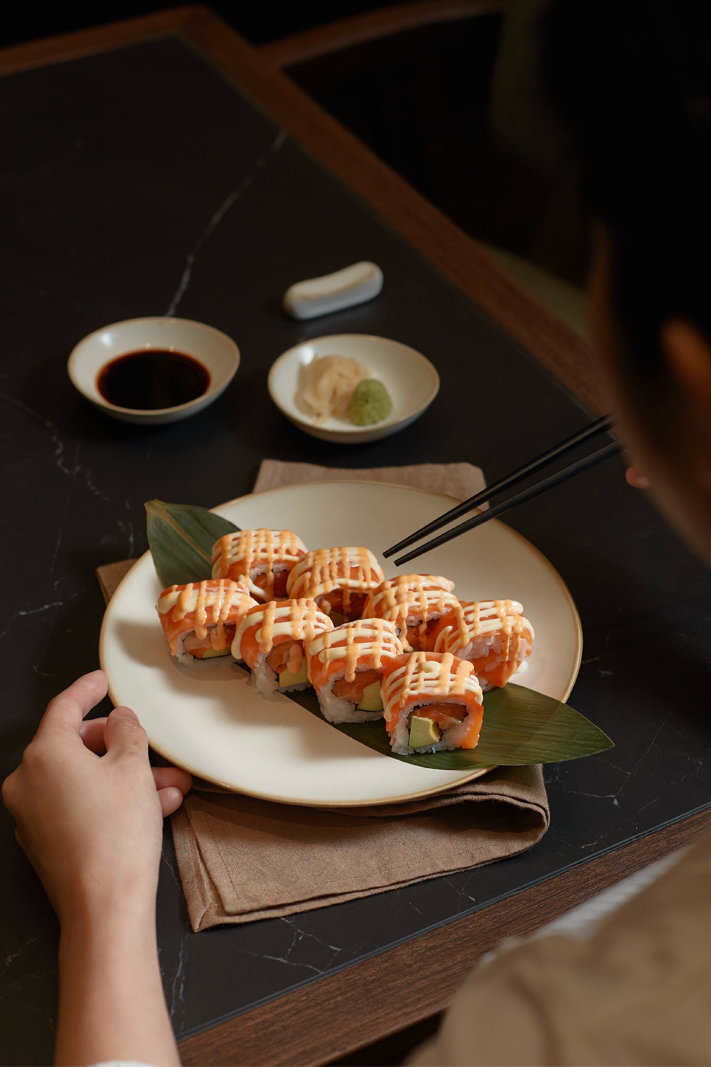
We prefer photographs captured from distinctive and unexpected angles, reflecting a distinct perspective. These images have a poetic and creative quality, proper of candid snapshots taken with a concealed camera. The aim is to portray events naturally, devoid of a staged or disrupted appearance. In this manner, we can extend an invitation to glimpse into the concealed life of Hokkaido Table.
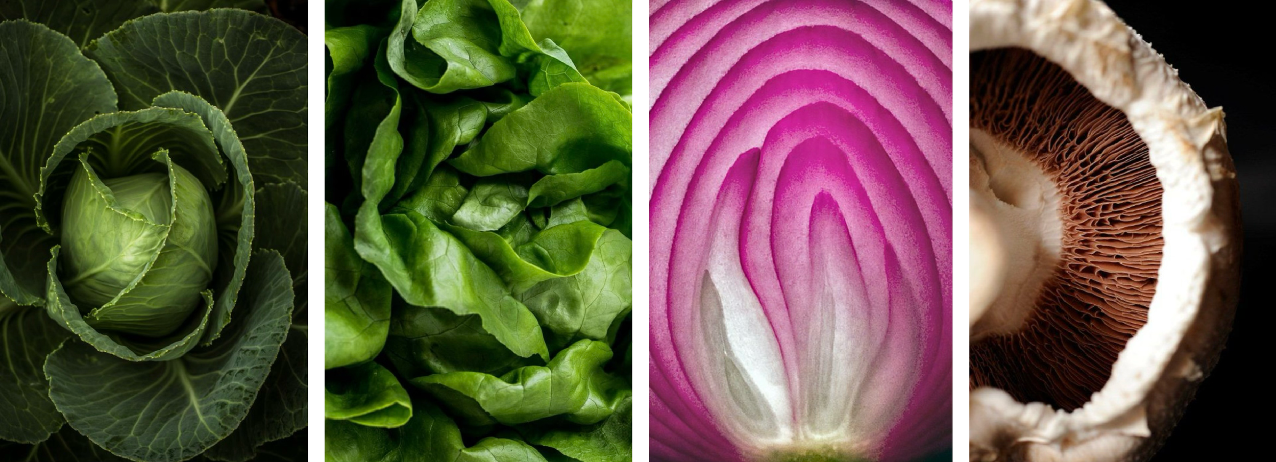
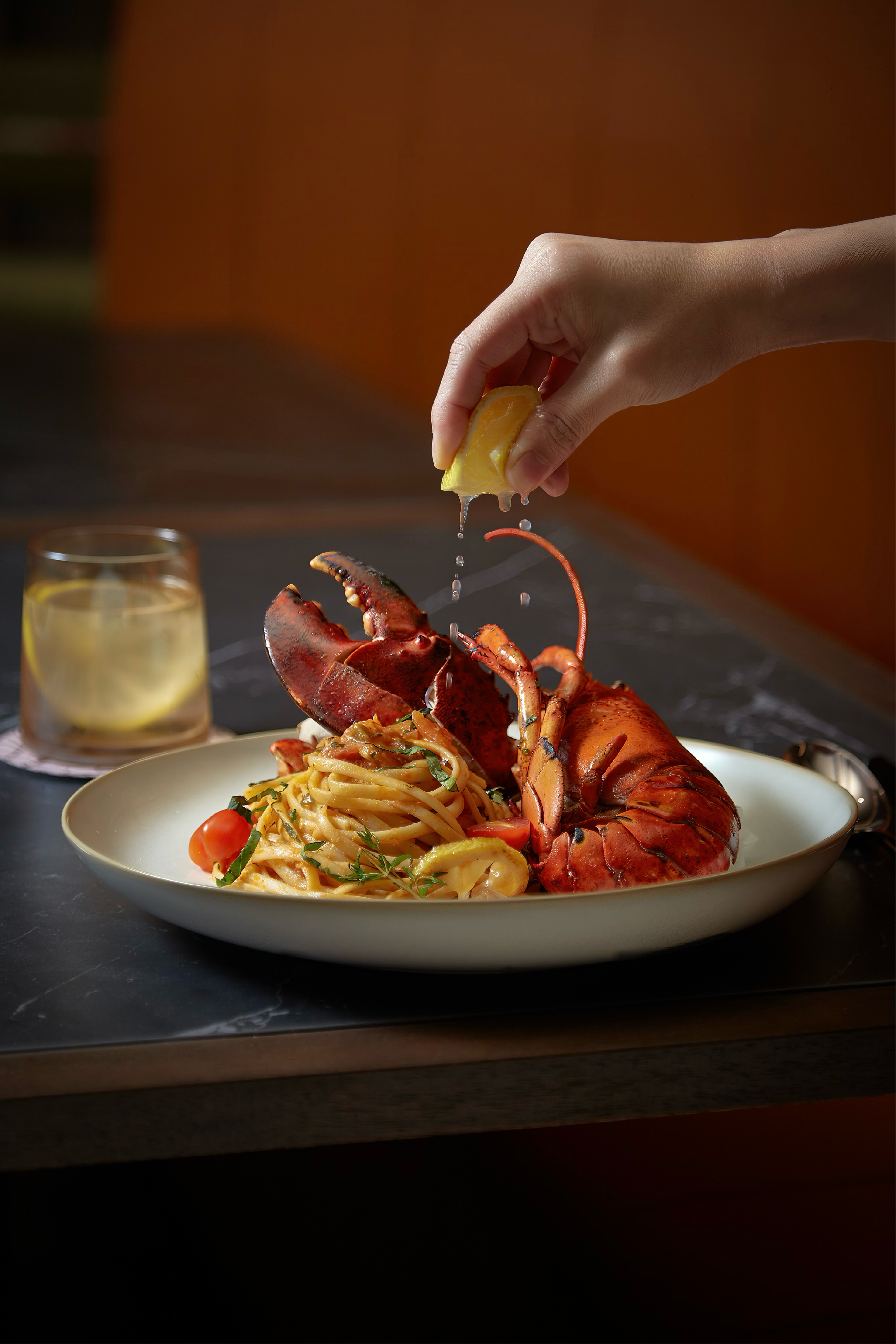
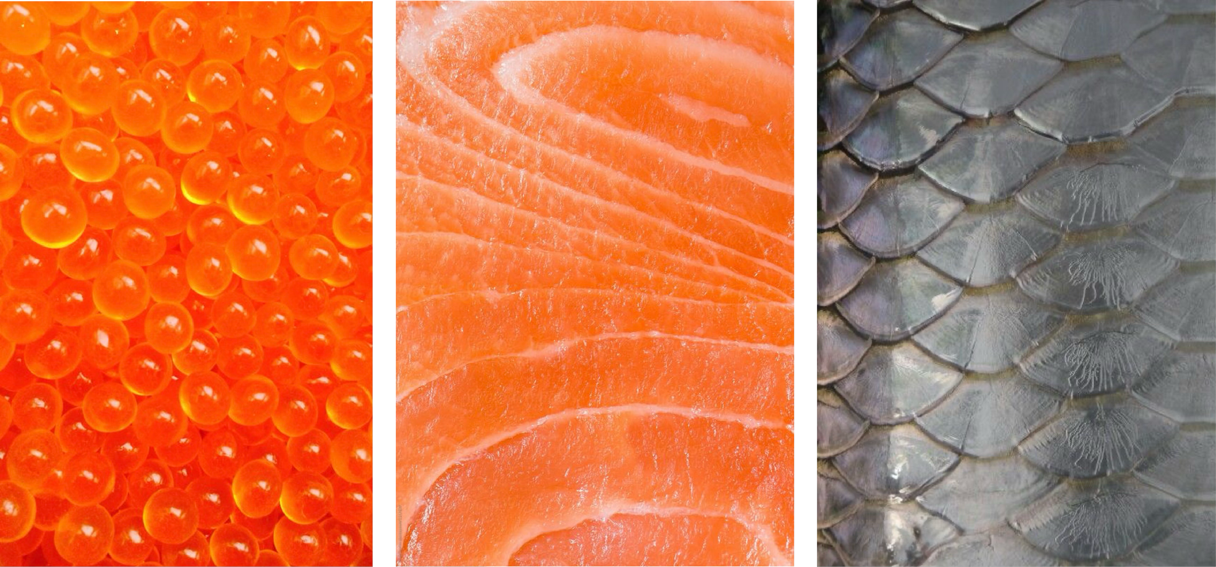
IngredientsWe show the crisp and fresh qualities of our ingredients through these pictures. We love closeups where the entire image is filled with a delicious vegetable or meat. This photos are extremely important because they encapsulate so many of our core concepts: Japanese essentialism, freshness, textures, and the natural aspect of our brand.
VISUAL IDENTITY APPLICATIONS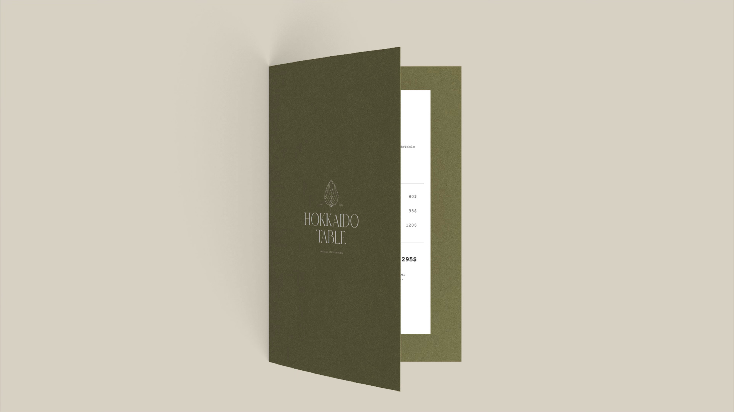
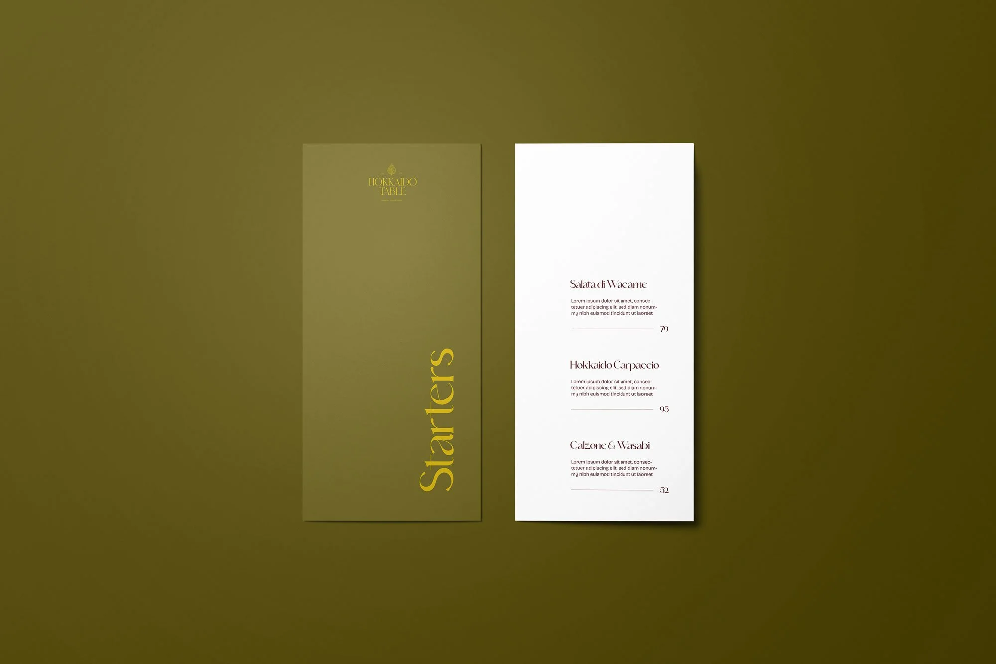
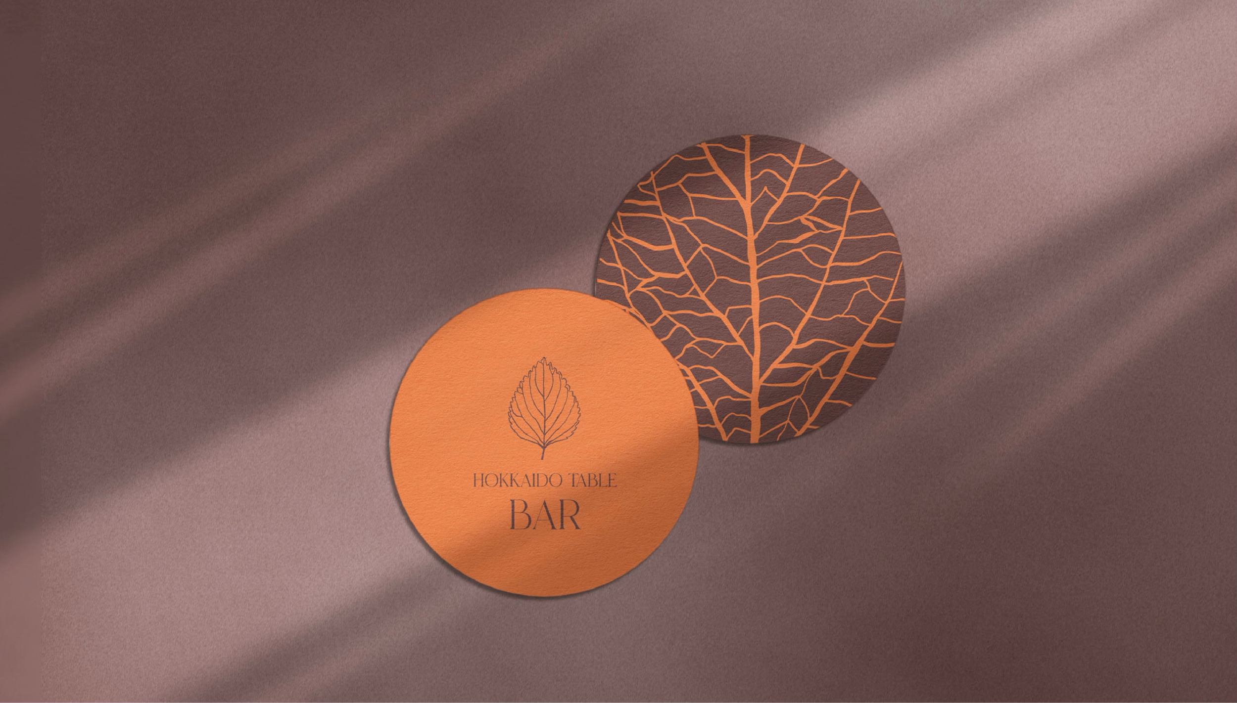
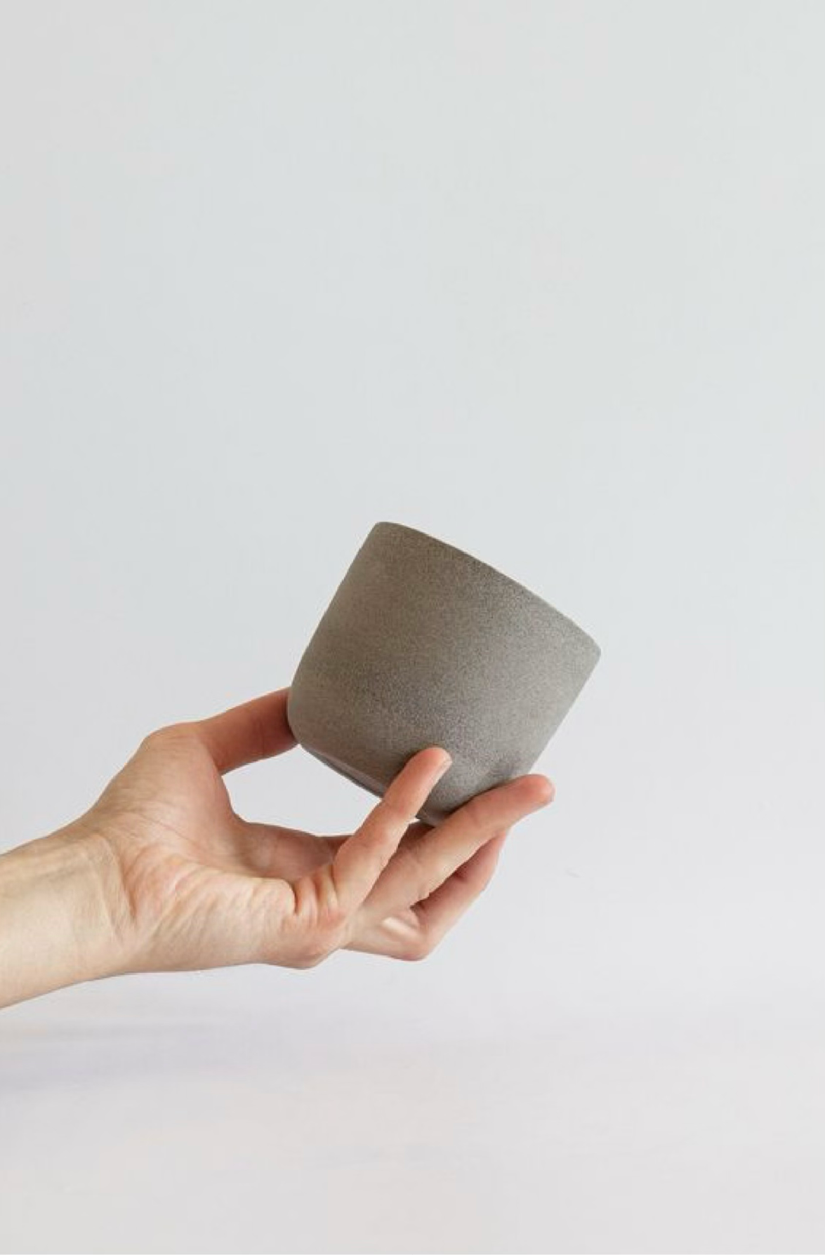
restaurant applications: TABLEWAREWe follow our core concepts and translate them into a selection of tableware elements. We wanted to create a balance where our guests can perceive all the different aspects of Hokkaido Table’s identity through the elements that lay out in front of them.
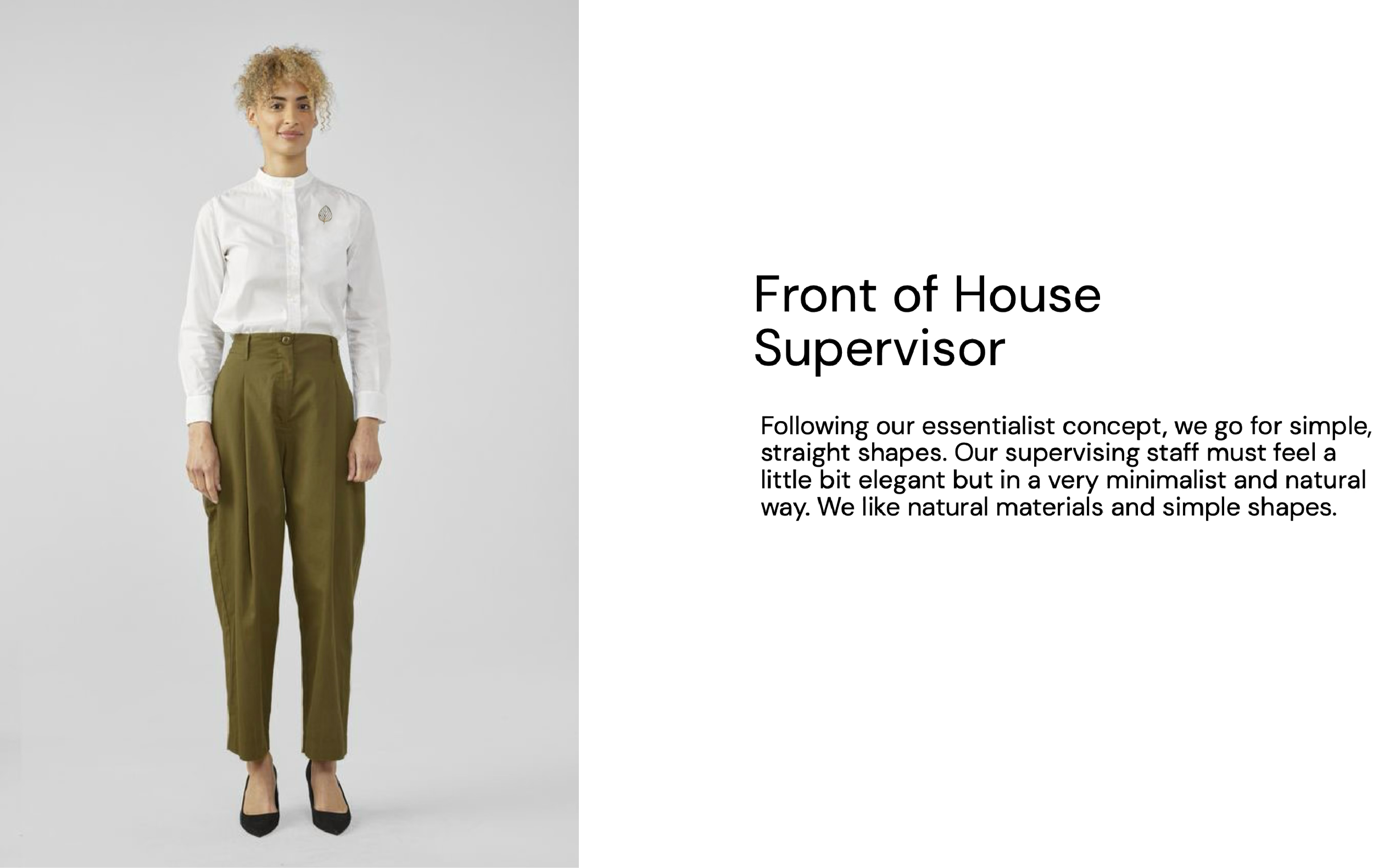
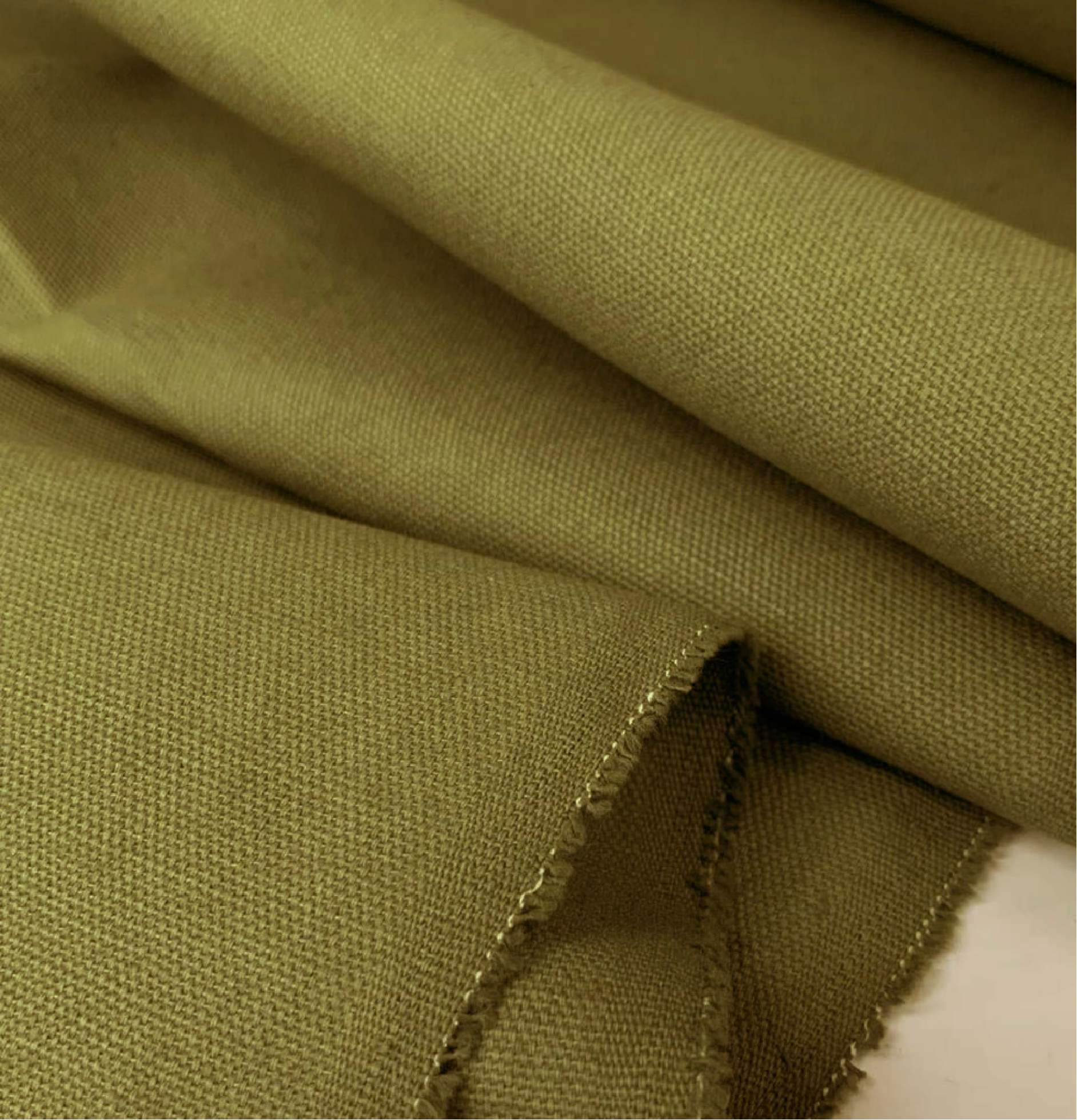
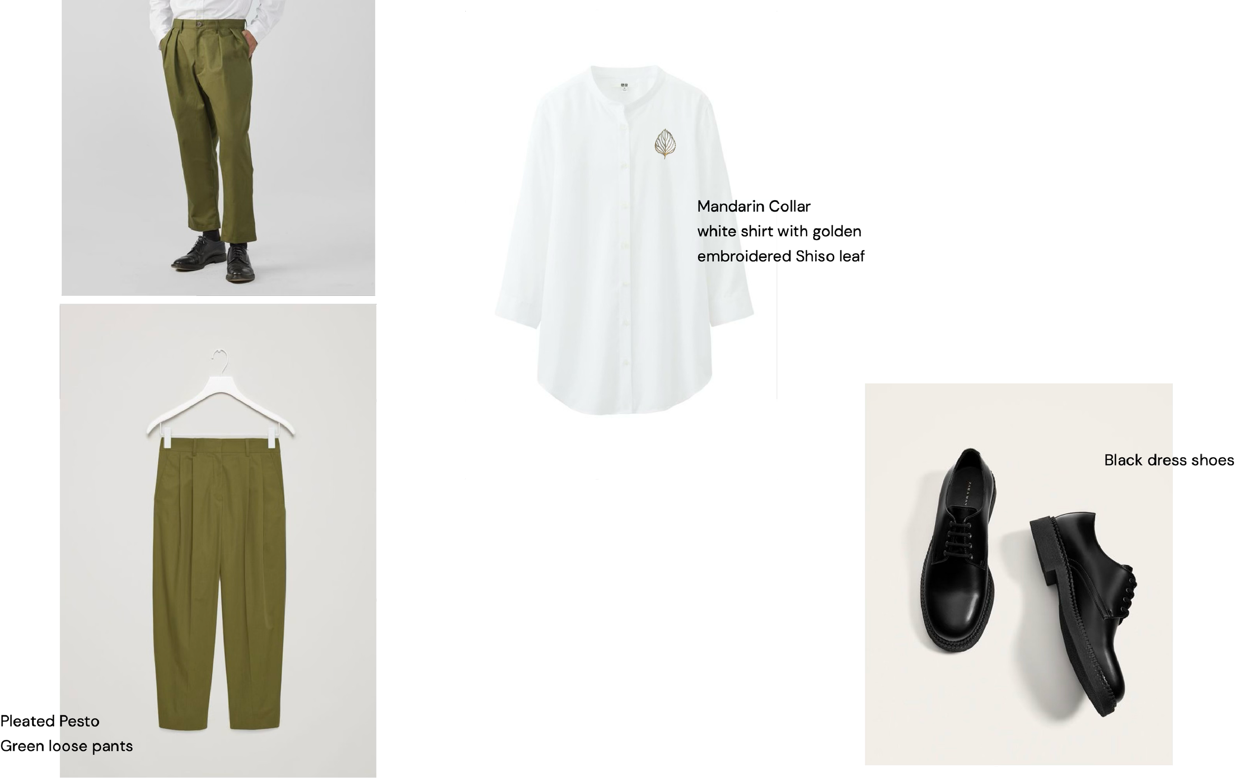
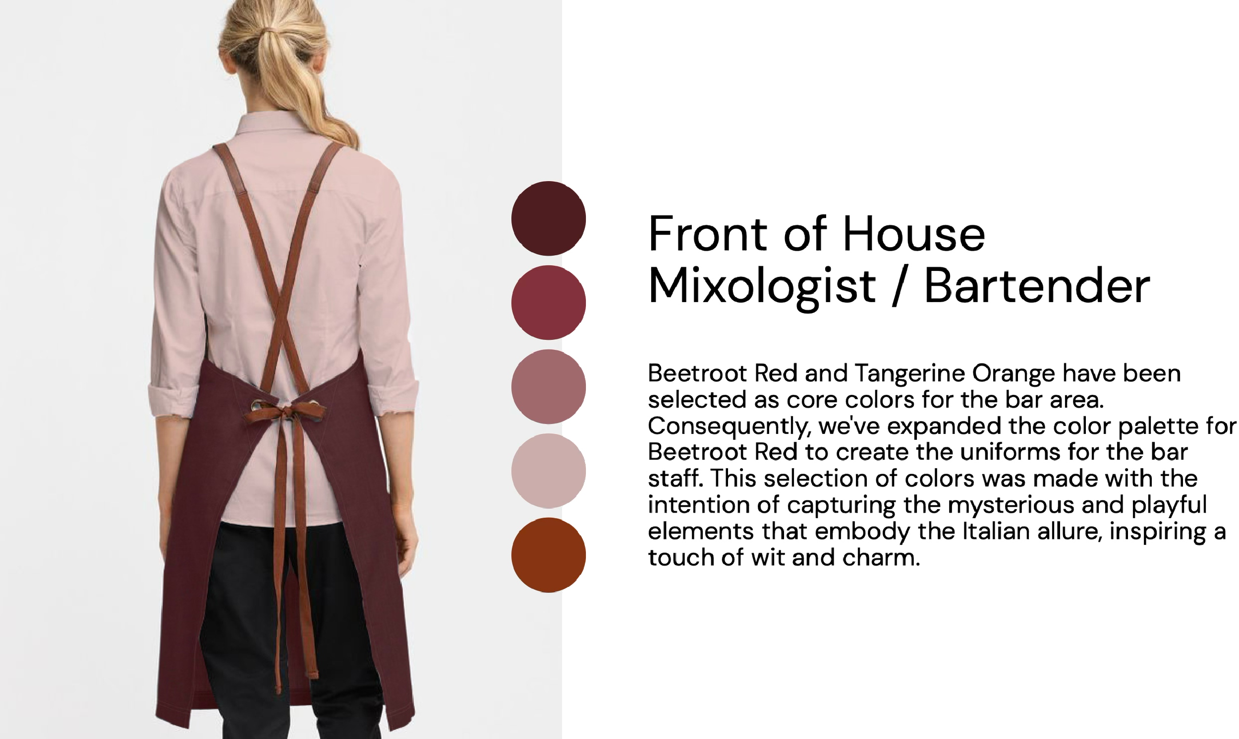
uniform designThe work apparel for Hokkaido Table has been meticulously designed to strike a balance between visual cleanliness, simplicity, natural elements, and elegance. We prioritize clean and straightforward designs, incorporating natural textures and materials, while remaining faithful to our neutral color palette. Additionally, we introduce subtle hints of our vibrant side to infuse some color and vibrancy into the overall aesthetic.
Earth. Natural . Japanese Essentialism.

SOCIAL MEDIA