deprogram
PERSONAL TRANSFORMATION PROGRAM
CALIFORNIA, USA
VISUAL IDENTITYwebsitesocial mediaphoto guidelinesCOLLATERAL DESIGNTHE PROJECTdeprogram is a personal transformation program combining meditation, psychology, and group coaching into a four-stage methodology for deep inner change. The founder came to me needing a brand built from scratch — strong enough to communicate real, lasting results, premium enough to reach a high-earning urban audience, and visually cohesive across web, social, and retreat marketing. The brief called for something that felt both rooted and luminous: dark greens, strong feminine energy, and a clear visual arc from struggle to freedom.
the conceptdeprogram needed a brand that could do something genuinely difficult: make deep psychological and emotional work feel both credible and desirable. The challenge wasn't just aesthetic — it was philosophical. How do you visualize the invisible? How do you design a container for something as nonlinear as healing?
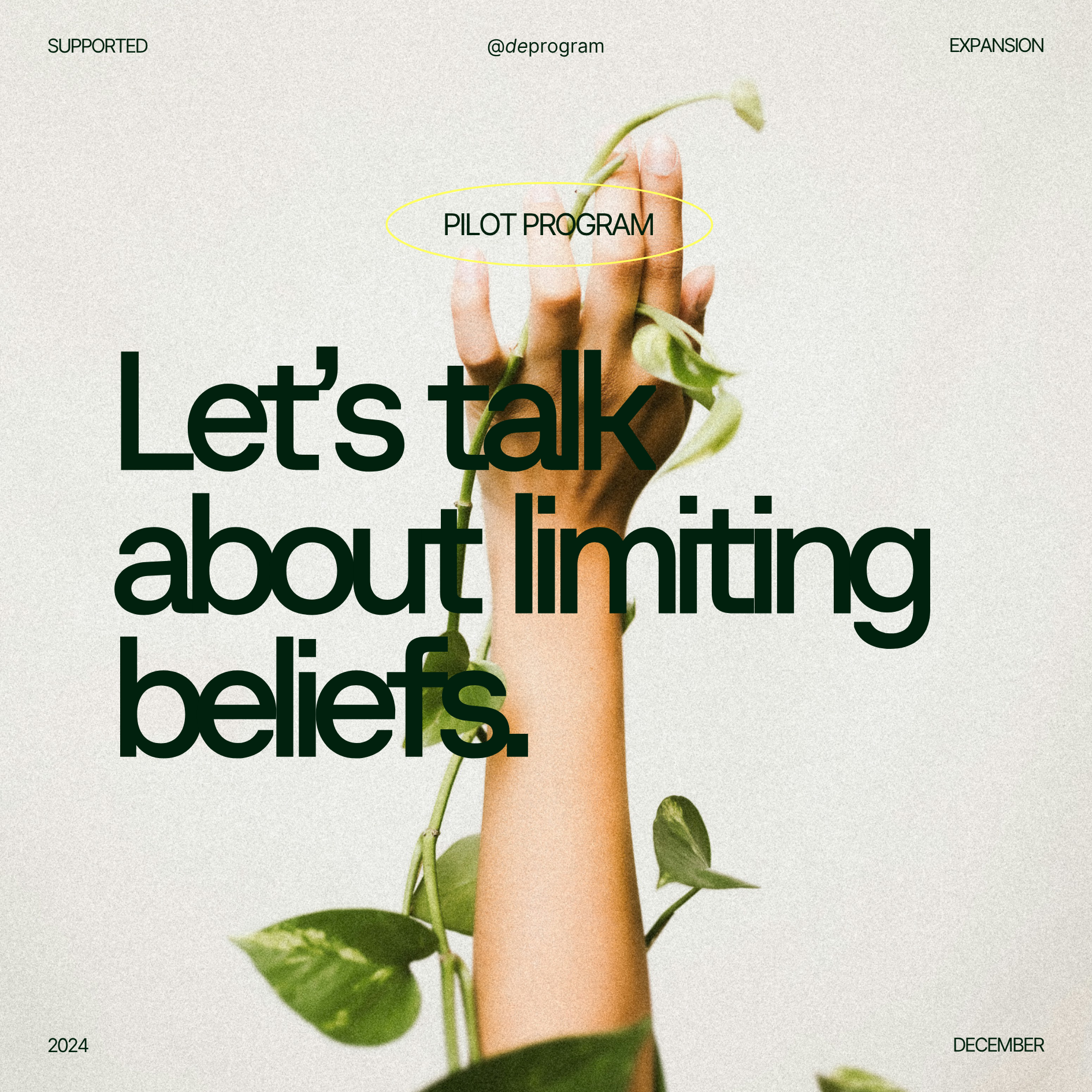
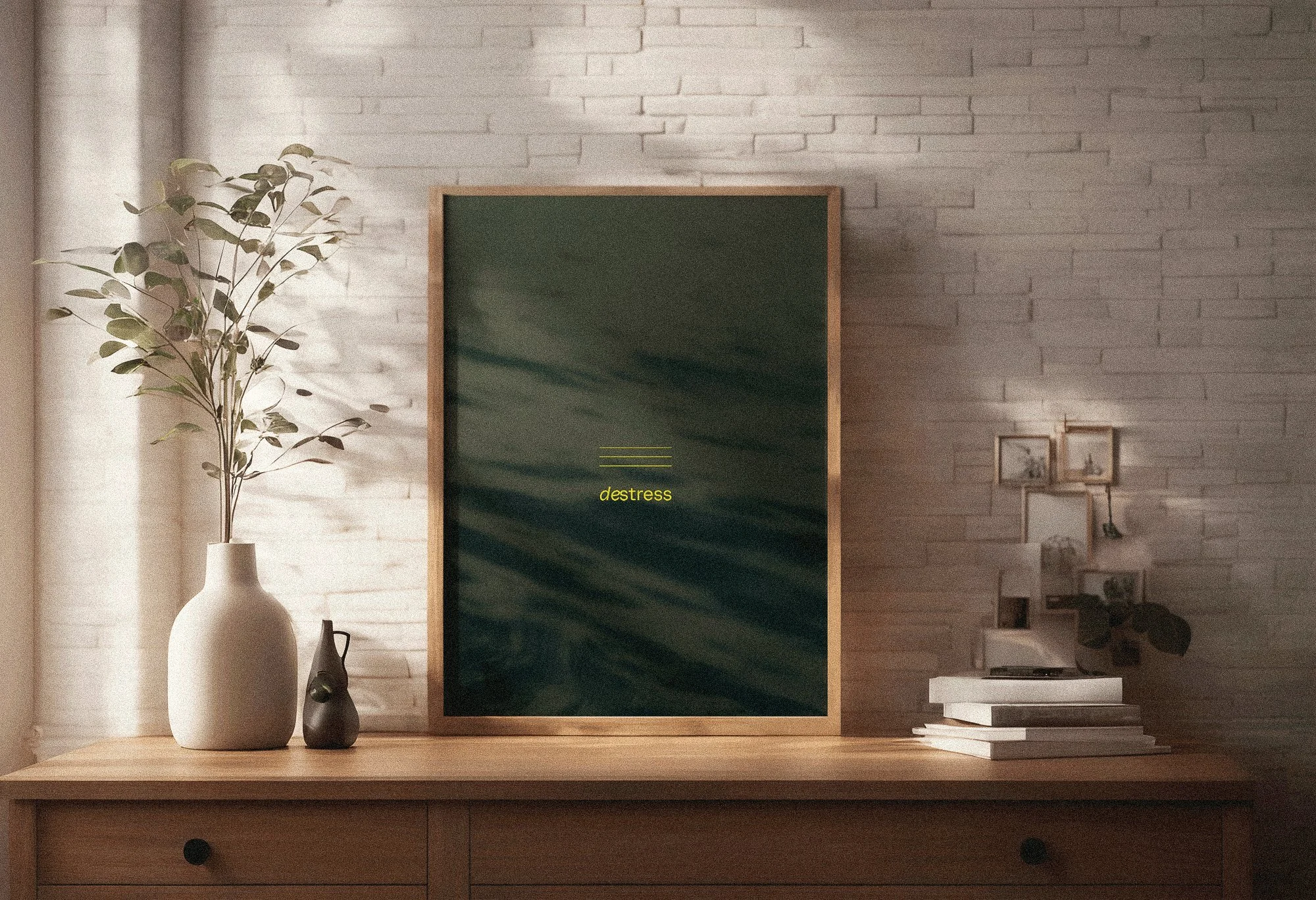
The concept we developed centers on the idea of light entering darkness — not as a metaphor applied on top of the brand, but as the structural logic beneath it. The dark-to-light journey isn't decorative; it's the methodology itself. destress, define, deprogram — each stage moves the individual from constriction toward expansion, from inherited patterns toward self-authored identity. The visual system was built to mirror that movement at every touchpoint.
The result is a brand that feels premium without feeling cold, grounded without feeling heavy, and human without sacrificing sophistication.
keywordsEmpowering
Liberating
Brilliant
Fresh
Human
Grounded
Sense of Calm & Order
Inspiring
VISUAL SYSTEMThe visual identity for deProgram was built around a single organizing idea: contained expansion — the tension between structure and liberation that sits at the heart of the methodology itself. Every element of the system was designed to hold that duality.
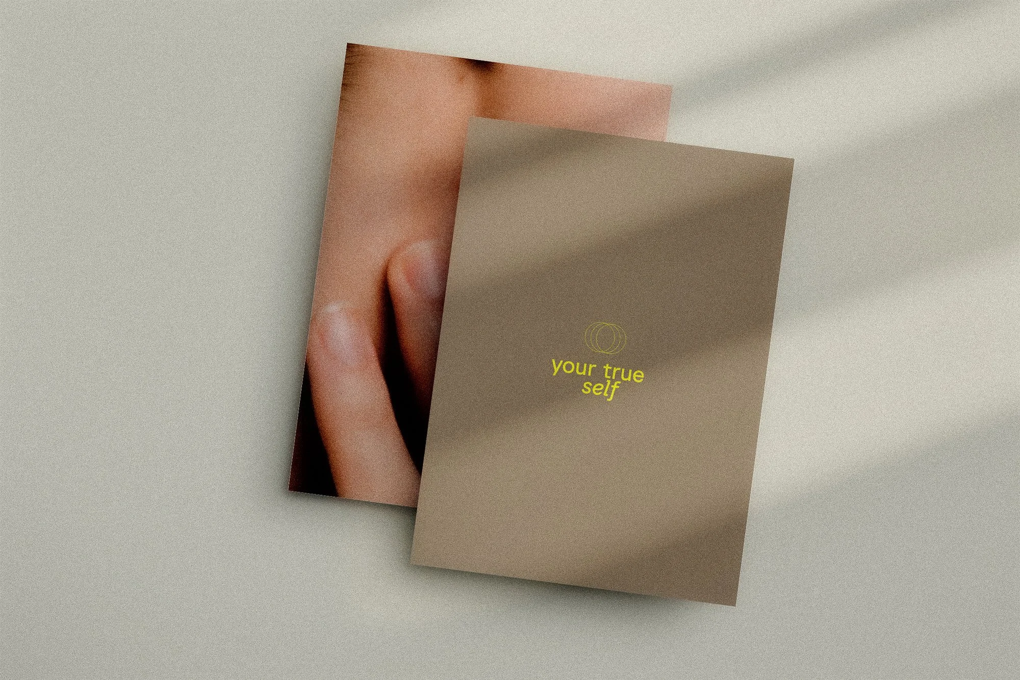
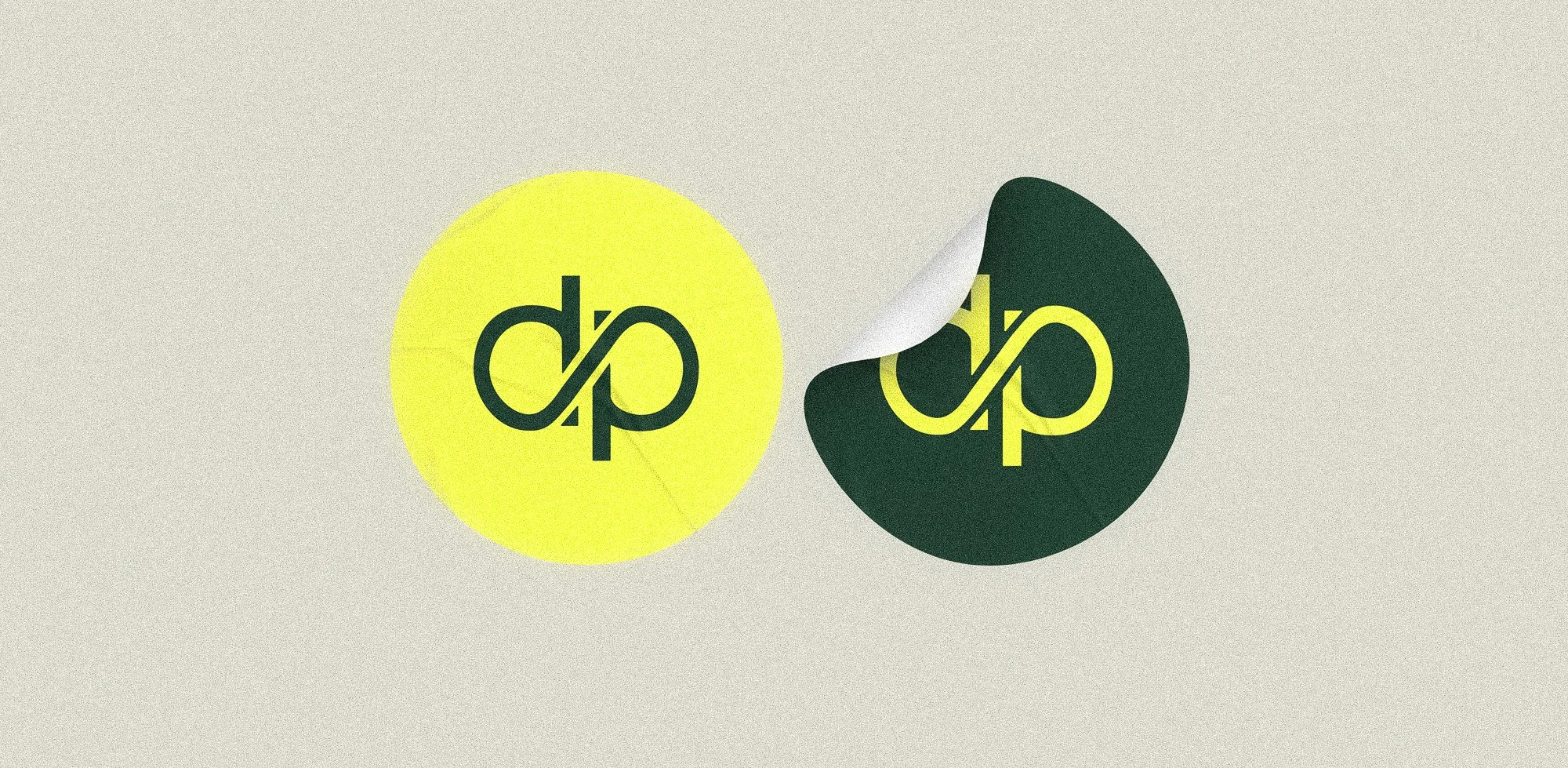
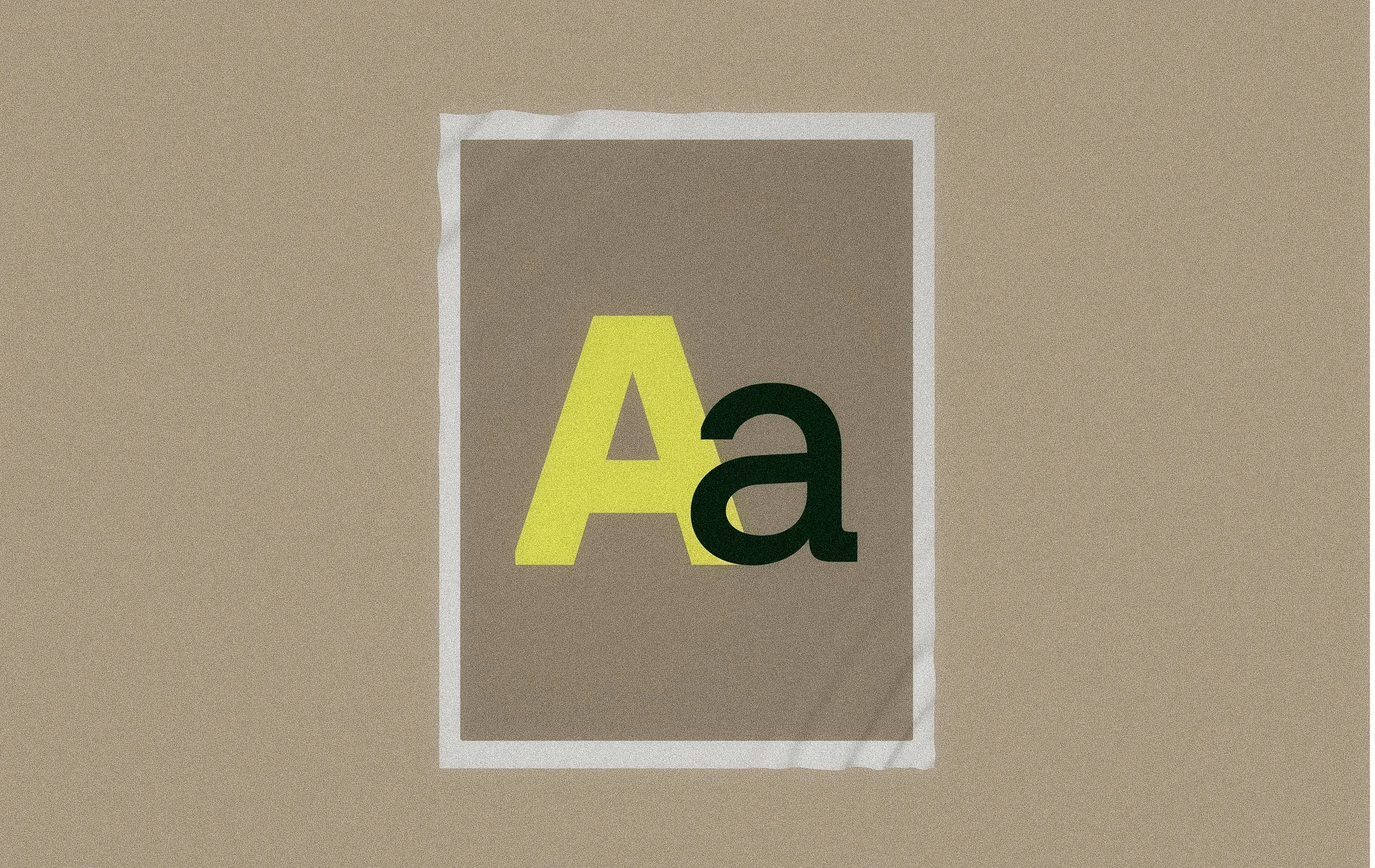
The wordmark is built on a deliberate typographic contrast. The de is set in a flowing script — loose, organic, expressive — while program is rendered in a clean geometric sans-serif. The pairing is intentional: fluidity meeting structure, the personal meeting the systemic. Together they say exactly what the methodology does — freedom, held by form.
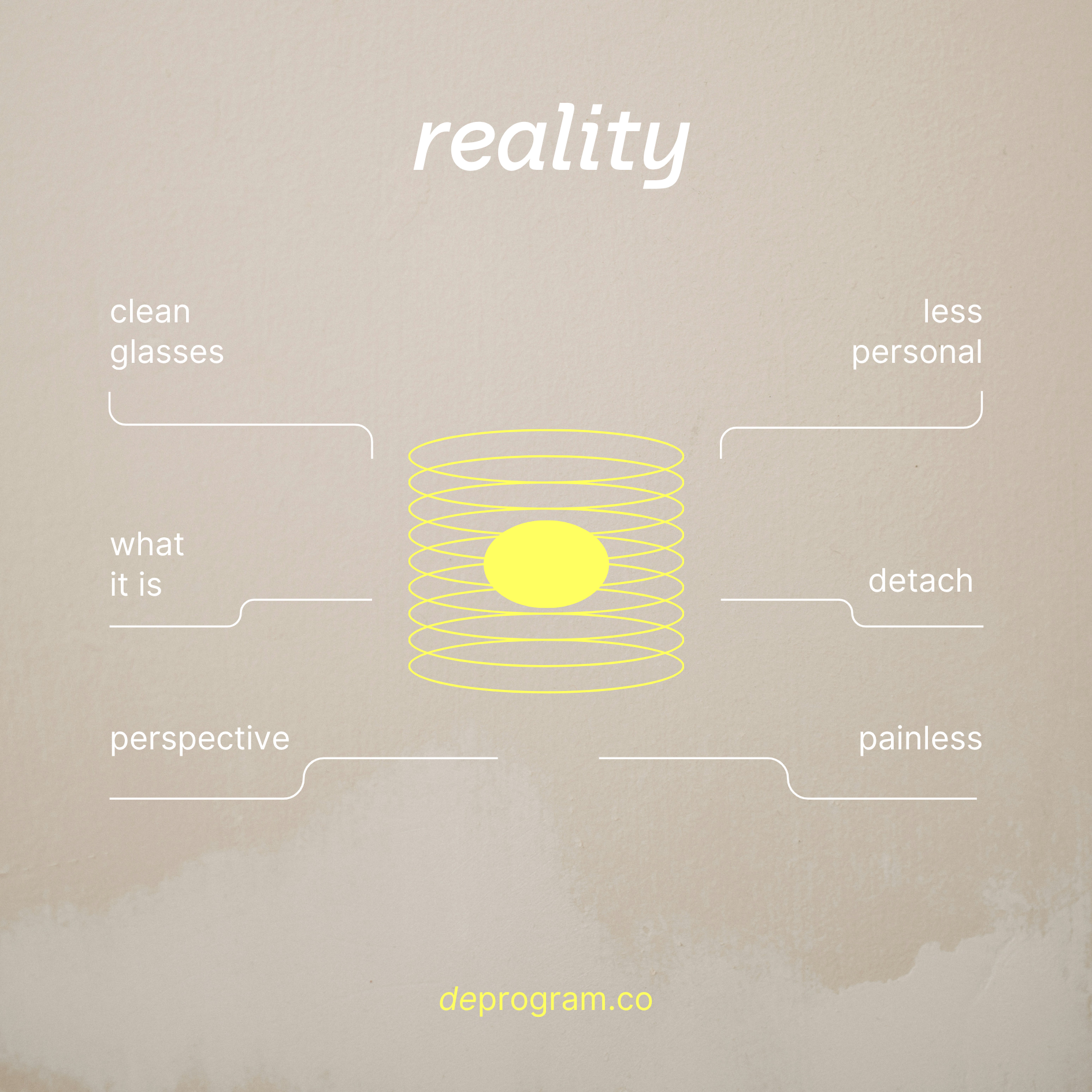
Nested within the letterforms, the d and p were drawn to form a broken infinity symbol. A cycle, interrupted. It works both as a mark and as a concept: the idea that the patterns we inherit can feel endless until, with the right support, they simply don't. The symbol carries the whole brand promise in a single gesture.
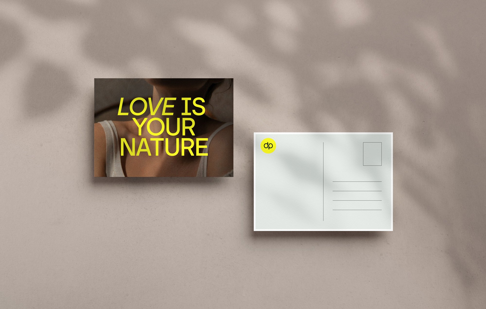
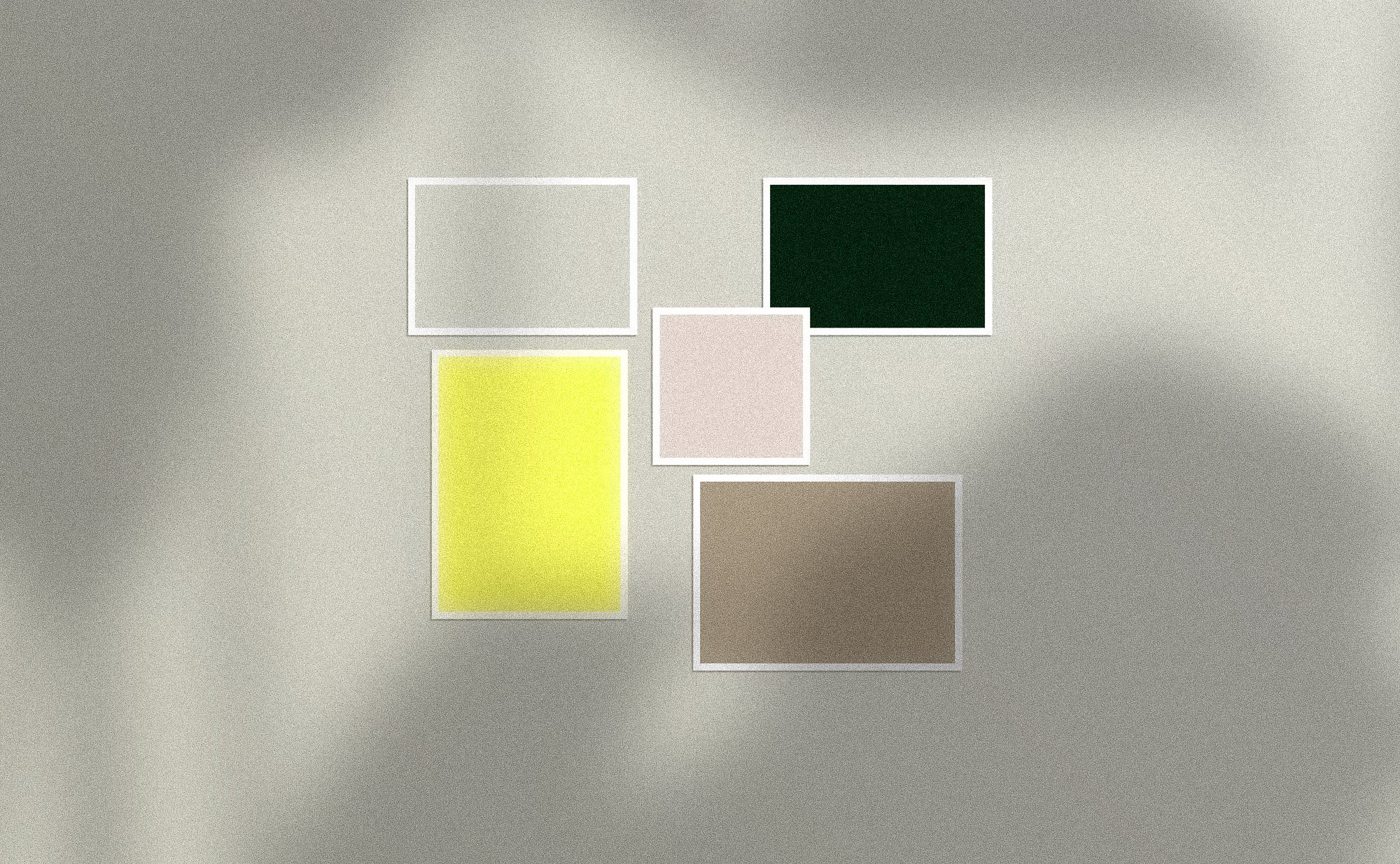
COLOR PALETTEThe color palette anchors the brand in contrast: a deep jungle green representing shadow and the unconscious, paired with a vibrant yellow-green that acts as light breaking through. These aren't decorative choices — they're a direct translation of the program's core arc, from conditioning to clarity. Warm beiges and soft pastels temper the palette, adding the human warmth and kindness that the brand voice required.
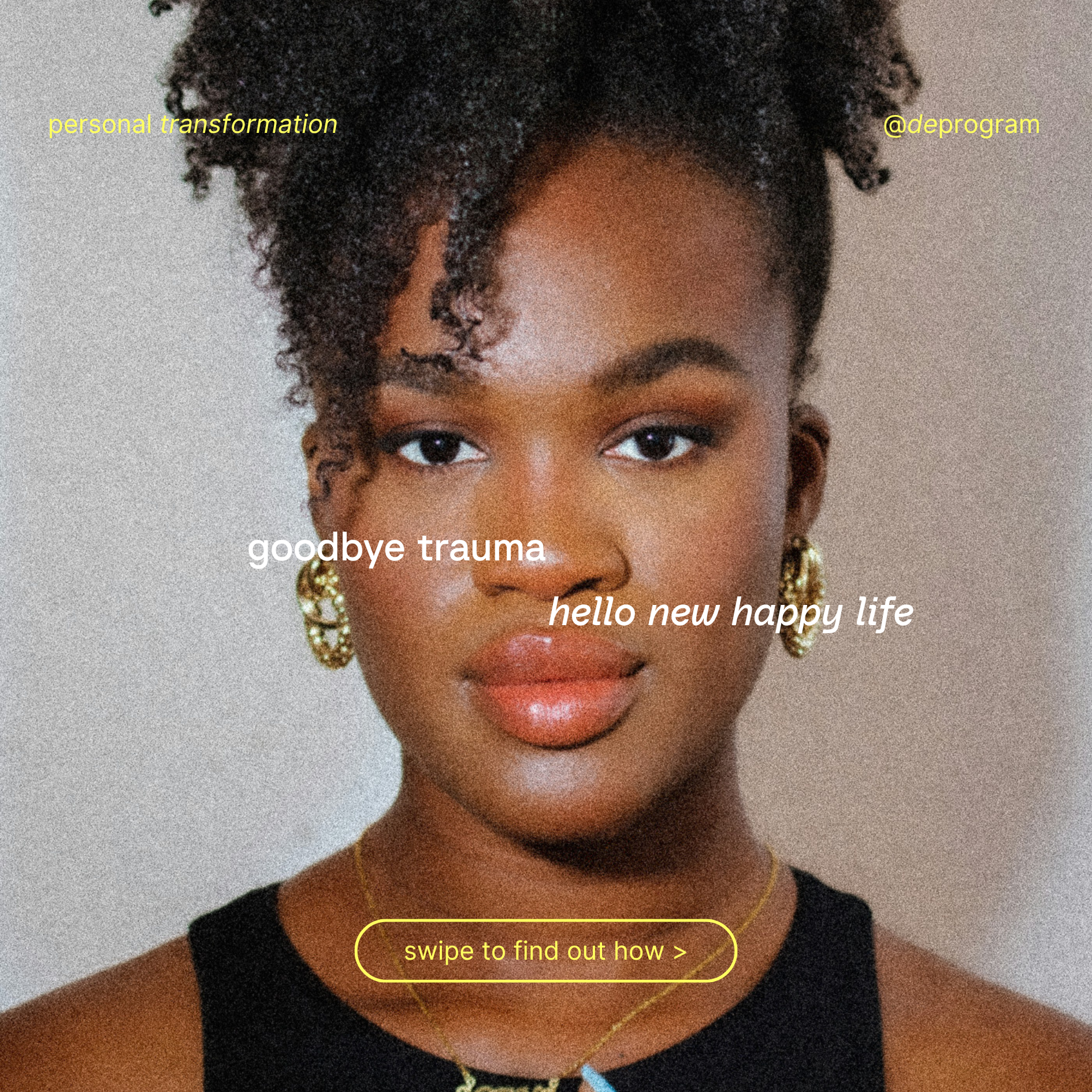
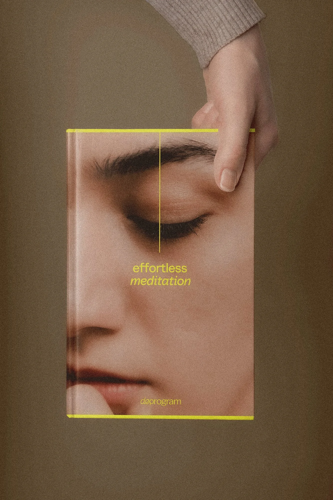
TYPOGRAPHYTypography follows the same logic. Bold, geometric sans-serifs communicate strength, structure, and confidence, while serif moments introduce softness and emotional accessibility — reflecting a voice described as empowering, insightful, and kind, all at once.
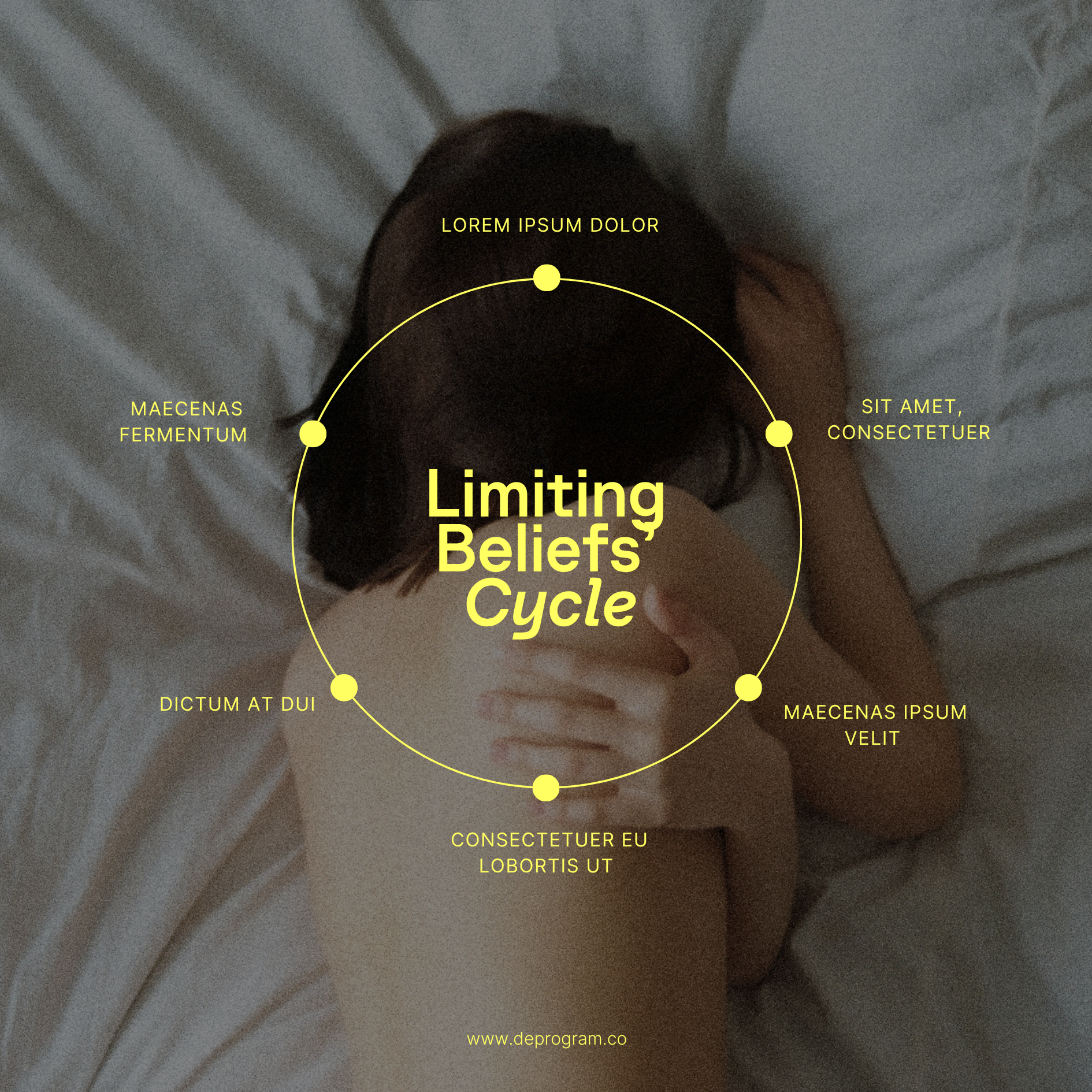
GRAPHIC ELEMENTSThe graphic language draws from geometric forms and fine linework: shapes that feel ordered and calm, yet alive with movement. These became the foundation for a custom illustration system capable of communicating complex psychological concepts with visual clarity and elegance.
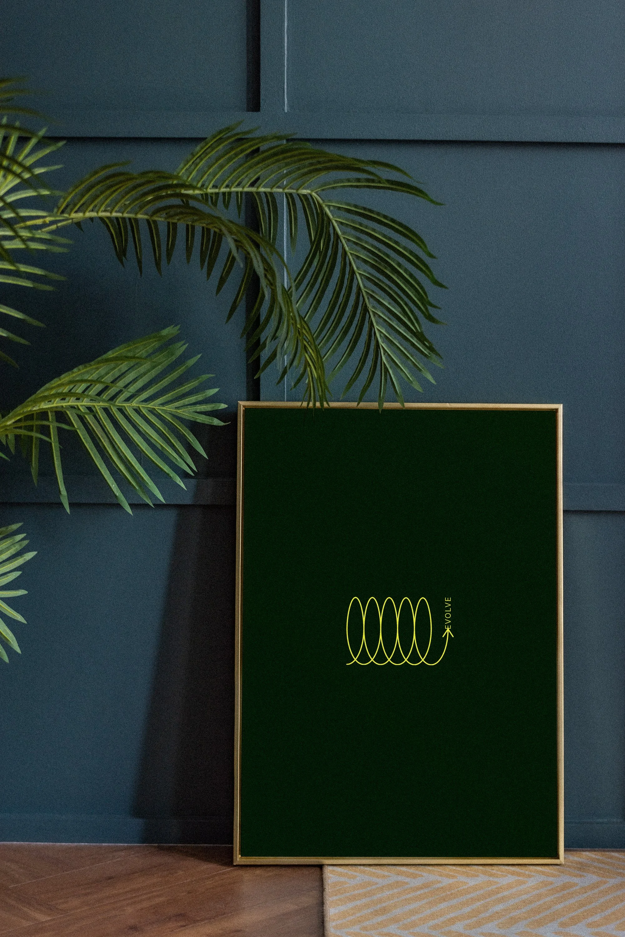
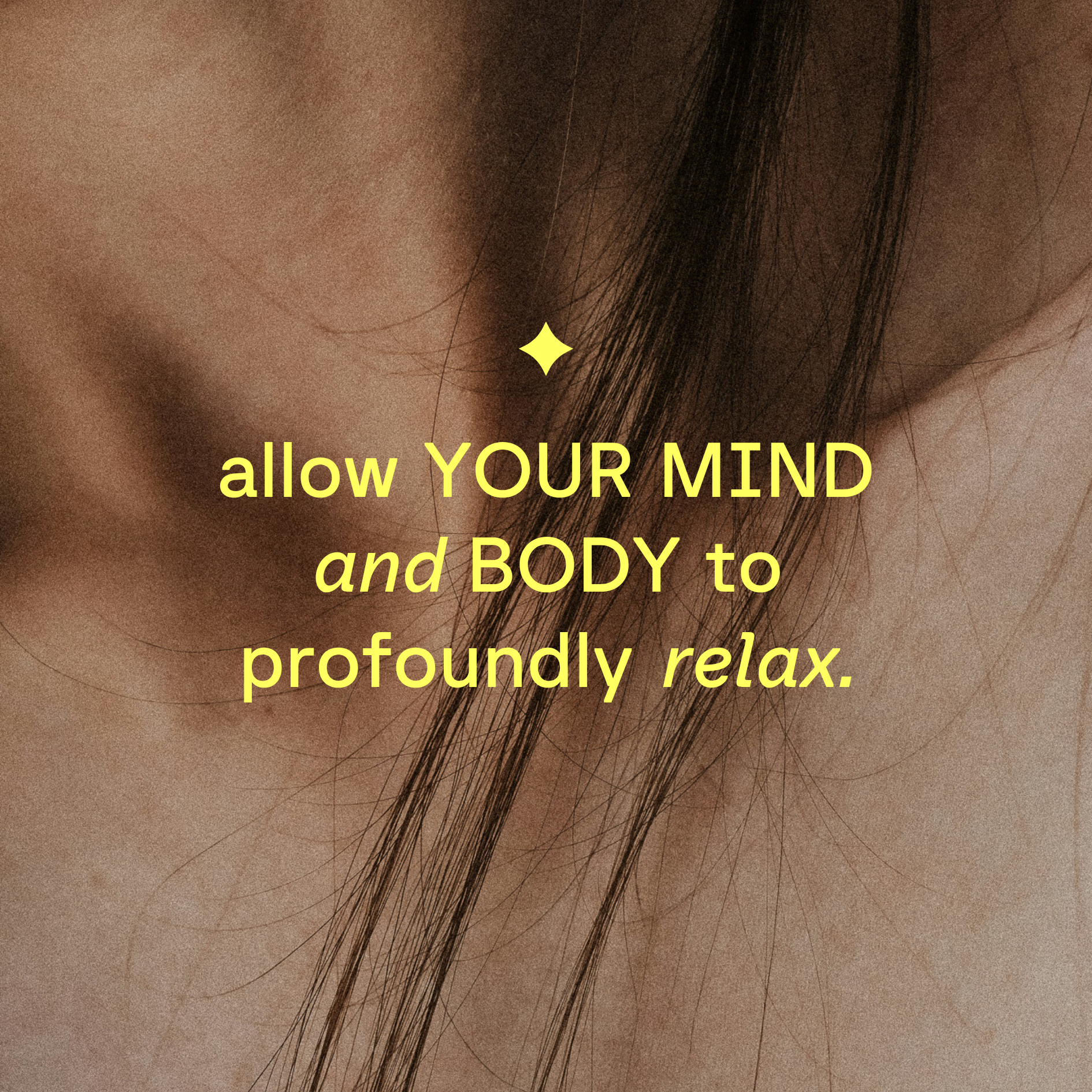
PHOTOGRAPHYPhotography direction leaned into analog grain, intimate depth of field, and intentional imperfection — grounding the brand in real human experience rather than aspirational polish.

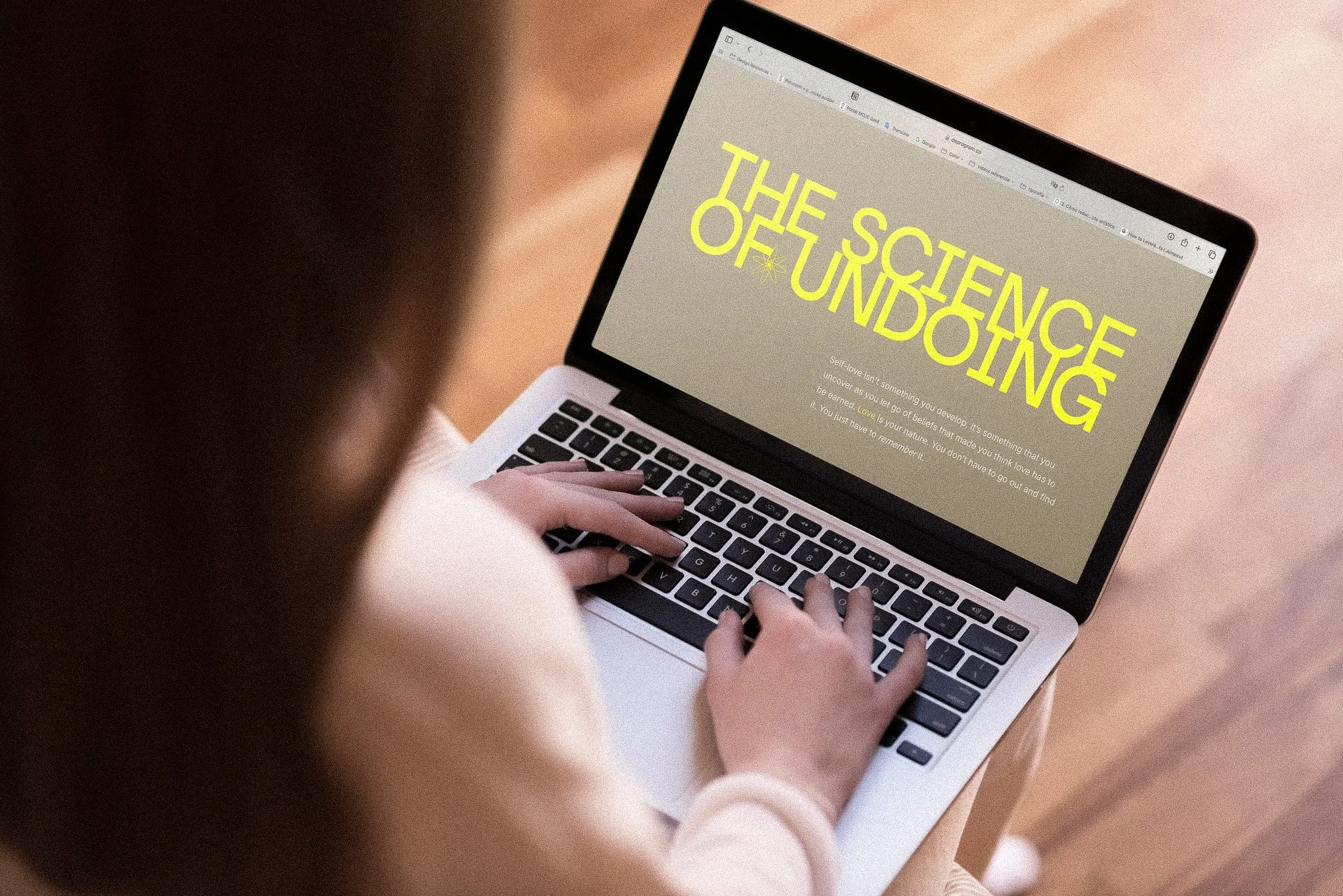
websiteSOCIAL MEDIA