BAR KOTAK
JAPANESE-INDONESIAN FUSION BAR
DHARMAWANGSA HOTEL, JAKARTA - INDONESIA
VISUAL IDENTITYMENU DESIGNsocial mediaCOLLATERAL DESIGNwebsite designTHE PROJECTOur client had a beautiful Japanese restaurant in the lobby of Dharmawangsa Hotel in Jakarta, Indonesia called Shikaku. They were looking to now create a sister bar, that would be next to the restaurant in the same location. Shikaku means square in Japanese, and they wanted to call the bar Kotak, which means square in Indonesian. We thought it was a perfect play on meaning and embraced the idea and concept of the dual square.
They wanted us to create a more structured identity for the bar and something that would connect both spaces.


the processShikaku and Bar Kotak are two sides the same square. Two businesses rooted in the same principles of elegant simplicity and Omotenashi. At the same time, each with its unique essence and singularities.
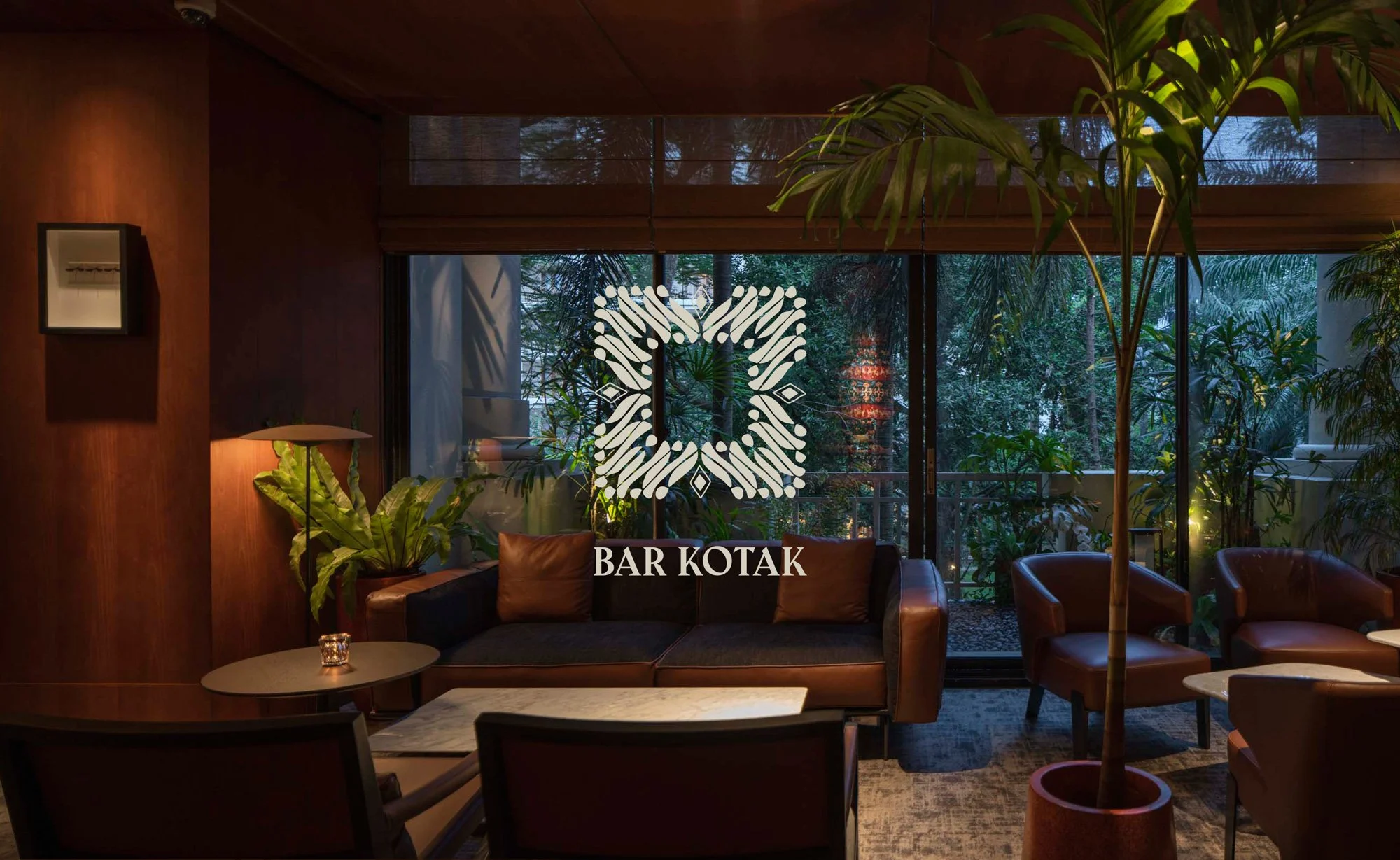
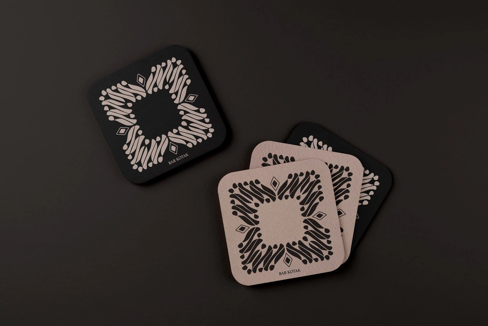
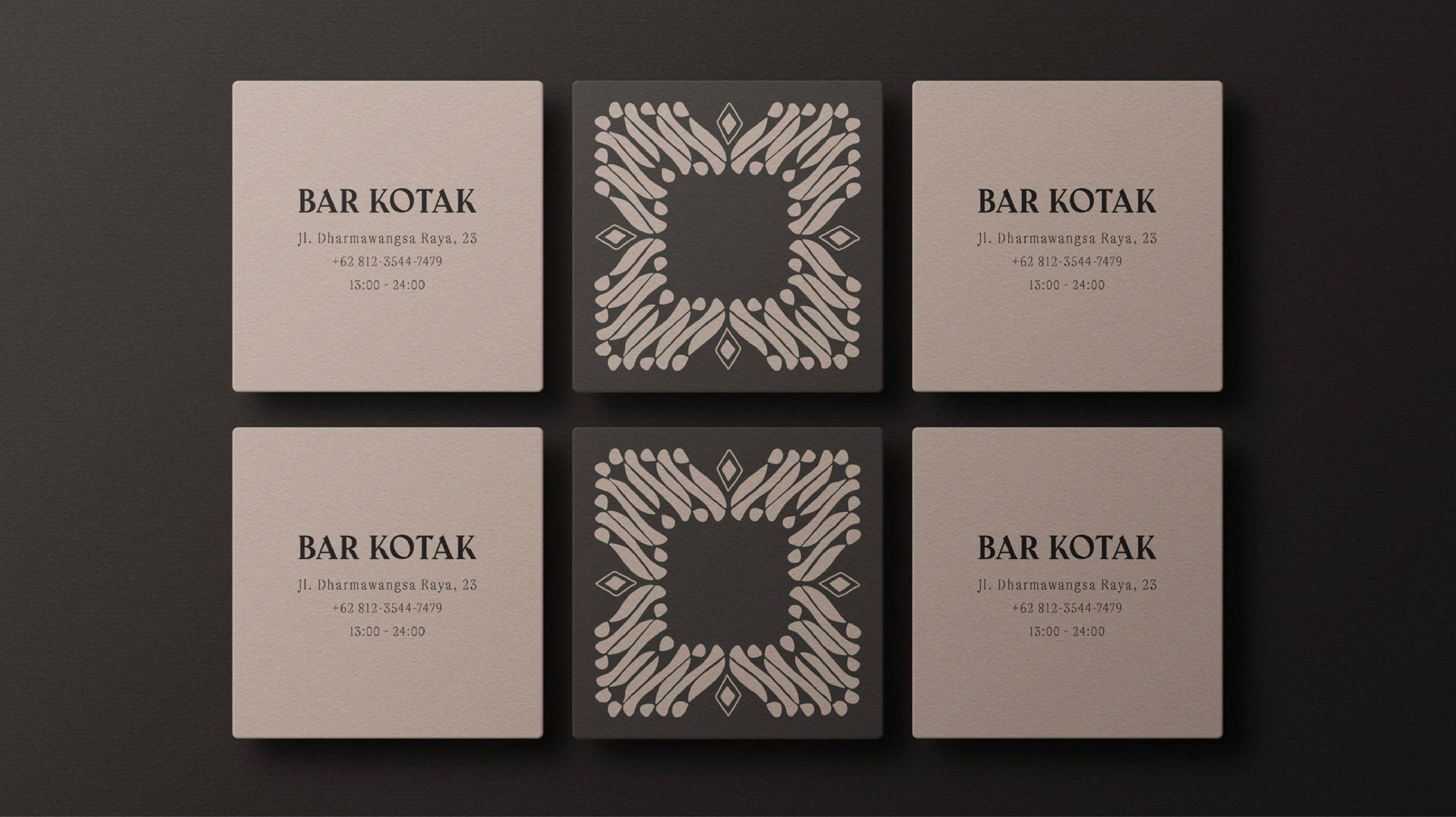
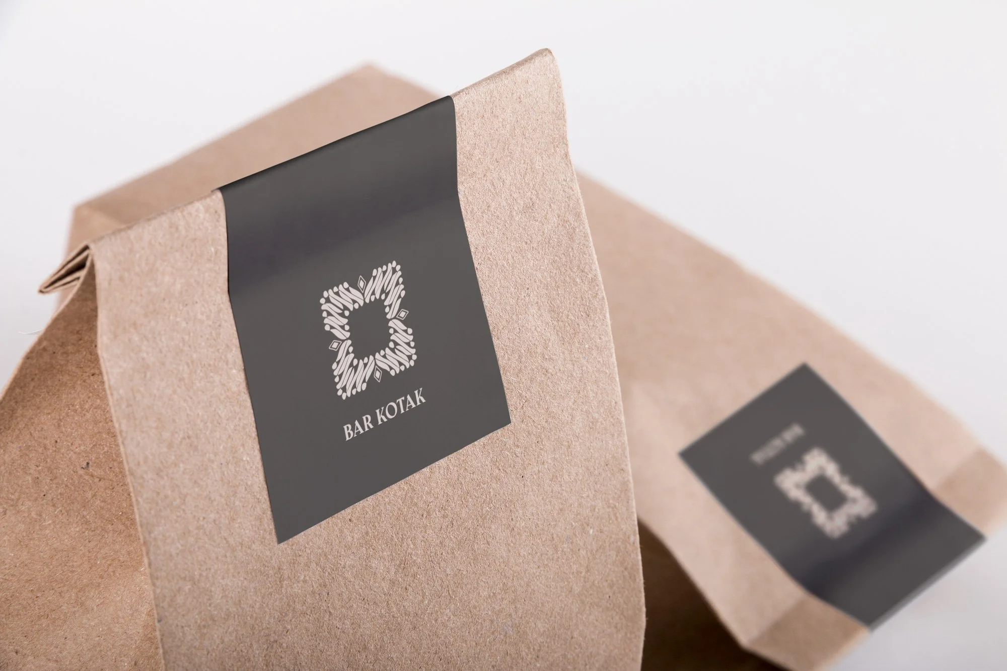
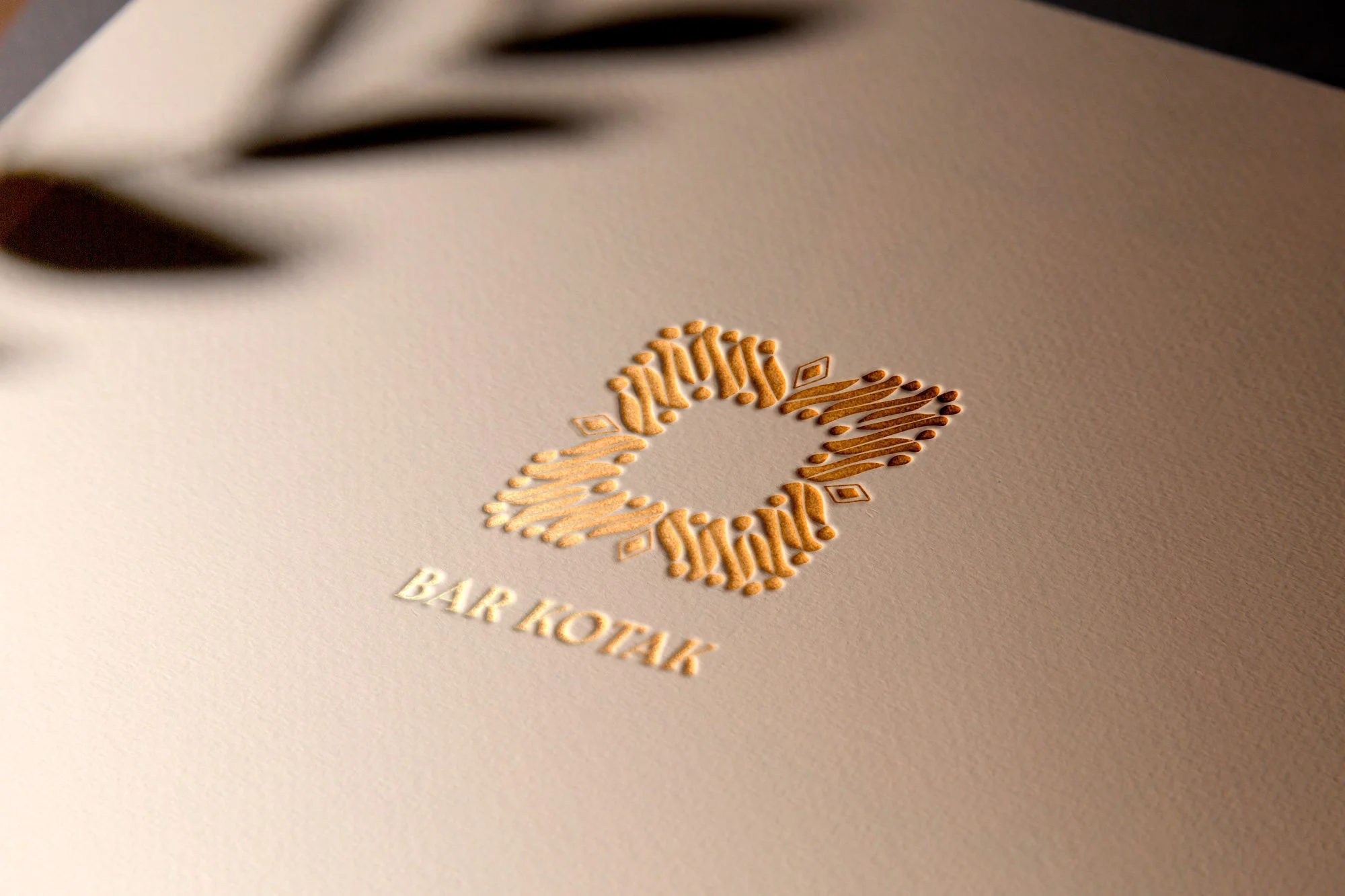
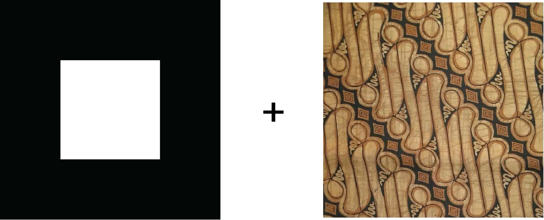
In order to connect these two businesses through their identity, we chose to maintain our commitment to the square; this will become the brand’s visual DNA.
A square represents harmony, balance, stability and structure. Some of the main traits of Japanese culture and, as a consequence, of its gastronomy.
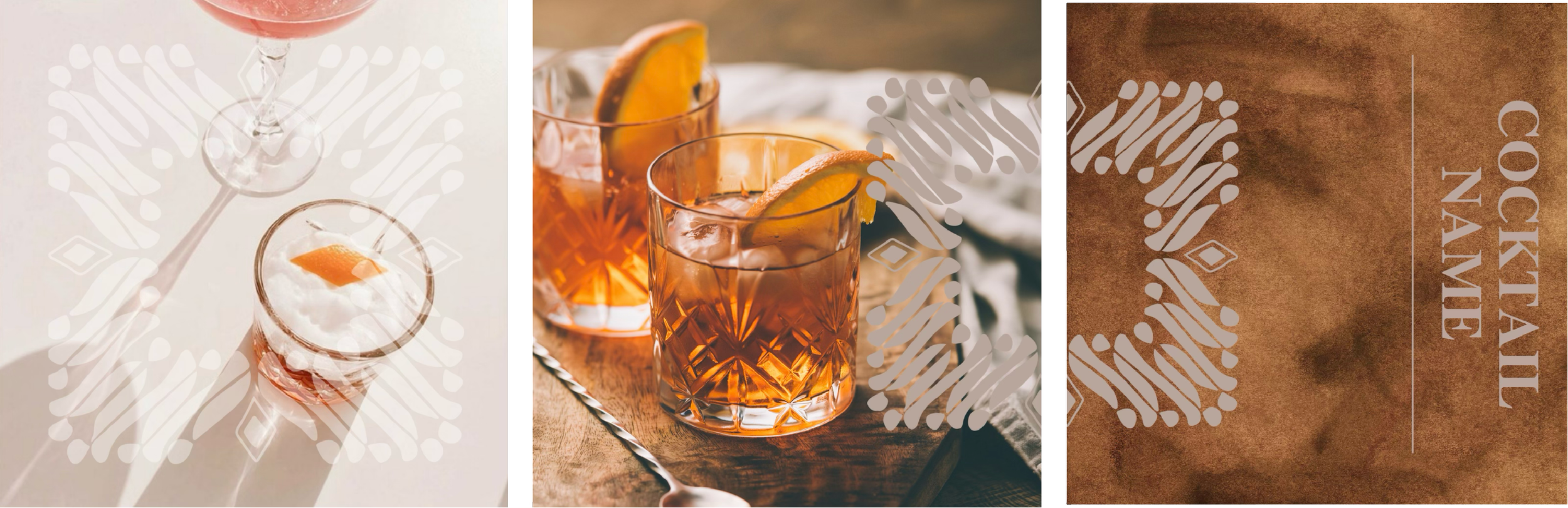
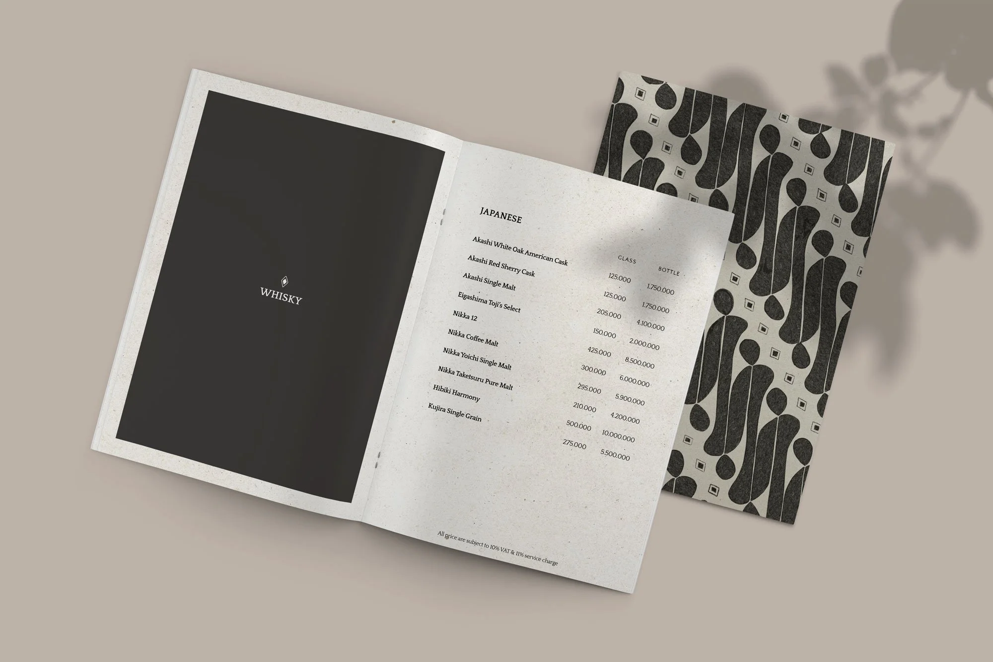
However Kotak’s square is very different in nature. For that reason, and to emphasize its Indonesian roots, we decided to experiment with an additional visual element that would give Kotak its unique essence and character: Batik prints. An artistic form that, just like Kotak’s essence is creative, smooth, elegant, and playful.

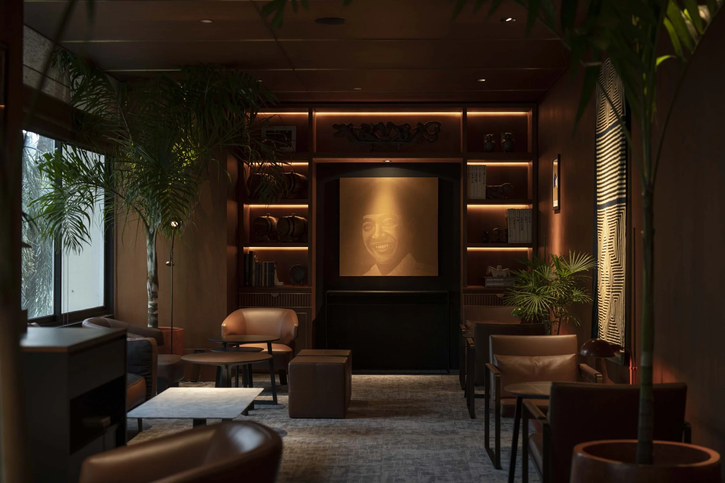
the conceptKotak means square in Indonesian — and just like the language it comes from, Bar Kotak carries an elegance that never announces itself. There are no ostentatious gestures here, only the quiet confidence of natural materials, fine craftsmanship, and beauty in its most honest form. The brand is rooted in tradition, local wisdom, and flavour — and that grounding gives it an unmistakable, deeply seductive character.
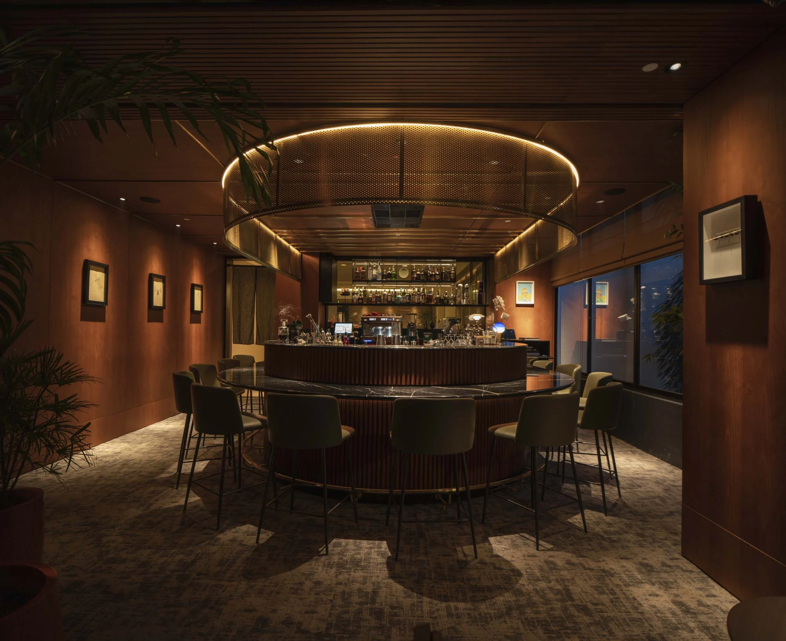
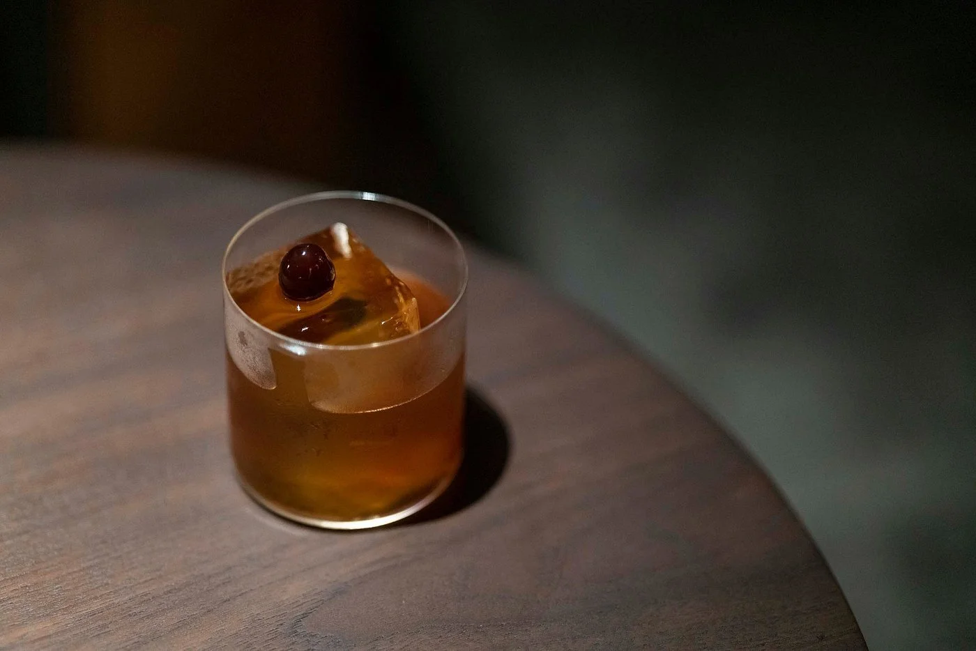
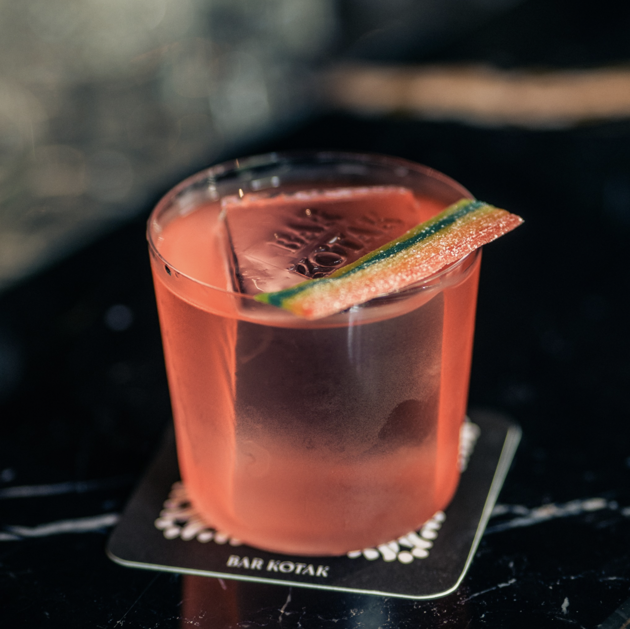
Being at Kotak is a lush experience. Premium spirits, finely crafted cocktails, and smooth jazz blend into something that feels effortless — a space where people slow down, open up, and genuinely enjoy themselves.
Creativity and playfulness live here too, but they're found in the details. The environment recedes just enough to let the senses move outward — toward the music, the conversation, the glass in hand. It's a more unstructured kind of pleasure, one that invites guests to let loose without ever losing the sense of care. The service, guided by the principles of Omotenashi, is warm and participative — present without being intrusive, attentive without being formal.
keywordsOrganic
Natural
Craftsmanship
Tradition
Local
Elegance
Boldness
Warmth
Lush & Seductive
THE MOODBOARD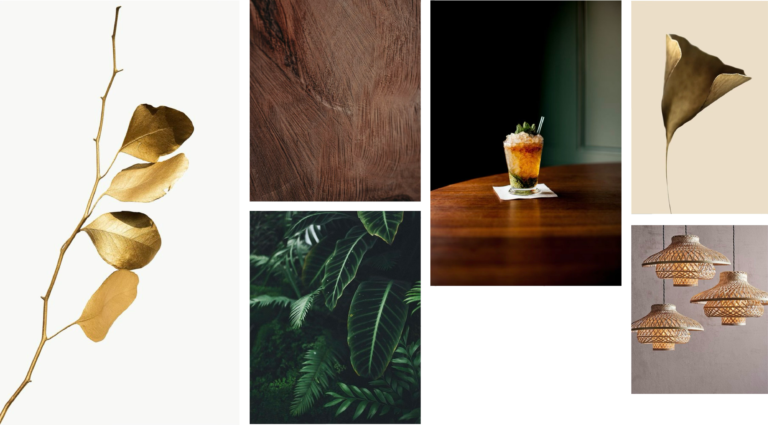
visual identity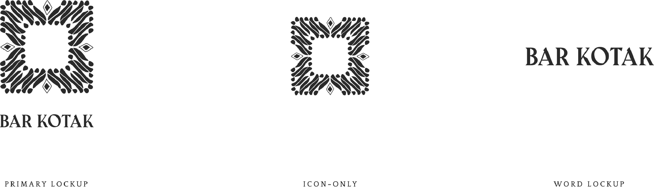
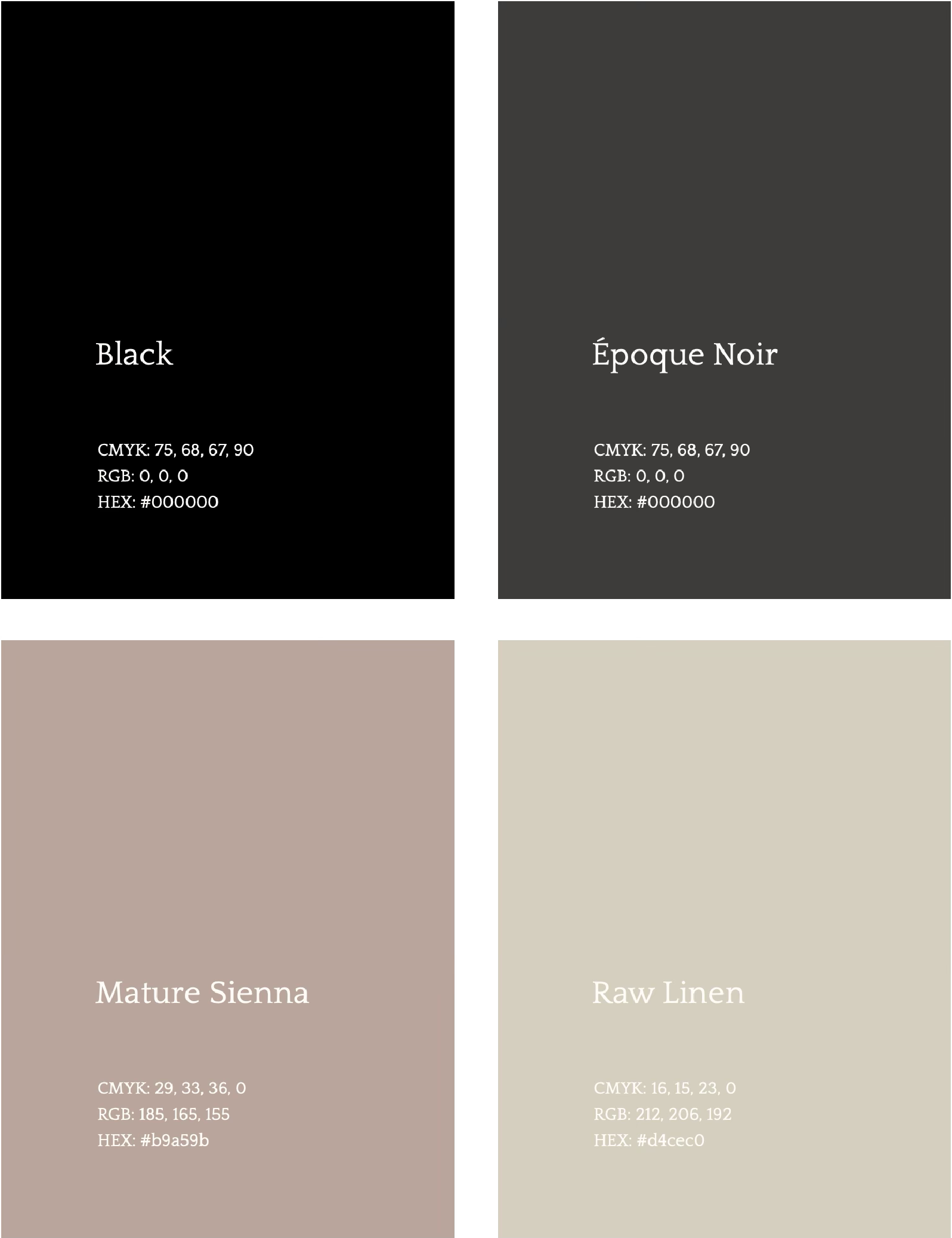
color paletteBar Kotak's color palette is drawn from nature in its most honest form — unpolished, grounded, real. Black anchors the identity as one of its primary colors, but rather than a flat, graphic black, we favor Époque Noir: a deeper, warmer shade that breathes and recedes, making space for everything else to shine.
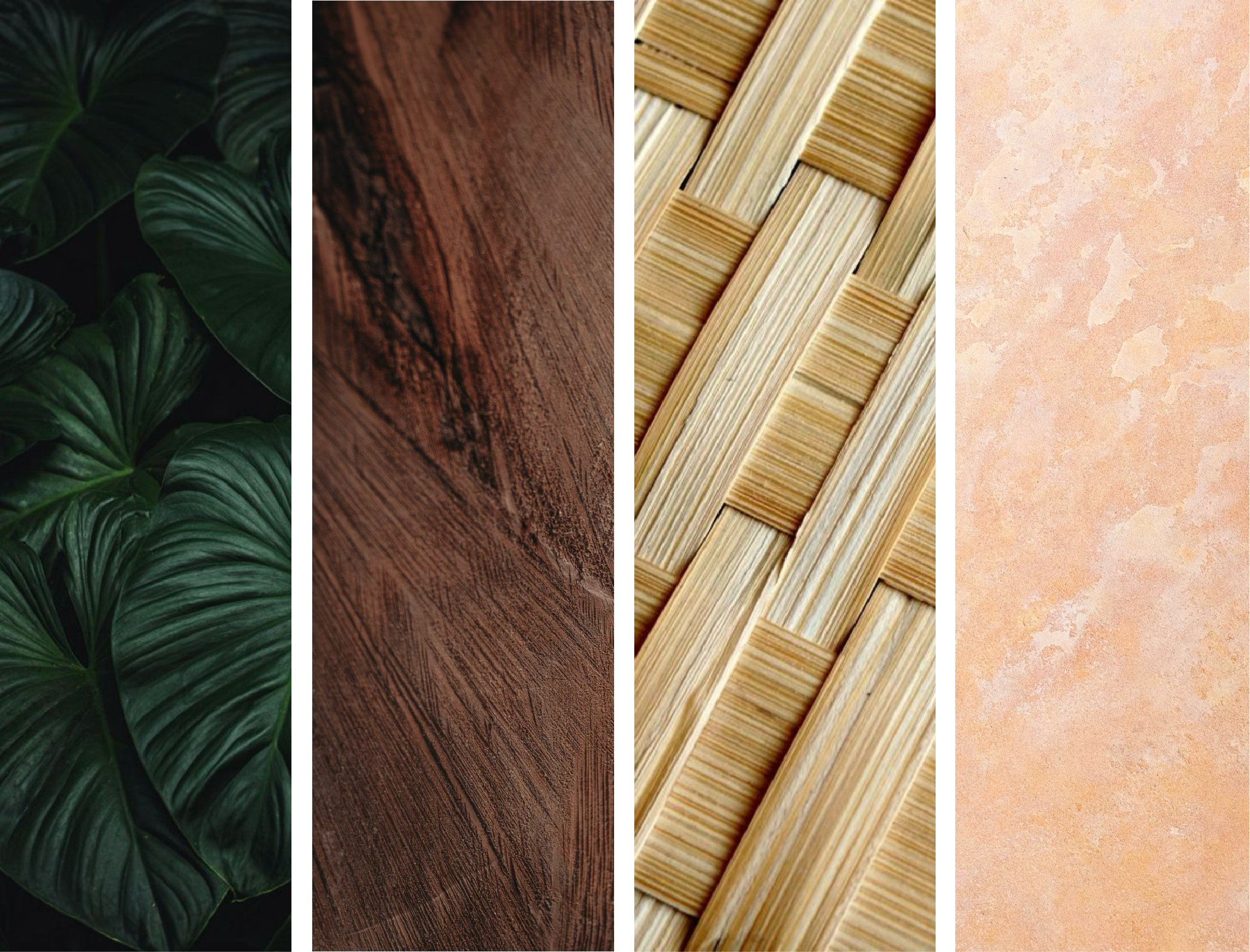
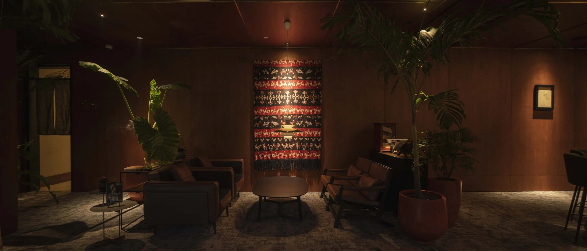
textures & materialsThe materials and textures of Bar Kotak are drawn from the natural world around it. When handled with intention, they become an extension of the visual identity — grounding its elegance in something tangible and real.
Dark woods, natural fibres reminiscent of traditional Indonesian craft, luxurious stone surfaces, and the deep, lush tones of tropical vegetation. Nothing imposed, nothing excessive — just the quiet richness of materials that have always been there.

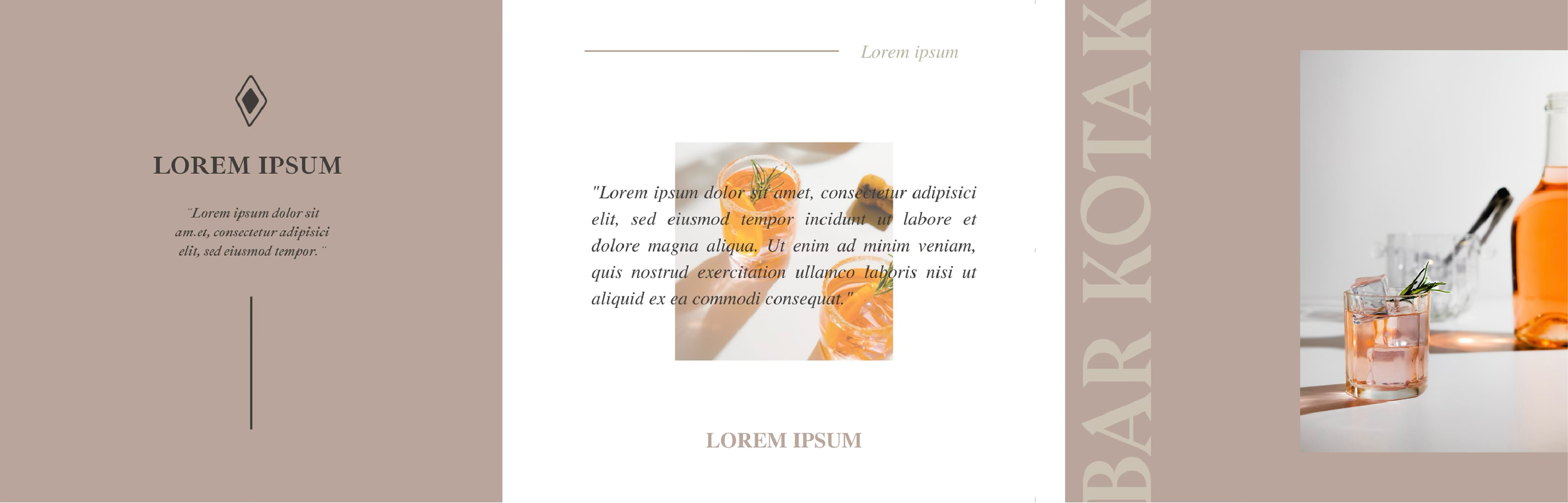
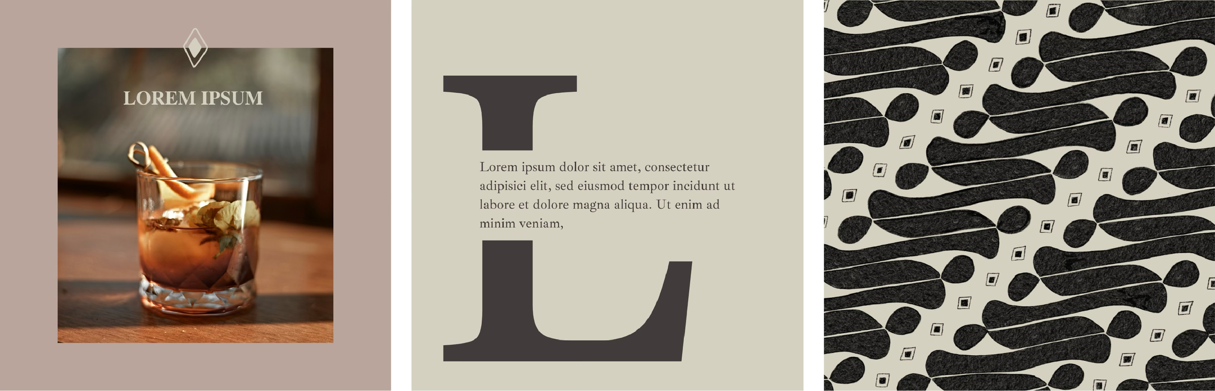
SOCIAL MEDIA