BONDING BLENDS
TEA BLENDS & WORKSHOPS
AMSTERDAM, NEETHERLANDS
VISUAL IDENTITYCOLLATERAL DESIGNPACKAGINGphotography GUIDELINESTHE PROJECTAzar is a mother, grandmother, and wife living in Amsterdam who wanted to build something that was entirely her own. Tea was the obvious place to start — it's her lifelong passion, and it carries her happiest memories. Bonding Blends is the result: her own line of tea blends, alongside tastings, workshops, and consultations.
Because the brand grew out of something so personal, a generic wellness-tea look was never going to work. It needed to feel close to her — warm and romantic, but also elegant and premium — and it needed to carry her heritage without spelling it out. Her own brief said it best: it should give people both an "aww" and a "wow." That feeling, more than any single deliverable, was what we were designing for.
the conceptThe name holds the whole idea: connection and blending. The question was how to make that visible — and the answer was watercolor.
Watercolor behaves exactly like tea. Tea releases its color and character into water; pigment does the same. And in water, different pigments travel toward each other, meet, and blend — the way flavors come together in a blend, and the way people connect over a cup. So watercolor isn't decorative here. It's the concept itself, made visible.
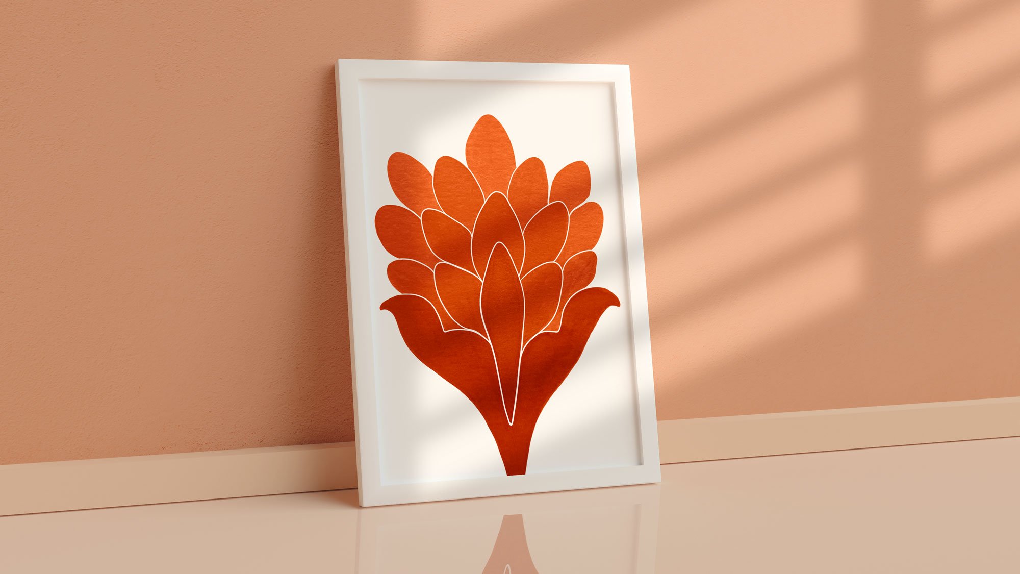
The technique mirrors how a blend is actually made. A good blend is patiently layered — flavors balanced so the whole feels harmonious, while each ingredient can still be tasted on its own. Watercolor works the same way: wet strokes laid over dry ones, building depth and letting new colors emerge where they overlap. The finishing details come last — fine marker lines, organic pencil marks, dry-brush texture — because quality lives in the details.
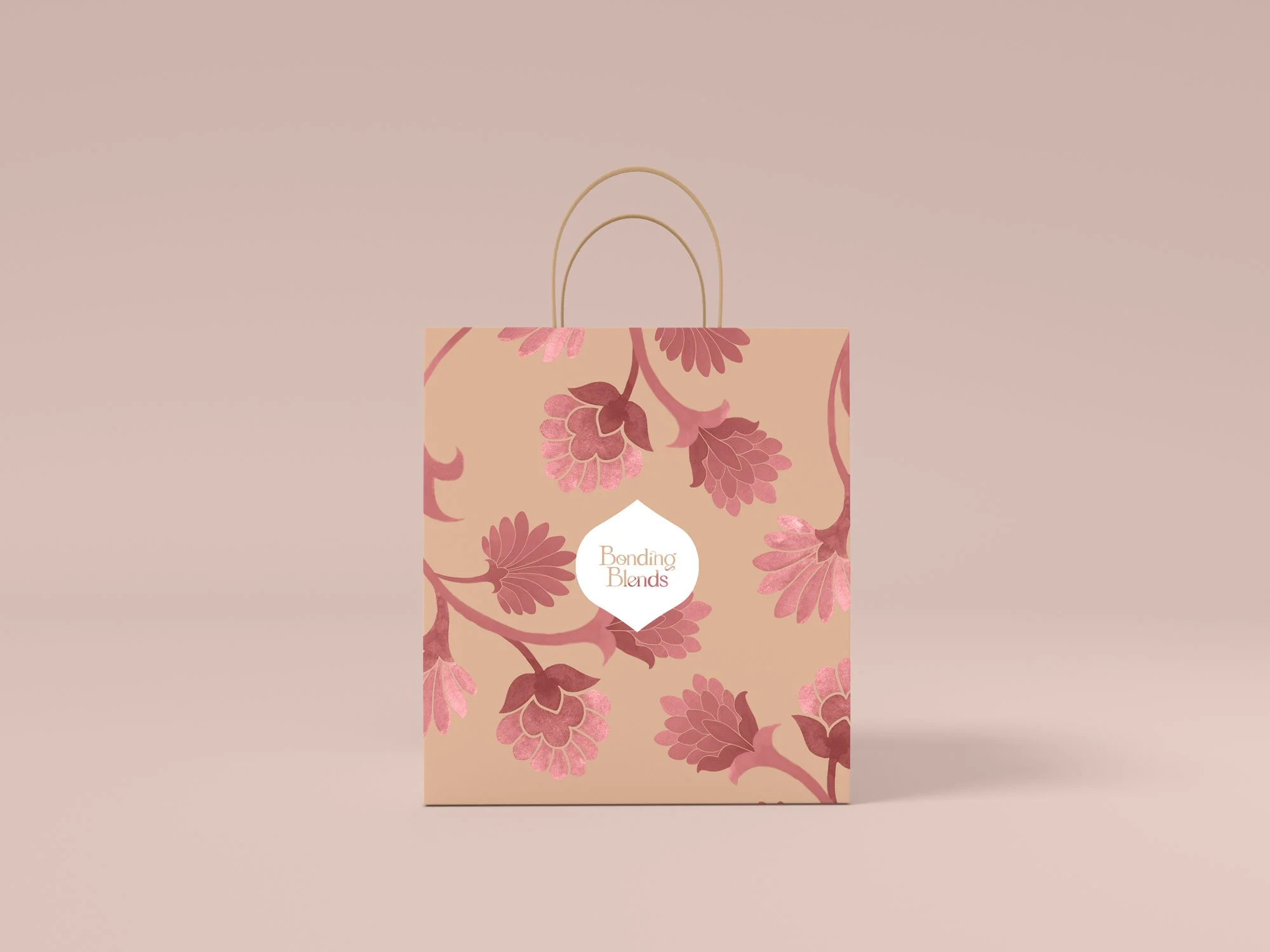
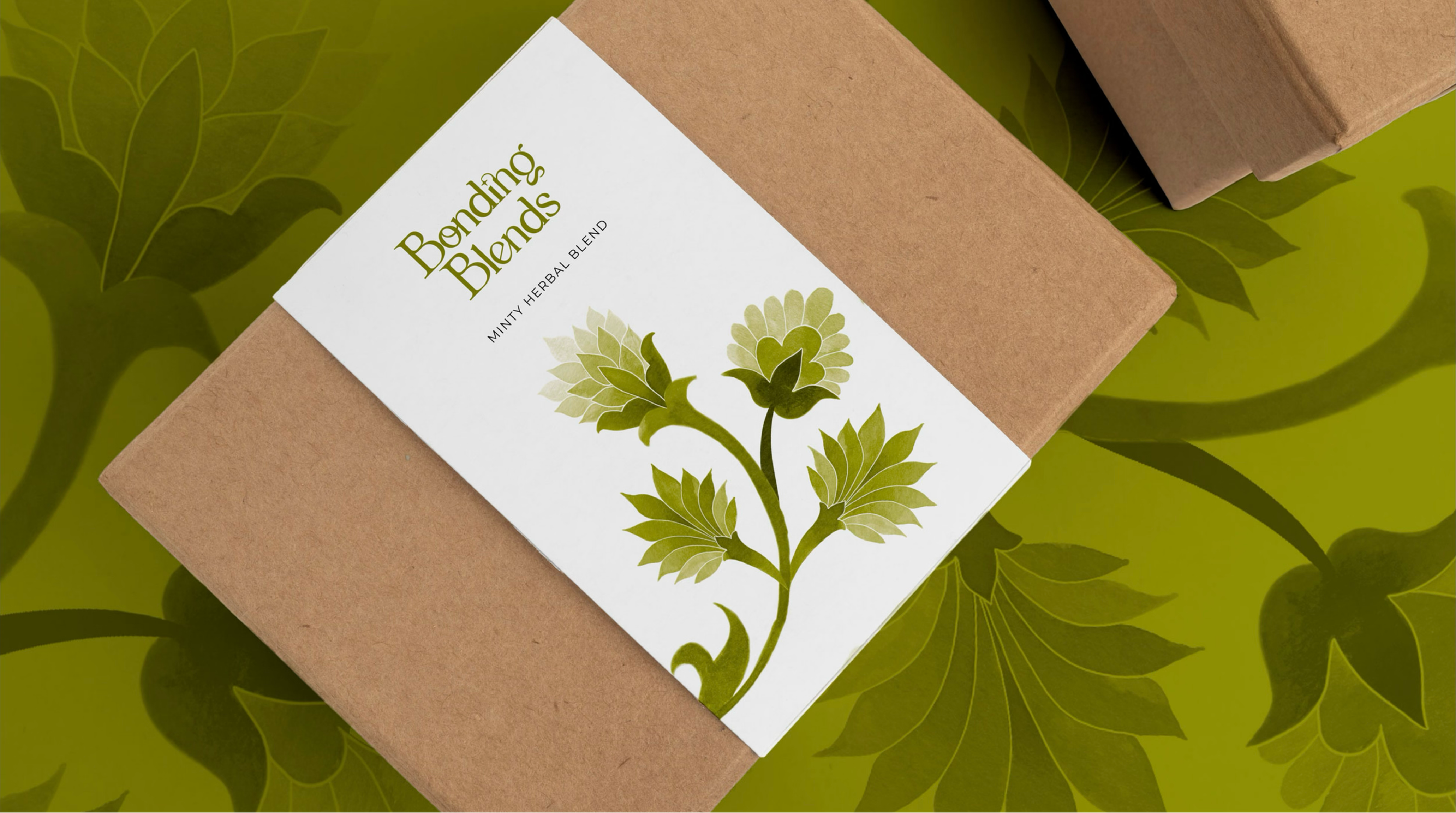
The motifs themselves draw on Azar's Persian heritage and the garden of her childhood: blossoms, folk patterns, the warmth and calm she grew up around. Painted by hand, they keep the brand romantic and personal — beautiful in a simple, unbusy way.
keywordsConnection
Blending
Heritage
Romance
Beauty in simplicity
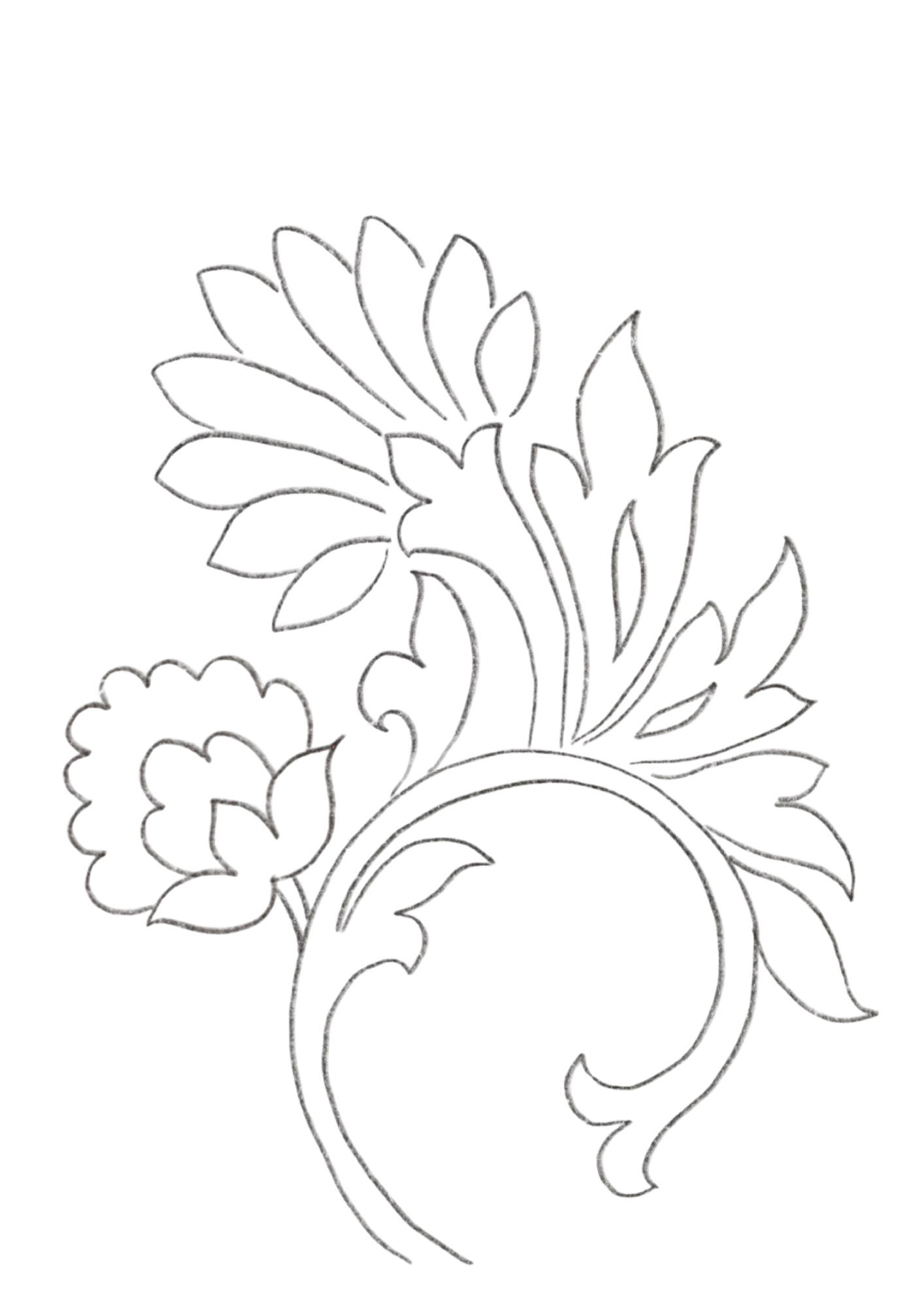
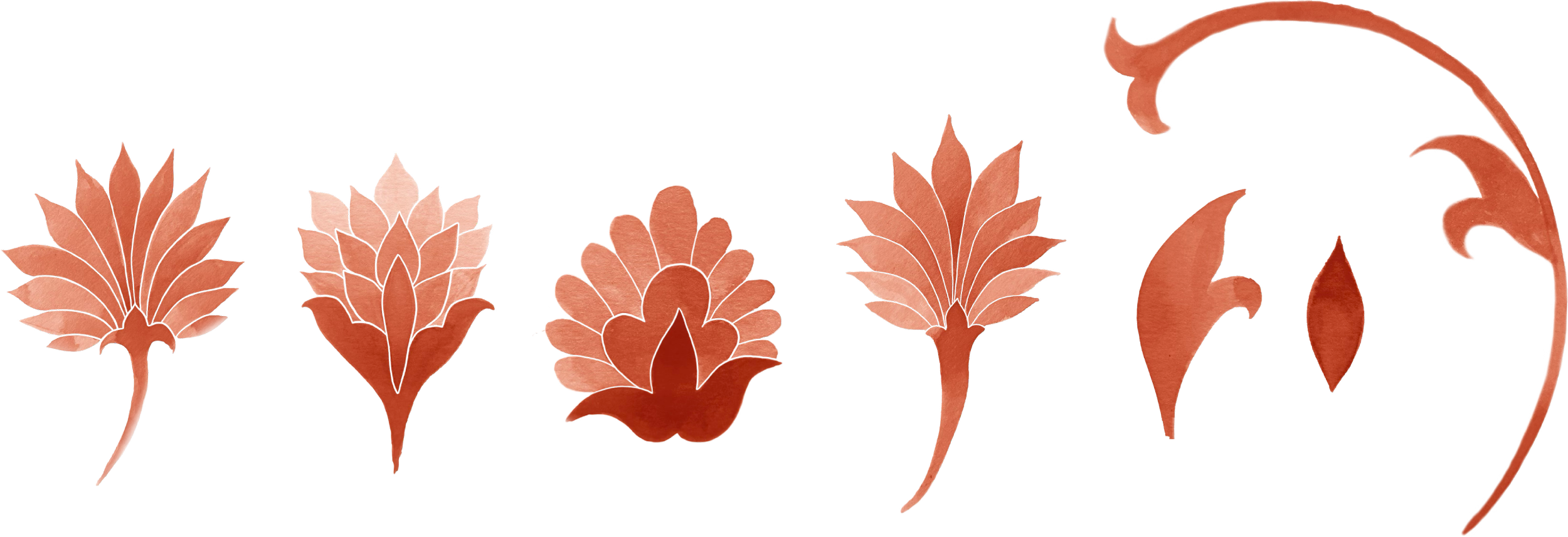
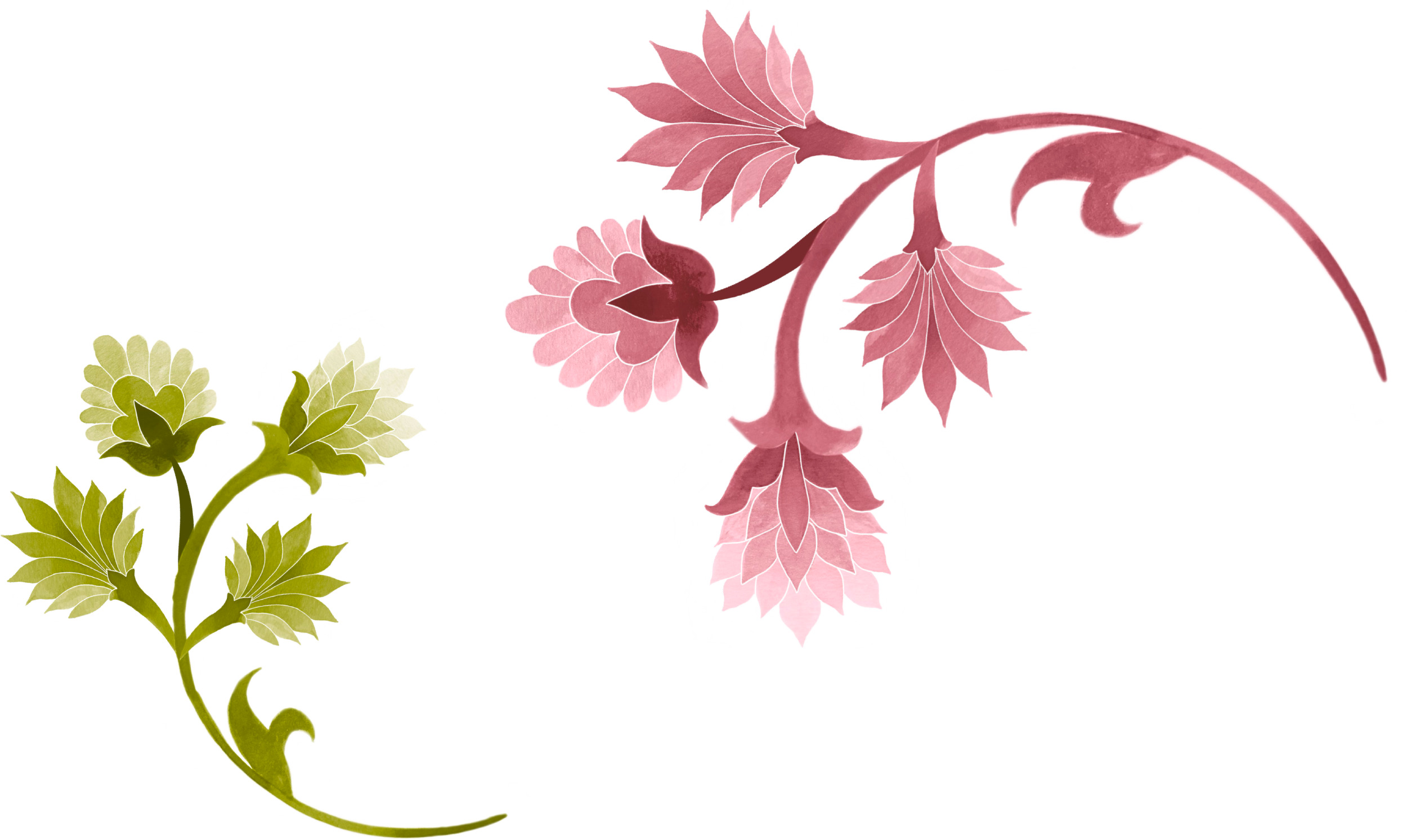
Persian RomanceWe've taken traditional Persian flower and pattern art as inspiration and starting point for shape exploration.
We sketched out the most beautiful and expressive flowers to craft them with watercolors.
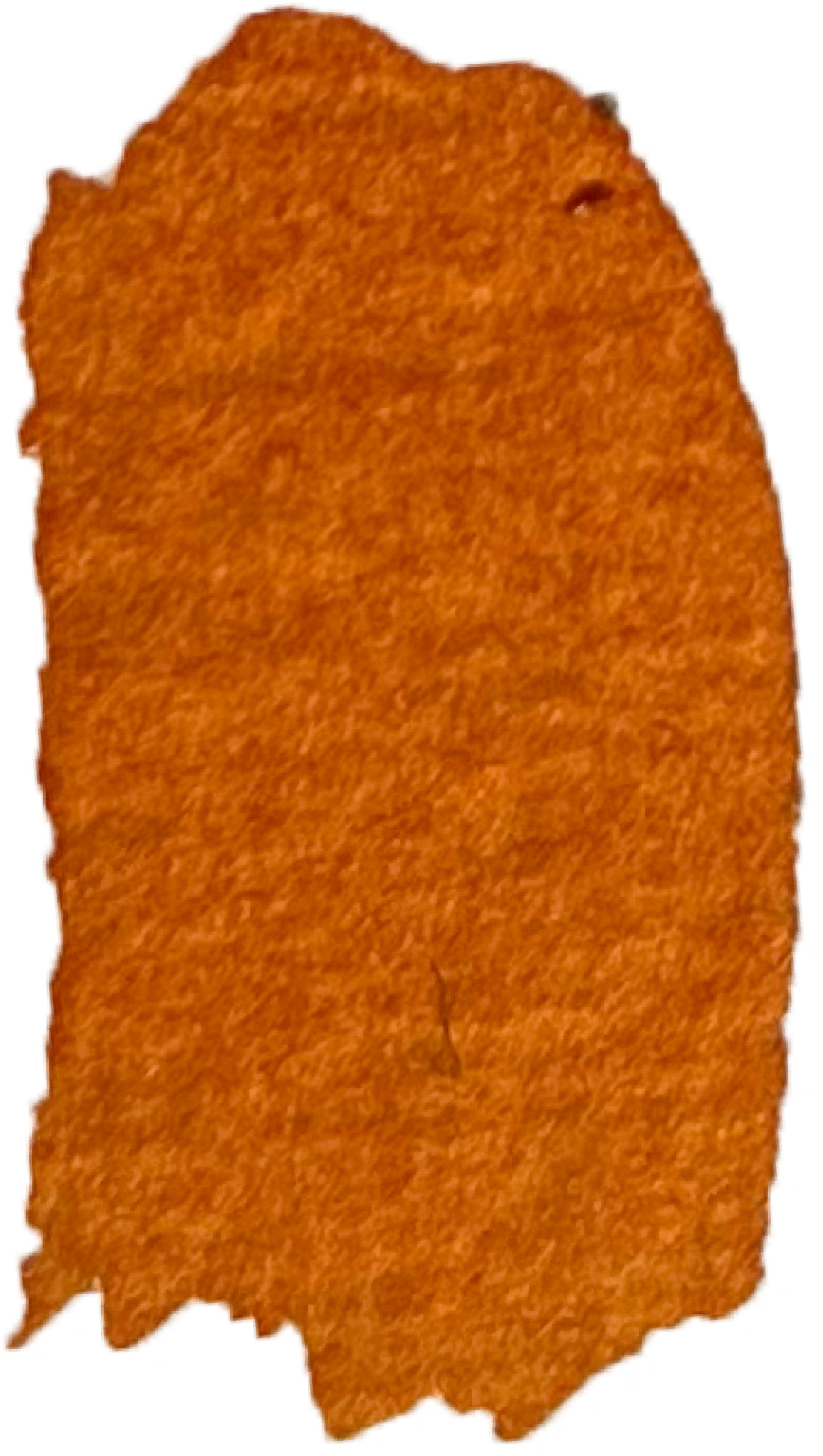
watercolorBecause of their imperfect quality, watercolor strokes act as metaphor for humanity and connection. They are also a striking and elegant visual element that supports our identity and helps add color in a tasteful way.
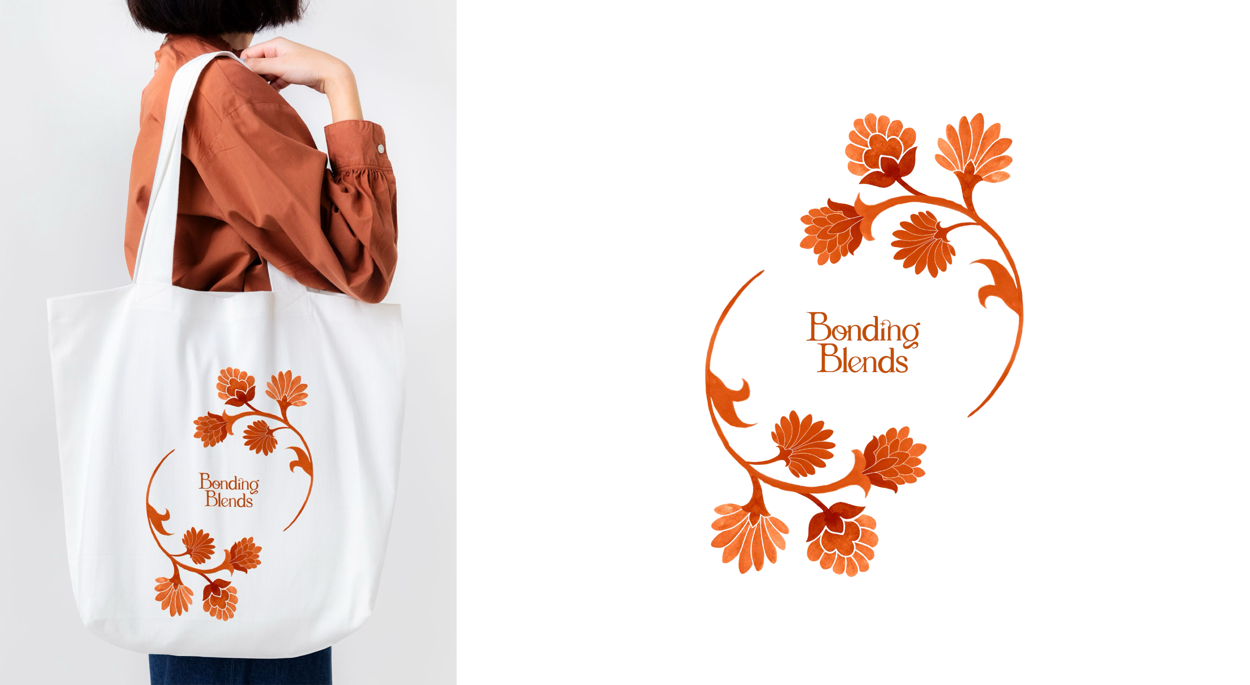
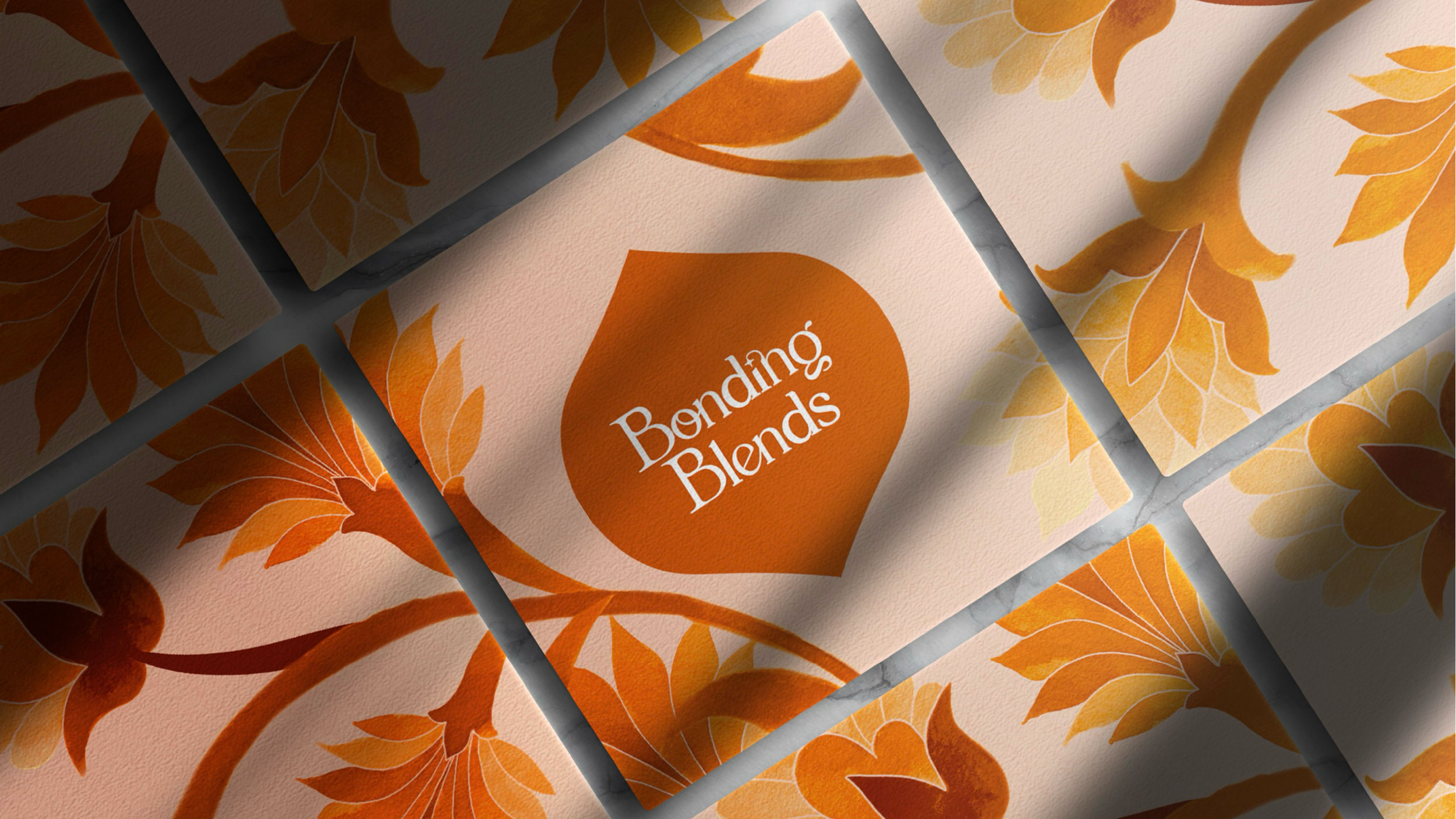
visual identity
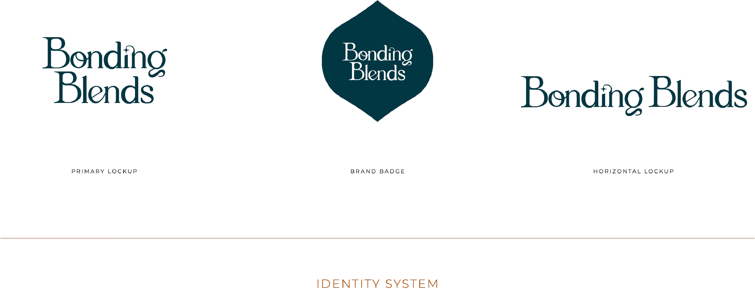
The logotype uses soft, rounded serif letterforms — curves and fine lines that feel romantic and warm.
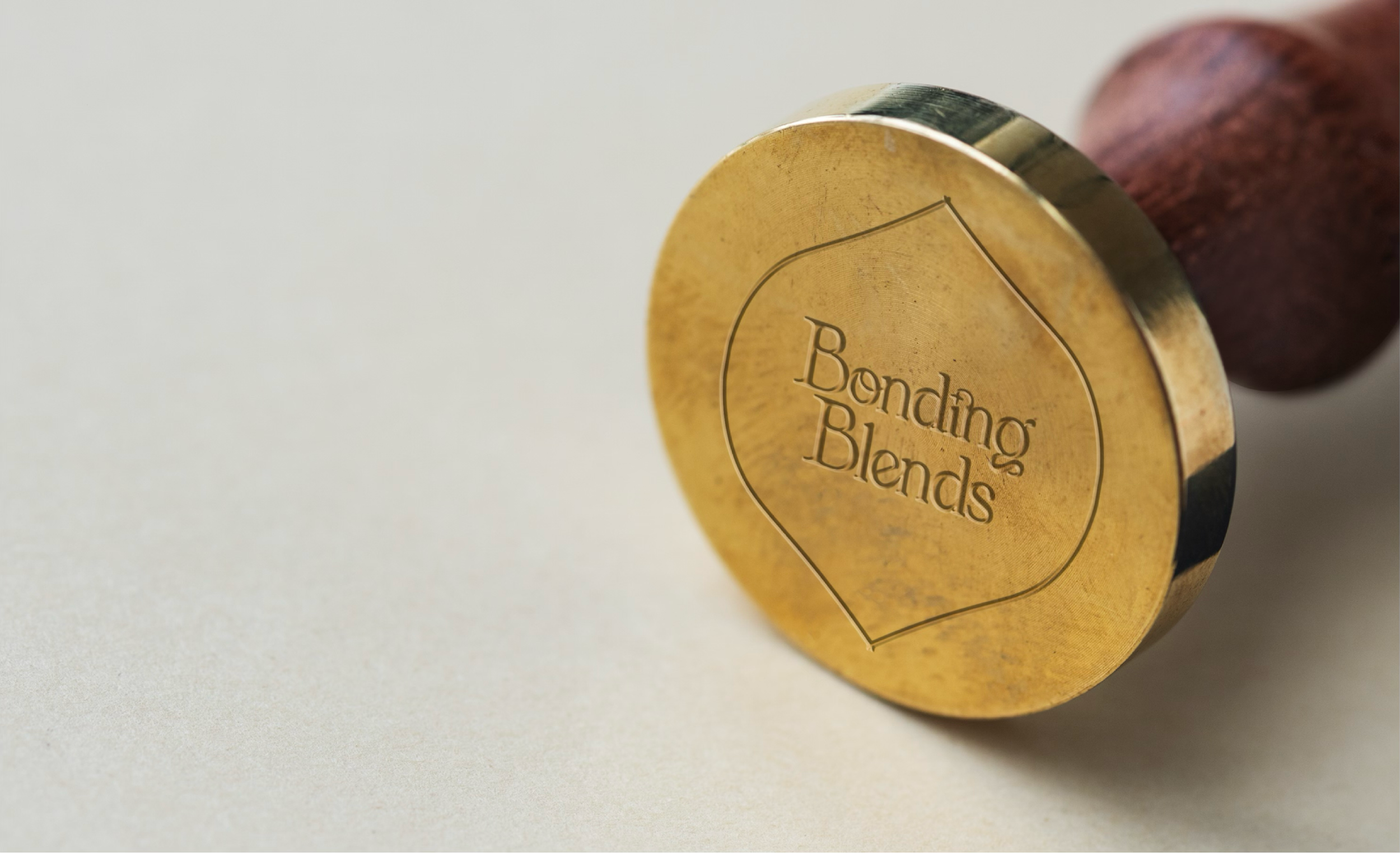
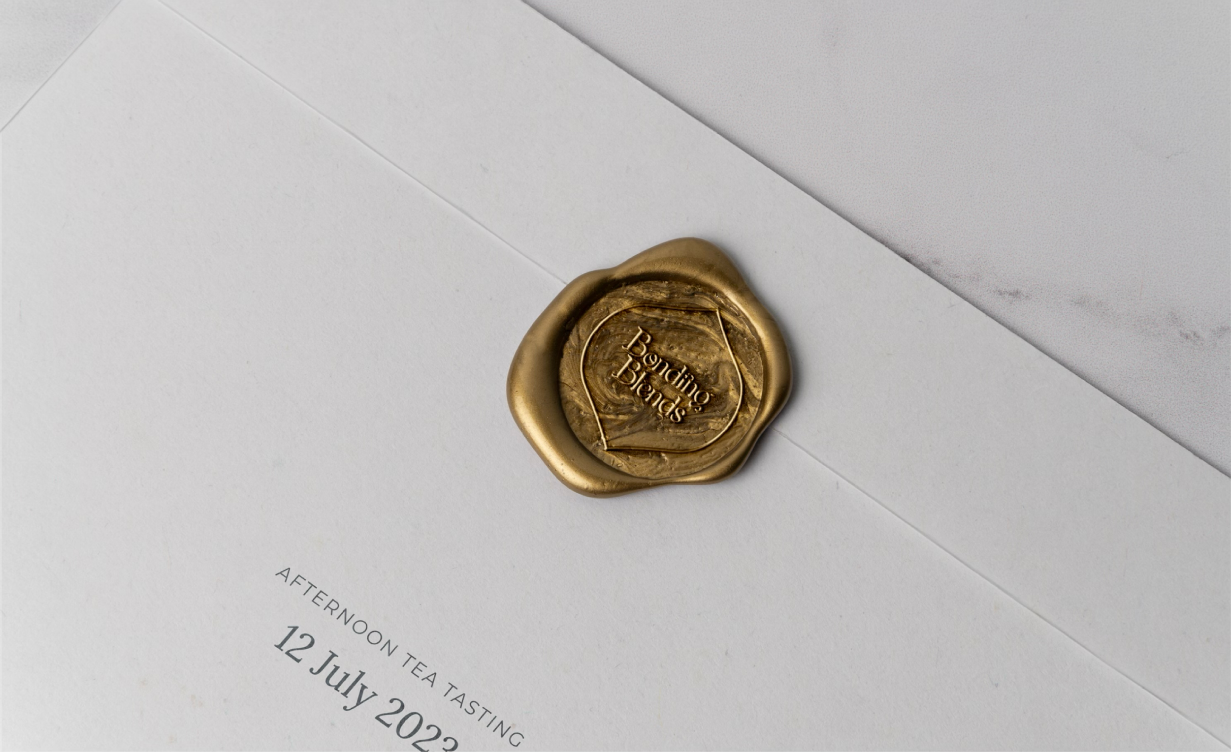
The key detail is the ligatures: letters that join into a single shape. They fit the brand directly — two things becoming one, the same way two people connect over tea. There's also a small gem worked into the logotype, a nod to Persian gemstones that adds a bit of richness and a wink of playfulness without taking over.
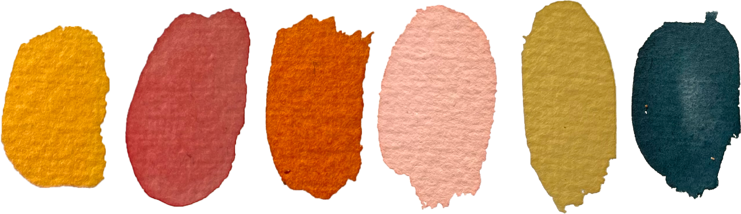
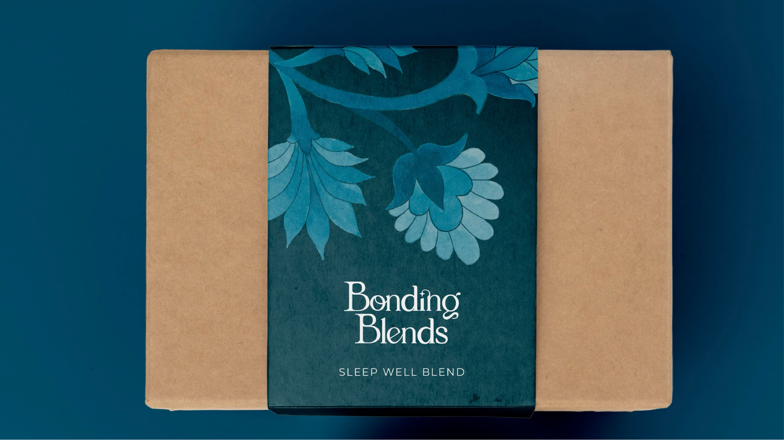
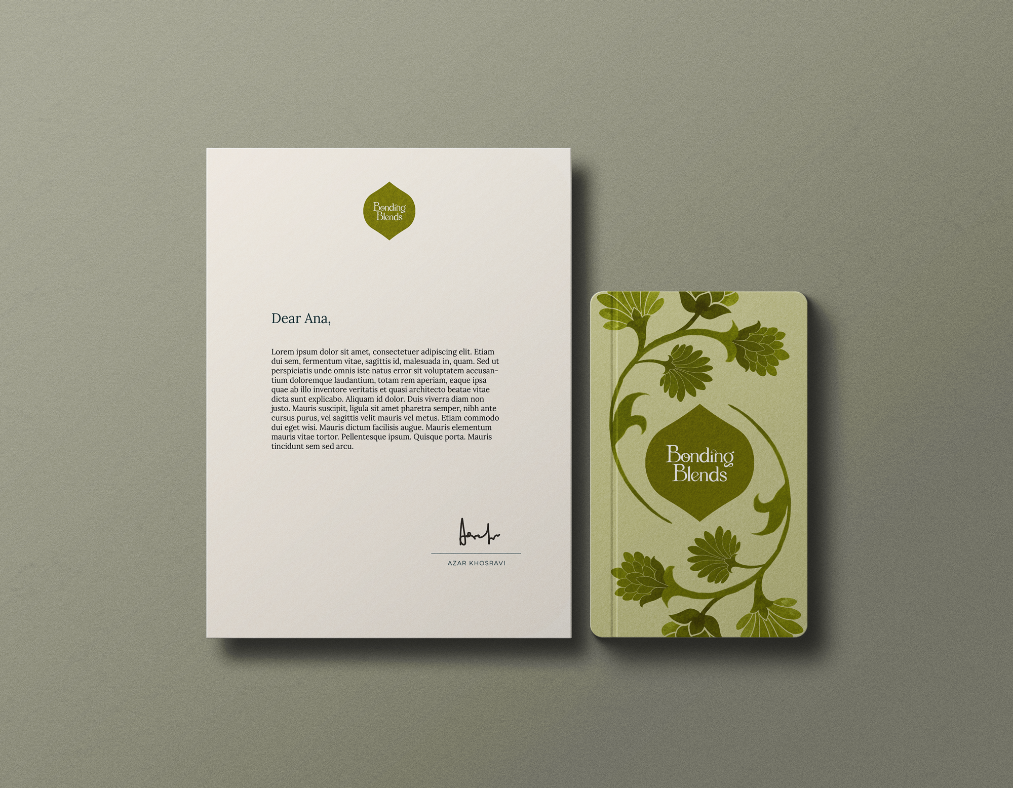
COLOR PALETTEAn earthy terracotta grounds everything with a warm, nostalgic feel. A soft pink keeps it delicate and romantic. A deep blue, drawn from traditional Persian art, brings elegance and calm. And a fresh green adds life. The colors aren't fixed to one look — they move across the painted flower modules, so each tea blend can carry its own color while staying part of the same family.
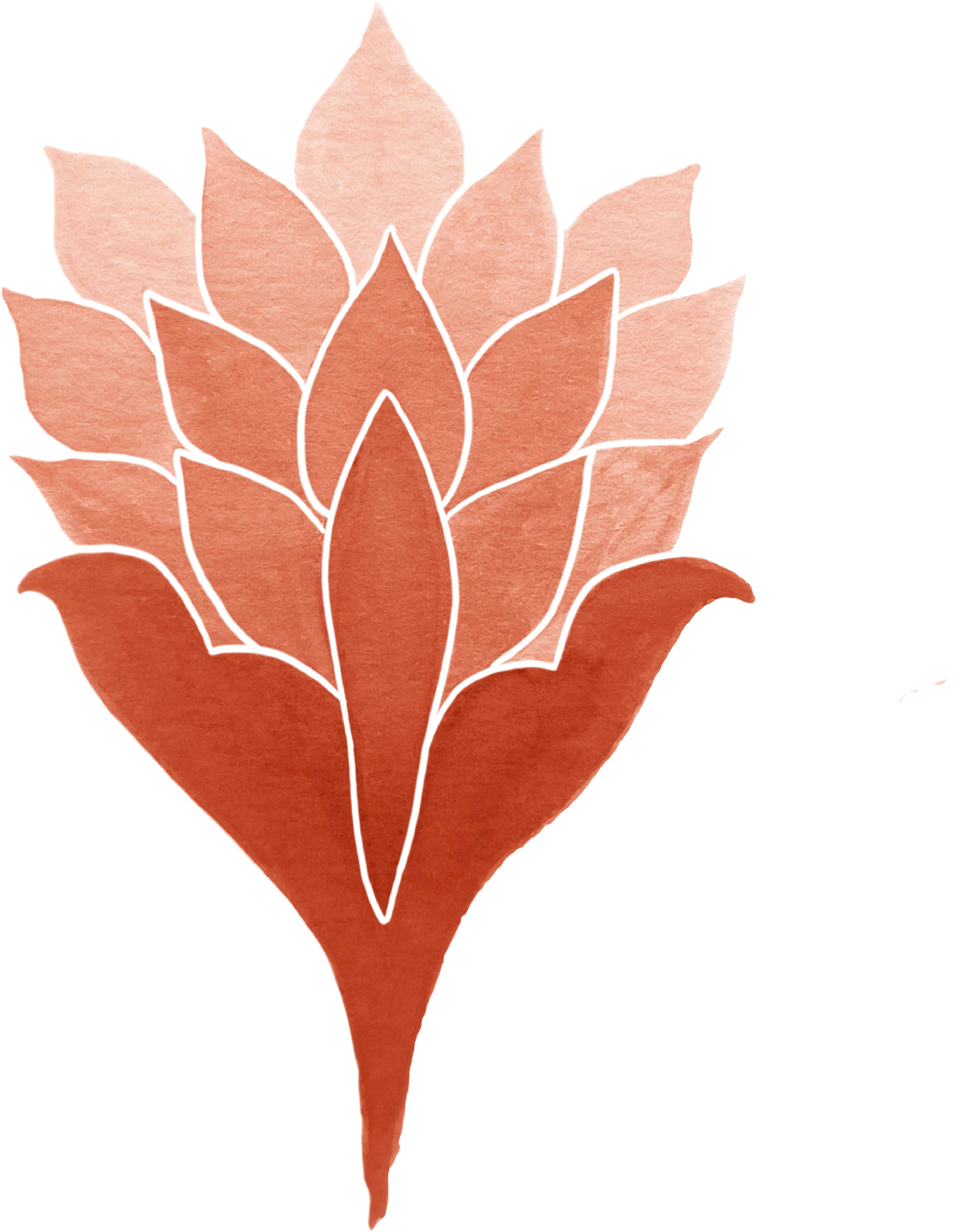
VISUAL SYSTEMThe core of the system is a set of hand-painted flowers based on traditional Persian floral art. I sketched the flowers and then painted them in watercolor. Watercolor was a deliberate choice — its imperfect, organic quality stands for humanity and connection, and a single color can carry light, mid, and dark tones for depth.